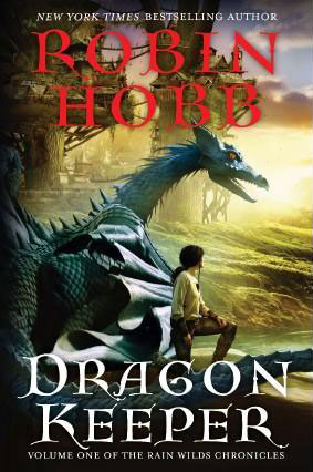
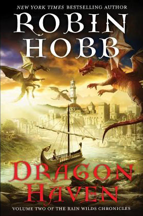
Hot on the heels of the recently released UK cover art for Robin Hobb’s Dragon Haven, we have a look at the US cover (as well as a looked at a tweaked version of the Dragon Keeper, where they tooled around with the typopgraphy, because, you know… that’s where the problem was) and, well… it’s not so pretty.


Since first unveiling the cover for Dragon Keeper, I’ve learned that EOS comissioned Hobb’s sister’s neighbour’s landlord’s highschool-aged son’s teacher’s grade 10 Computer Animation class to do the artwork. In recompense, they were allowed to skip two periods to watch Reign of Fire and Dragonheart. Lucky kids!

The concept of these covers isn’t so bad, but those dragons look like robotic fakes. There is no life to them.
wow, what the heck were they thinking, i don’t know if it is the picture quality (though i think it is not) in both covers the red text looks blurry and just does not fit the cover colors, and the dragons??? the first looks like a bad toy, the two flying ones seems like stuffed animals you get hanging on toy store windows
i just can’t understand how a publisher authorizes covers like this
To be fair, I think the jankiness of the red text is because of the awful image compression. It should look better in person.
I wish I could say the same about the art. That Hobb went from Whelan and Howe to this is a travesty.