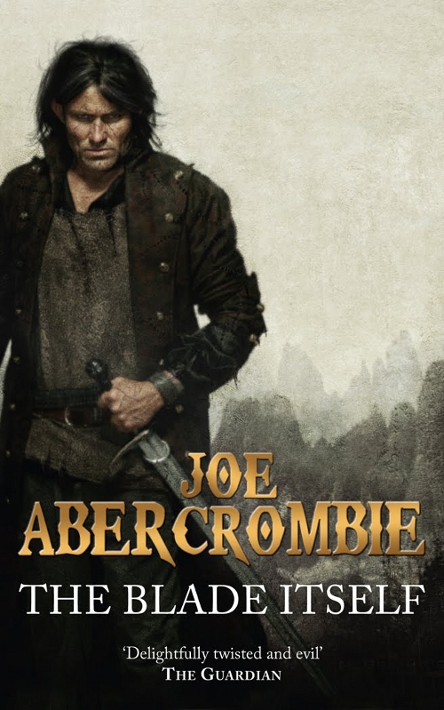
Abercrombie gave a peek at the cover art for the upcoming (Winter 2009) paperback UK release (phew!) of The Blade Itself.

Abercrombie’s thoughts:
Art is by Chris McGrath who does a lot of Urban Fantasy covers but less epic-style stuff, and I reckon he’s done a bang up job. Gritty, impactful, and says epic fantasy without the slightest whiff of cheesiness (which is not an easy trick to pull off). Not at all a bad representation of Master Ninefingers either. Never an easy thing for an author to see his/her characters made manifest like that. Glokta (Before They are Hanged) and Jezal (Last Argument of Kings) will be following over the next few months, at which point there’ll probably be some tweaking to give it more of a unified series feel…
Most notably, this is the first semi-official look we’ve had at any of the characters from Abercrombie’s The First Law trilogy. Logen’s pretty straight forward (but looks a bit younger and less ugly than what I pictured), so what I’m really curious to see is how they portray Sand dan Glokta, the tortured, erm… torturer from the series.
Chris McGrath is probably best known for his work on the Dresden Files books, which I was recently raving about. It’s just too bad about the gradient used on Abercrombie’s name.
As Abercrombie says, kudos to the art team at Gollancz for putting together a character based cover that doesn’t suck (Orbit should take note…). In fact, it’s actually pretty great.

I really like the artwork. Not so big a fan of the typography. Most of the colors are darker or a muddled gray, so the copper of the title sticks out like a sore thumb.
Still, it is many times over far greater than what Orbit has pulled off for Joe’s other book. Let’s hope they take notice.
First impressions: that’s awful, I don’t believe this is for the UK market. The guy on the cover is far too handsome and smouldering to be Logan Ninefingers. Sorry, but to me it makes perhaps the finest fantasy trilogy of the decade look like a piece of cheap, generic swords ‘n’ sex pulp.
Afront – I like it, but I definitely agree with you that it seems silly to change something that ain’t broken. The original artwork was nearly perfect.
It’s ok – it does the job, which is to appeal to genre readers who maybe were put off by the superior textured original artwork (and who don’t go online, so have no idea of what they’re missing).
That aside, I’m not really a fan. I’m generally not a fan of this sort of cover anyway, although admittedly I’ve seen far worse. Still, Logan Ninefingers – in my mind – doesn’t look like that!
I think he’s sexy on that cover. :)
‘Sexy’ is the last word that should ever be used to describe Logen. Which is a problem!
Well, the cover’s not aimed at y’all who’ve read the book; it’s aimed at people who haven’t read it. ;-) So its inaccuracy (?) isn’t a big deal, I’m sure, in marketing-land….
I like the cover, which is odd since it looks like a Western, not a fantasy. I haven’t read the book (and I know it’s a fantasy, not a Western ;-). This “Logan” person is a bit handsome and smouldering, as James says–but also looks scarred and/or weatherbeaten, and like he’s had a pretty rough life and won’t take shit from anyone. I don’t know if that’s accurate or not….
I like the cover even it doesn’t look like “my” Logan. I’m curious to see the San dan Glokta cover.
Eh, I like the cover, but not for this book.
I absolutely loved the other 3 covers. 3 of the best looking books on my shelf. I really wish they would have stayed with the same theme, but i suppose change was inevitable.
Lastly, if you are going to highlight “master nine-fingers” so on the cover, do a better job of showing his missing finger.
Personally, i would have rather seen something in the lines of the other covers, with perhaps a bloody handprint complete with missing finger to round out the image.
Aren’t we all critics.
[…] link: Cover Art | The Blade Itself by Joe Abercrombie (UK Paperback) | A Dribble of Ink […]
[…] new cover for Before they are Hanged, the second volume of his First Law Trilogy. Similar to the paperback release of The Blade Itself, this new cover is a definite departure from the original cover. That said, I’m a fan of […]
Both covers are excellent; I have no problem w/ two editions. This is a Best/Big selling book & you can be certain it will be reissued again in a couple/few years. I’m a collector (as well as reader) & I like having both covers: the leatheresque olde burnt & torn map quality of the first copy to the gritty Logen w/ sword & forest background cover as Abercrombie himself says, “kudos to the art team at Gollancz for putting together a character based cover that doesn’t suck!” Yea! If you don’t like one & only like the other, well, buy the one you like. Someone used the patha-silly-etic literary cliché “if it ain’t broke…” (nope; no! No offense), right, whatever. You can’t really break a book anyway, eh? Use ’em don’t abuse… Both editions (again) are excellent. Cheers!
[…] And, really, should a man called ‘The Cripple’ really look this good? How about a scarred and battle-worn Barbarian? Still, this time around you have playboy Jezal Dan Luthar adorning the cover, and he’s […]
[…] you’re interested, the Dribble of Ink posts can be found here, here, and […]
[…] similar to Chris McGrath’s covers for The First Law trilogy [1, 2, 3] by Joe Abercrombie, particularly Before They Are Hanged. It makes sense that Solaris would […]