Artwork by Richard Jones
Gavin Guile is the Prism, the most powerful man in the world. He is high priest and emperor, a man whose power, wit, and charm are all that preserves a tenuous peace. But Prisms never last, and Guile knows exactly how long he has left to live: Five years to achieve five impossible goals.
But when Guile discovers he has a son, born in a far kingdom after the war that put him in power, he must decide how much he’s willing to pay to protect a secret that could tear his world apart.
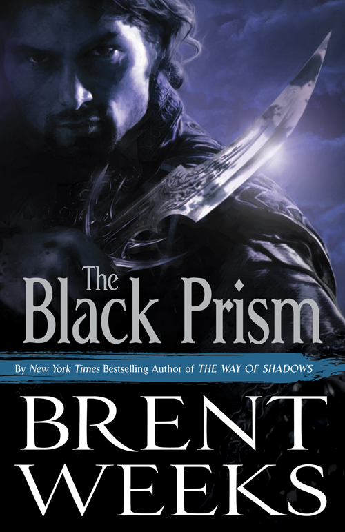
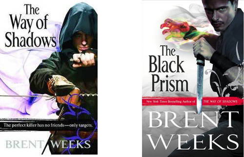
A few months ago, I raised a bit of a stink when I stumbled across a leaked cover for Brent Weeks‘s The Black Prism. My main criticism about the cover wasn’t so much the quality of the artwork, the layout of the typography or the general tone of the cover, but rather that it looked exactly like Weeks’ previous series, The Night Angel Trilogy, which is completely unrelated to The Black Prism. Now, fast forward a few months and we have this, the revamped cover for The Black Prism that seems to finally hit the nail the previous cover was going for.

Lauren Panepinto, the designer, on the cover:
Your friendly neighborhood Creative Director here really had a hard time balancing how much to show, what tone the cover should have, what the color of the cover could be (hint, hint), and still remain true to the story and world inside. We must have gone through a thousand poses, color and lighting treatments, and crops. Debate raged for months over this one, as some of you heard about when a prior version of the cover was unofficially released. What was great was so many people were involved in the development of this cover, and so much feedback was taken into account, that I think we’ve really nailed this cover for a book which we hope will blow you away both inside and out.
While I’m not always a fan of the super-realistic digital painting technique used for the art (at least on covers, artwork using the style can be quite striking), I applaud the Orbit team for coming up with a cover that manages to identify with Weeks’ previous novel without resorting to completely emulating it. If there’s anything I’ve learned since the first cover was leaked, it’s that familiarity, and creating a brand for an author (especially one as immediately successful as Weeks) is important for continued success and making sure that Weeks’ fans, the casual ones in particular, can find the book as easily as possible.
I may not love this cover, but I appreciate that Orbit was willing to take a step back and consider some of the feedback generated by my post and others like it.

I like the revised cover. :-) Thanks for sharing it.
I think I’m a fan of the revamped cover. I’m not necesarily a fan of the realistic “photo” covers, because I like to imagine the characters in my head from “scratch.” But the style of this cover is decent.
Personally, I LOVE the new cover. I had the same problems you did with the leaked cover, Aidan, but this one is top notch in my book. Just the look of the knife ALONE makes it one of the best covers we’ll see this year. haha
Hey Aiden,
I’ve come to check out your blog, yet again. As you mentioned in class, this new cover is better but I still think its a pile of crap. I would not pick up this book and read it (mostly because I tried reading the way of shadows and decided it was a little too young adult for me), but even if I didn’t know who Brent Weeks was, I still wouldn’t pick this up. It is boring and shows us nothing except the typical fantasy assassin trope. Nothing new or interesting here, in my humble opinion (which is normally not even close to being humble)
Gareth
[…] one can be found over on A Dribble of Ink run by Aidan Moher. Aidan is the acknowledged king of cover art, and he has a great deal to say on […]
Sorry but this cover just dosen’t do anything to entice me to buy the book.
Orbit put such a good cover on The Hundred Thousand Kingdoms by N.K. Jemisin yet the Brent Weeks books get a typical “moody guy with knife” cover, at least he isn’t wearing a hooded cloak I guess.
I love the graphics involved in the new cover! the brush used gives the “creepy darkness” of the storylibe a light edge. Well done.
I would however like to put in that the banner saying “best seller of night angel trilogy” is an off colour and almost takes away from the beautiful artwork. Also, the appeal would be enhanced with a nicer/different font (once again it follows the previous series’ style too closely)
I just wanted to throw my opinion in there in case you wanted some more constructive critisism, but once again I want to commend you on such an interesting cover image :)
thanks for listening!
Bryanna.
[…] Hooded Figures ranked; though, if they took out the ‘hooded’ part and added in ‘hired college student wearing a cloak, labelled with a tramp stamp and/or looking menacing‘ to the list, I’m sure it’d rank near the top. I do like those ‘dark covers […]
I second every word :)
I think that the Way of Shadows grew a little in the second half, but I still don’t think I will pick up any more from Weeks for quite some time. I’ll recomend Abercrombie and/or Scott Lynch if you want death and/or thievery :)
Well i have read the Night Angel triology and now the Black Prism, and in my opinon Weeks have really raised the stakes. I liked NightAngel but positively loved Black Prism, its gritty, witty, and the plot have astounding twists and turns. If Night Angel was more Young Adult, then Black Prism is mature adult. Weeks is all the way up there with Joe Abercrombie, R. Scott Bakker, Patrick Rothfuss and China Mieville…to mention some of my favourites. Cant wait until the next volume is available…
I, too, am a little iffy with the use of photo realism on covers, however, I can honestly say that if I had stumbled across the book with the initially released cover on it, I wouldn’t have bought it. I bought “The Black Prism” as an impulse buy, and the cover was part of that. I much prefer the dark.
[…] looked like a sequel to Weeks’ first trilogy even though it was an entirely new series. The cover was changed before publication. And then a new cover was issued for the recent trade paperback edition of the […]