

I’m sounding like a broken record, but I’m a big fan of Chris McGrath, the artist behind these covers. What I’m worried about, though, is that as McGrath becomes more successful, his art is starting to become its own flash-in-the-pan marketing trend. He continues to appear on more and more covers, but his style doesn’t vary a whole lot. Individually, his covers are striking and he has a knack for nailing the characters as I see them in my head, but when put side-by-side, McGrath covers all start looking the same. Can’t blame the guy for finding success, though. Jeff, at Genre Reader, feels similarly. I’m also not sure that the cartoony typography really fits the tone of the series.
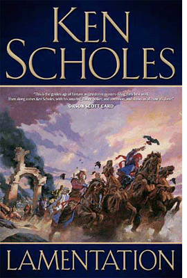
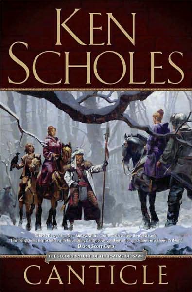
On top of that, I’m a big fan of the style used on the hardcovers of Lamentation and Canticle, with lovely Greg Manchess art and a classier layout and use of typography.
Thanks to Mad Hatter for the Antiphon cover.
Odd. My paperback copy of Lamentation has the Greg Manchess cover (which I really like), and I just assumed they would continue with the same style.
@Ellie – Scholes has an enlightening post on the decision to change cover artists HERE. I’ll likely post about it later today.
Well, I like the new covers, but I liked the old ones too. AND it kinda bugs me that my books will have separate cover art styles.
I like McGrath, but I loved the old cover art and thought it worked very well for the books. Inconsistent artwork is annoying too. Oh well.
The artwork is lovely. The cover design left me first speechless, then loudly and profanely disgusted. “Cartoony” is right – that layout makes the book look like a $.99 bargain bin special.