Monthly Archives: October 2010

The Book of Transformations by Mark Charan Newton

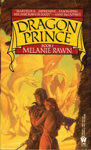
A new and corrupt Emperor seeks to rebuild the ancient structures of Villjamur to give the people of the city hope in the face of great upheaval and an oppressing ice age. But when a stranger called Shalev arrives, empowering a militant underground movement, crime and terror becomes rampant.

The Inquisition is always one step behind, and military resources are spread thinly across the Empire. So Emperor Urtica calls upon cultists to help construct a group to eliminate those involved with the uprising, and calm the populace. But there’s more to The Villjamur Knights than just phenomenal skills and abilities – each have a secret that, if exposed, could destroy everything they represent.

Investigator Fulcrom of the Villjamur Inquisition is given the unenviable task of managing the Knights, but his own skills are tested when a mysterious priest, who has travelled from beyond the fringes of the Empire, seeks his help. The priest’s existence threatens the church, and his quest promises to unravel the fabric of the world. And in a distant corner of the Empire, the enigmatic cultist Dartun Súr steps back into this world, having witnessed horrors beyond his imagination. Broken, altered, he and the remnants of his order are heading back to Villjamur.

And all eyes turn to the Sanctuary City, for Villjamur’s ancient legends are about to be shattered…

A couple of weeks ago, I whined and complained about the early cover for Mark Charan Newton’s The Book of Transformations, the third volume in his wonderful Legends of the Red Sun series. I wasn’t the only one displeased by the cover, it seems. Newton has posted a new cover on his blog, citing fan feedback for inspiring the change. A very cool move on the part of Newton and his publisher, Tor UK.

And the result? Much better. They’ve removed the ninja-girl and shifted the focus to the city, which is much more appropriate for Newton’s work, in which the cities are as important to the story as any of the characters. I’m not a fan of obvious CG artwork in a Fantasy setting (especially when compared to the lovely artwork on the UK Hardcover of Nights of Villjamur), but as long as I look at the city as a whole, rather than focussing on the details, it’s a nice approximation of Villjamur, where the novel takes place.

The novel itself sounds great. Nights of Villjamur (REVIEW) was a solid debut, but Newton showed great progress with City of Ruin (REVIEW); if The Book of Transformations continues that trend, we’re likely looking at one of the most unique and compelling series in recent years.

The Broken Kingdoms by NK Jemisin

Apparently I am pretty. Magic is all I see, and magic tends to be beautiful, so I have no way of properly judging the mundane myself. I have to take others’ word for it. Men praise parts of me endlessly — always the parts, mind you, never the whole. They love my long legs, my graceful neck, my storm of hair, my breasts. (Especially my breasts.) Most of the men in Shadow were Amn, so they also commented on my smooth near-black Maro skin even though I told them there were half a million other women in the world with the same feature. Half a million is not so many measured against the whole world, though, so that always got included in their qualified, fragmentary admiration.

“Lovely,” they would say, and sometimes they wanted to take me home and admire me in private. Before I got involved with godlings I would let them, if I felt lonely enough. “You’re beautiful, Oree,” they would whisper as they positioned and posed and polished me. “If only — ”

I never asked them to complete this sentence. I knew what they almost said: If only you didn’t have those eyes.

I was blown away earlier this year by The Hundred Thousand Kingdoms, the wonderful debut novel from NK Jemisin, and can’t wait to get my hands on the second volume, The Broken Kingdoms, coming in just a few weeks. For those looking to whet their appetite for the second novel, Jemisin’s already released the first chapter, and has now added the second.

If you’re interested, I interviewed Jemisin a few months ago and she talks at length about the structure of the trilogy and how The Broken Kingdoms relates to The Hundred Thousand Kingdoms.

Read Chapter Two of The Broken Kingdoms by NK. Jemisin.

Artwork from Todd Lockwood for SPELLBOUND by Blake Charlton

From Charlton’s post on Tor.com:

The scene inspiring this cover was suggested by the lovely Megan Messinger (who was one of my valuable beta readers). For this cover, Todd and Irene faced an additional challenge. At the heart of Spellbound lies a mystery as to what, fundamentally, a dragon is in this world. It’s more complicated than you might expect. Much of the action is devoted to trying to discover and understand two hidden dragons. For this reason, when I saw the first sketches I began doing cheerleader back-flips to make sure that the cover couldn’t “spoil” the story. Through various methods that can’t be discussed without spoiling, Todd and Irene created an image that will keep the reader guessing as to exactly what kind of a creature is on the cover. Things are not as they seem.

It’s no secret that I’m a fan of Todd Lockwood. I loved his art on the cover of Spellwright… and I like this even more! Where the cover for Spellwright felt a little adolescent (due, in part, to the typeface used), Spellbound is a bit more sophisticated and adult. Nicodemus Weal, the protagonist, looks like an adult, which is also nice. Really harkens back to some of Michael Whelan’s old covers. And I *love* the creamy blue background against the red dragon. Certainly it’s Lockwood at the top of his game.

Now, let’s just hope the typeface gets a bit more tender love ‘n care than Spellwright‘s bizarre glowly, swirly font.

Update: Looks like LEC Book Reviews has a newer version of the cover with the title and author.
SPELLBOUND by Blake Charlton

I’m still not fond of the font, but the dark blue and lack of glow is nice, but, well, author branding and all that jazz. Lovely use of colour all around.

It’s interesting to note the loss of detail in this version, suggesting that this is an earlier version of the cover. Expect the more detailed artwork above to actually appear on the cover.

Snagged from BSC Review:

A Transatlantic Tunnel, Hurrah! by Harry Harrison

A metal highway under the sea is no longer a dream. Captain Augustine Washington and his team of navvies are already driving the tunnel under the Atlantic in an heroic feat of construction. For Gus, a descendant of the infamous George Washington, executed as a traitor after the Battle of Lexington, this is the opportunity to redeem the family name. But his beautiful fiancee has been forced to end their engagement, and there is a ruthless and sinister plot to destroy the tunnel – and Gus himself…

Man, between this and the Angry Robot Books editions of Infernal Devices and Morlock Night by K.W. Jeter, the progenitors of the Steampunk genre have sure been getting some amazing cover treatments. Yay! for old books being given a fair shake with a new audience. Hopefully we see more of this across all genres.

Cheers to the art team at Tor Books and artist Lorenzo Petrantoni.

The Dragon's Path by Daniel Abraham

To top off a week-long deluge of information regarding Daniel Abraham and his upcoming The Dagger and the Coin series, we’ve got a first glimpse of early cover art for The Dragon’s Path, the first volume in the series.

The dragons are gone, the powerful magics that broke the world diluted to little more than parlour tricks, but the kingdoms of men remain and the great game of thrones goes on. Lords deploy armies and merchant caravans as their weapons, manoeuvring for wealth and power. But a darker power is rising – an unlikely leader with an ancient ally threatens to unleash the madness that destroyed the world once already. Only one man knows the truth and, from the shadows, must champion humanity. The world’s fate stands on the edge of a Dagger, its future on the toss of a Coin.

It’s from a catalogue, so likely it’s an early draft, but, well, I kinda dig it! It doesn’t blow my socks off like the Tor Books editions of The Long Price Quartet (A Shadow in Summer, The Price of Spring), but it’s succinct and ‘Fantasy’ without being over-the-top and should appeal to the Joe Abercrombie/Richard Morgan/Paul Kearney/Brent Weeks crowd, which is a very good thing, in terms of his marketability and expanding his audience. Particularly, I like the choice of classic art used in the background, rather than going with something more contemporary. It’s a small touch, but a nice one. My frothing demand for this novel grows.

If/when I get my hands on it, I’ll be sure to post the final version of the cover.