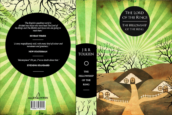
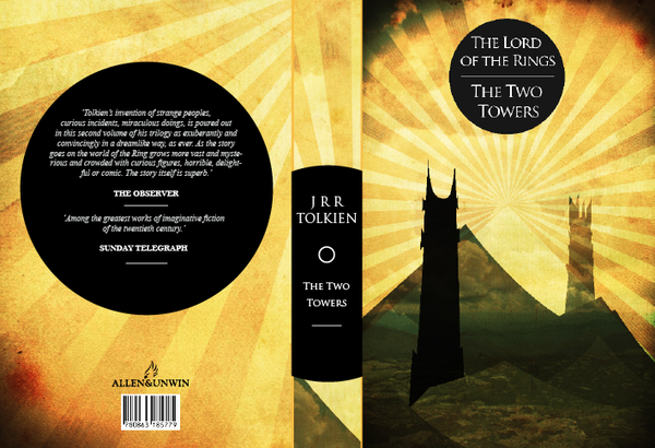
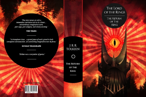
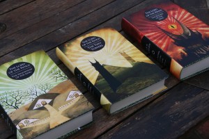
Artist Jack Fish created these out of a desire “to engage new/younger/different readers who may not have considered picking up the series before.” I think the accomplished this well, by making the cover bright and interesting, without making them look like children’s books. There’s a wonderful sense of journey and continuity to the covers and a classic feel that a lot of Fantasy novels lack these days.


What do you think of these covers? And, what are your favourite official covers for The Lord of the Rings?


The reddit thread: http://www.reddit.com/r/pics/comments/uryl6/my_approach_to_redesigning_the_lord_of_the_rings/
Jackfish90’s website for more pics: http://www.jackfishdesign.co.uk/66227/538373/gallery/lord-of-the-rings-book-cover-designs
Cheers, I linked to the Reddit post originally, but I’ve added a link to his website, as well as including the full covers in the blog post. Awesome stuff!
These covers are great. I love that the beams of Sauron’s gaze are present in each cover and grow closer and brighter each time. He’s a very talented artist, definitely going to check out his webpage.
A friend just linked me to this blog, thank you so much for featuring my work on your blog it really means a lot. Having just graduated this is the exact motivation I needed to really push my self as a designer.
Much appreciated
[…] Beautiful Fan-Made Covers for The Lord of the Rings by J.R.R. Tolkien. […]
I bought my first set of THE LORD OF THE RINGS in 1987, and I have always been partial to its abstract design: http://www.tolkienshop.com/contents/media/herrderringepb81.jpg. It is a German edition by Klett-Cotta.
I loathe them as covers. They are artsy, nouveau, hipster covers… and Tolkien would likely have disliked them as well.
My faves will always be the Alan Lee painted covers.
Don’t listen to Scott, Jack; your covers are great, they’re a wonderful alternative, and knowing quite a few kids who loathe the idea of reading, I can say these would at least have them taking a second glance – which is more than most covers do. Bravo.
Those are amazing. I’d buy them in a heartbeat. I also disagree with Scott – these actually have a lot in common with art that Tolkien drew himself, on display in The Art of the Hobbit. There’s a lovely, almost cartoonish, highly-stylised quality that Tolkien clearly enjoyed, and I think it is expressed in these as well.
Sorry, I should clarify, the art itself is fine (if you dig that art style), I just had a vehement reaction to them from a Tolkien perspective. I’m not ragging on the artist and his art, as much as I am disliking it as applied to these books. It looks like I worded it poorly early, my apologies.
Oh PLEASE tell me these are going to be available for purchase? I love them.
Hi Scott, no offence taken. Unbeknownst to the majority, the aim of these books was to entice a different demographic/reader base to pick up the books. My intention, I can assure you, was not to violate the irreplaceable originals. Having spoken to many people who had never considered picking up the books before, unfortunately the cover and the fact they had already seen the films was a recurring factor in why they didn’t choose to read them. This was my reason for doing these in the first place.
I think these show a great sense of design, the recurring theme ties the books together as a set but the variation in colours denotes the different tonal qualities of the books, its very smart. If the artist isn’t already being employed by a publishing house then one should snap him up right away.
As for previously published versions, the John Howe covers from the early 90’s are my favourites, not just the beautiful paintings but the black and gold embossed runes around the borders of the cover were a nice touch http://www.tolkienbooks.net/images/main/lr/rk-1993.gif
Lovely, and better than most official covers, except perhaps some of Tolkien’s own:
http://lotrscrapbook.bookloaf.net/gallery/bookcovers/pages/02.htm
http://lotrscrapbook.bookloaf.net/gallery/bookcovers/pages/06.htm
The spine design on Moher’s is a close miss, though. It would be nice if each comprised its respective third of a single panel, i.e. a single circle and sunburst spanning all three spines, with color and text to differentiate.
Edit: I meant “design on Fish’s”