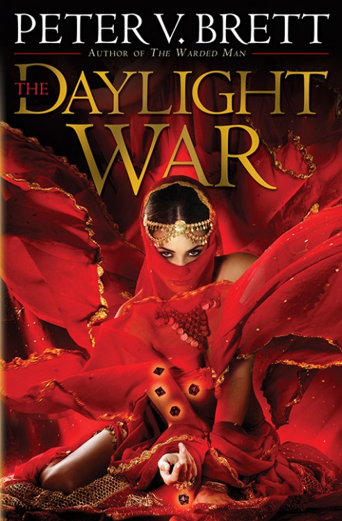
Not too shabby. I like that they’ve included a woman on the cover (presumably Inevra) without over-sexualizing her. There’s a nice amount of energy, equal to The Desert Spear, and you can never go wrong with a bold red/black colour palette. The dice are a little cheezy, but they’re important to the series, so I’ll let them pass. Worth noting, this cover was debuted by Entertainment Weekly, a large mainstream publication, rather than a genre blog, website or publication, a vote of confidence for Del Rey, Brett and the success of this series.
For those interested, Entertainment Weekly also has an excerpt of The Daylight War.

You are quick and that image is extremely eye-catching. I think a lot of us (fantasy geeks) thought Peat was a big deal, but this really is a few steps above and beyond.
Huh. They completely changed the color-palette. First ones I saw were predominantly blue (it was a nice blue). I do love that red, though. The woman’s pose is a lot better, too. Really like it.
wow….that’s ….i don’t know,why does it remind me of some women’s magazine covermusic video poster /erotica book maybe ?? LOL
I liked the french edition covers of the previous books,the english eds. were also decent,at least they clearly gave the impression that the book was “Fantasy”,but this,nope.
Hey is that a Kushiel cover?
Blerg. Awful.
This cover is absolutely awesome. It’s powerful, it’s sexy and it’ll definitely make anyone pause in a bookstore.
Just because it’s red and shows a bit of skin doesn’t mean it’s erotica. Only that it’s a nice change from previous covers in the series and a smart deviation from other book covers in the genre that to me is a breath of fresh air. The cloak and sword thing was getting too old, imho :)
They may have covered all the naughty bits, but we have very different definitions of over-sexualized.
I like that they’ve included a woman on the cover (presumably Inevra) without over-sexualizing her.
Not over-sexualising her!? It’s orientalist soft porn.
I think the cover is stunning just on its own (not having read any of Brett’s books yet – shame on me) but I have to agree with Martin. This is a pose that clearly says “come take me, I’m yours”…
Despite that, I love the colors and how striking the entire design is. Definitely an eye-catcher.
Lol ! This is so corny.
I’m with Martin. This is about as sexualised as it gets.
I’m with Martin on ‘Orientalist soft porn’. If this is an accurate depiction of the character as she’s portrayed in the books, I’m glad I haven’t read them.
Really hate this cover. Would be embarrassed to be seen reading this.
At least its not a bloke in a cloak!
Well it certainly seems to be doing its job of getting everyone to notice the book, given the debate it’s causing!
Laughing at something stupid is not a debate.
If THE DAYLIGHT WAR is even half as rape-happy as THE DESERT SPREAD (which taught us how rape reduces women to mentally-traumatised wrecks whilst it merely builds strong character in men), this cover will be even more inappropriate.
@adam whitehead
It’s SPEAR!
@locusmortis
Damn straight. Hell, the people hear complaining would probably bitch away if it were another pillock posing in that f@#$in hoodie. Political-correctness, as usual, in nuclear mode.
About the cover itself. Eh it’s nothing special. If not for the titles, one would think it was for a kushiel cover. At least the colors look sharp.
DESERT SPREAD would be a good title for this one.
They are totally over-sexualizing her. Bare skin, transparent red cloth, and a come-hither look? Nasty. The Kushiel covers were sexy, but this is just tasteless.
I thought I should let everyone know that I got a severe tongue-lashing from my wife when she read this post. I’ve been set in my place and seen the errors of my comments!
:S
I’m going to second Adam’s comment since I clearly can’t be that clever.