
Welcome to the latest version of A Dribble of Ink!
Last March, I launched a new template for A Dribble of Ink. Being a web developer/designer by day, I enjoy fiddling around with my template and continuing to evolve the look, feel, features and functionality of A Dribble of Ink. With a new spring, I felt like it was time to revisit my template and continue that evolution. This time around, however, I’ve done an entire from-the-ground-up rebuild of the theme, rather than the small tweaks and visual changes that I normally make. You might notice that the visual identity of A Dribble of Ink hasn’t change drastically from the previous theme. This is intentional. I still like the look of the old template, so instead of spending time re-inventing the wheel, I’ve updated and evolved the look. The real heavy lifting comes in some of the behind-the-scenes features that will make it easier for me to maintain A Dribble of Ink (loads of custom post types, allowing me to get creative with featured articles and reviews, and automating some things), and more enjoyable/easier for you, the readers, to read and interact with the blog.
The main purpose of the previous redesign was to increase site speed. This redesign focusses on improving user experience with a simpler layout, and by embracing the shift towards responsive CSS3/HTML 5 layouts. What does this mean? Well, in years past, it was likely that you’d be reading this blog post on a computer screen. Nowadays, however, a large portion of my readers come to the site on computers, tablets and phones. So, this new theme is designed to adapt itself dynamically to whatever screen a reader is viewing it on.
On a phone it looks something like this:
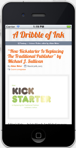
Same code. Same content. Fun times.
I’ve also tried to keep it as consistent cross-browser, though there are always compromises that must be made in these situations. If you want to experience all the new fun stuff, and have A Dribble of Ink look its best, make sure you’re using a modern browser like Chrome or Firefox. Most of my readers do so already, according to my web analytics. It’ll work just fine in Internet Explorer 9+, but Microsoft are a little behind the curve in integrating the new HTML5 and CSS3 features, so it’s impossible to replicate all of these features.
I hope you like it. I’d also love to hear from you. Last time around, reader feedback was extremely helpful in terms of layout improvements, polish and bug fixing, so, if you have suggestions, please feel free to (kindly) provide feedback in the comments section here. I’m sorry if you still don’t like orange.
I like it, although the 3.0 image at the top of this post is a LOT of orange!
More than a template relaunch, I thought you were due for a new reason why Terry Goodkind is still an asshat.
I’ll have to try it on a mobile device to get the wealth and spread of the experience .
This does show that you ARE a web developer, the idiosyncratic and individual look of a Dribble of Ink clearly marks it as yours rather than being off the shelf.
If I might ask, what do you use? WordPress with a custom template? Whom do you have hosting ADOI?
@Django, after last time, I wracked my brain to come up with a way to increase the amount of orange on the blog. I thought enormous numbers accomplished that!
@RobB, you have no ideas. I’ve got a doozy of a personal story in my back pocket.
@Paul, Thanks! I appreciate the kinds words. A Dribble of Ink runs off of wordpress using the Bones base template, from there its all custom built. I’m hosted by HostGator.
Looking good, Aidan!
Thanks, Mieneke!
:)
Looks pretty good from where I’m standing (or sitting, as the case may be). Though really, I’m probably not the best judge since I still read everything through my laptop instead of one of these newfangled tablets or smartphones. :p
Another big thumbs up from me. Probably the best looking SF&F blog I frequent.
Small bug though. The comment/author/title options in header ribbon can’t be selected in the first unexpanded post (the war piece as I write this). Can be selected for 2nd, 3rd post etc though.
@Bibliotropic, Thanks! A lot (most, actually) of my readers come via a desktop browser, so I certainly had you all in mind, too. :)
@B, Cheers. That’s a huge compliment and means a lot. Seriously.
Also, thanks for notifying me about that. Adding it to the top of my list of fixes!