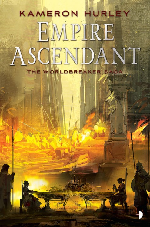
Cover Art | The blood-spattered (not) final cover for ‘The Heroes’ by Joe Abercrombie

Cover Art
6 Comments »

Thanks to The Mad Hatter for the tip:

The Heroes by Joe Abercrombie

I loved the cover when it was first revealed, but it was missing polish. It wouldn’t be an Abercrombie cover without a splash of blood. That said, too much blood can be a terribly cheesy thing.

An Aside | Cover Art Cliches for 2009

Asides, Cover Art
7 Comments »

Orbit's Chart of Fantasy Cover Art 2009

Last year, Orbit Books had a bit of fun by rounding up a huge swathe of 2008′s Fantasy novels and compiling a graph of the cliches used in the art. Now, they’re back at it, taking a look at the covers for 2009′s novels and comparing them against the novels in 2008.

It’s interesting to see that nearly all the categories dropped off (Maps, Hobbits/Dwarves/Trolls/Ogres, and Guns are the only categories to see an increase in 2009), suggesting, perhaps, that we actually saw a bit more variance in the cover art released in 2009. I think we’re all shocked by how low Hooded Figures ranked; though, if they took out the ‘hooded’ part and added in ‘hired college student wearing a cloak, labelled with a tramp stamp and/or looking menacing‘ to the list, I’m sure it’d rank near the top. I do like those ‘dark covers of meaningless’, though. We could use more of them, and maybe even add in a ‘light cover of meaningless’ or a ‘colourful cover of meaningless’ while we’re at it.

It’s an interesting, humourous look at the trends in the industry. It certainly shows that cliches are alive and well in the hearts of readers and the minds of graphic designers and marketers everywhere. Also of note is that Orbit Books will be compiling a similar graph based on the titles of novels released in 2009, which should be of equal interest.

Cover Art | ‘By Light Alone’ by Adam Roberts

Cover Art
5 Comments »

From Roberts’ blog:

By Light Alone by Adam Roberts

In a world where we have been genetically engineered so that we can photosynthesise sunlight with our hair hunger is a thing of the past, food an indulgence. The poor grow their hair, the rich affect baldness and flaunt their wealth by still eating. But other hungers remain . . . The young daughter of an affluent New York family is kidnapped. The ransom dermands are refused. Years later a young women arrives at the family home claiming to be their long lost daughter. She has changed so much, she has lived on light, can anyone be sure that she has come home? Adam Roberts’ new novel is yet another amazing melding of startling ideas and beautiful prose. Set in a New York of the future it nevertheless has echoes of a Fitzgeraldesque affluence and art-deco style. It charts his further progress as one of the most important writers of his generation.

You know how I like to complain about cover art being boring, derivative and blandly figure-centric? Well, you won’t be hearing any of those complaints today. Lovingly kitschy and spot on for the tone and setting of the novel.

Cover Art | ‘Knife of Dreams’ by Robert Jordan (eBook edition)

Cover Art
5 Comments »

From Tor.com:

Knife of Dreams by Robert Jordan (eBook)

It was time to pump up the action on the covers. I knew early on I wanted to ask Michael Komarck to work on the series but I wasn’t sure which book. After talking to Jason Denzel and reading some of the fan comments, it seemed Komarck’s gritty photorealism would be a perfect fit for this sequence.

At this point in the series Rand’s physical and mental stability is breaking down. Komarck’s tight composition and unconventional angles make the viewer feel that imbalance. Komarck engages you by making you feel slightly uncomfortable, almost wishing you could take a step back to regain your composure.

In an age when a lot of noise is being made about illustration “needing” to become moving images, I would say the beauty of this image is that you are in perpetual conflict—you want Rand to regain balance, but no amount of looking will change his struggle at that moment.

Since his work on George R.R. Martin’s A Song of Ice and Fire, Michael Komarck has become one of my favourite Fantasy Illustrators working in the industry. If put in Irene Gallo’s shoes, of choosing the artists involved in the Wheel of Time eBook re-issue, he would have been one of my first choices. I mean, just look at this Lord of the Rings painting.

I’m a big fan of the Knife of Dreams cover. Great physicality, emotion, colours, contrast. Just awesome. Plus, Rand actually looks like a man in the painting, as opposed to a teenager or a boy, as befits his transformation through the series. Great stuff from Gallo, Komarck and the rest of the Tor Books art team.

Cover Art & Synopsis | ‘The Omen Machine’ by Terry Goodkind

Cover Art
9 Comments »

The Omen Machine by Terry Goodkind

RARGHRGH. Angry Giant Kahlan is angry. RARAGRHG! This is the cover that Terry Goodkind, apparently, helped design. Looks like an ordinary, generic cover. I expected more moral objectivity, beards, Ayn Rands and Goodkind’s name to be even larger and foiled in 22k gold. It is appropriate that Angry Giant Kahlan appears to be worshiping Goodkind’s name, though.

Terry Goodkind’s novels of the Sword of Truth series set a new standard for epic storytelling in a fully realized world. Now Goodkind returns to that world for a new cycle of tales, centering on Richard Cypher and Kahlan Amnell. The Omen Machine begins directly after the events of the Sword of Truth, but it starts an independent storyline. Readers who haven’t experienced the Sword of Truth novels can begin here, while longtime fans will be captivated by a new tale of the characters that fascinated them before.

Hidden deep underground for millennia, discovered only by chance, the mysterious machine has awakened, to begin issuing a serious of ominous and alarmingly accurate omens. As the wizard Zeddicus attempts to destroy the sinister device, it issues a cataclysmic omen involving Richard and Kahlan, foretelling an impending event beyond anyone’s ability to prevent it. With catastrophe imminent, the machine then reveals that it is within its power to withdraw the omen…on fulfillment of an impossible demand.

I love that it’s ‘a Richard and Kahlan Novel‘. I guess the ship has sailed on the Sword of Truth Series, though how this is anything but the 14th volume is a mystery to me. I mean it’s got Kahlan, Richard, Zeddicus, Prophecies, Omens (and Machines!), Valour, Heroism, (likely) jaw kicking and sadomasochism, and it picks up directly after the end of Confessor. Totally sounds like a new series to me.

Glibness aside, with all the Imperial Order junk out of the way, it does sound like it might recapture some of the fun and adventurousness that made the early novels in the series readable and, *gasp*, enjoyable. At least he’s not trying to hide it as a literary thirller this time around.

Cover Art | Final Artwork for ‘Gauntlgrym’ by R.A. Salvatore

Cover Art
6 Comments »

Gauntlgrym by R.A. Salvatore

A few months ago I posted a cover for Gauntlgrym by R.A. Salvatore, the 7,345th volume in the Drizzt Do’Urden Saga. Turns out that was just placeholder art (likely for a catalog) and Wizards of the Coast was still working on the real cover.

It’s not my favourite artwork from Todd Lockwood, but it’ll surely appeal to its audience. For some reason, I get no sense of inertia or energy from the painting, it all just seems so static and lifeless to me, like a piece of sports photography shot at too high a shutter speed.

On the plus side, that title still makes me laugh, and I liked Neverwinter Nights when I played it years ago, so the setting might be cool. Still, I left Drizzt and co. behind many, many volumes ago.

Cover Art | The Inheritance by Robin Hobb

Cover Art
3 Comments »

The Inheritance by Robin Hobb (UK Edition)

It’s, uhh… catastic? I dunno. I wasn’t a fan of the style when there were Dragons involved, and I’m not really any more keen on it now. Just seems like a strange marketing decision. I do appreciate the consistency in style, though. Long gone are the days of wonderful John Howe art gracing the covers of Hobb’s work.

That said, though it’s an odd fit for this book cover, artist Jackie Morris does have a wonderful portfolio of art, and it’s absolutely worth visiting.

Cover Art | The Blade Itself by Joe Abercrombie (Limited Edition)

Cover Art
5 Comments »

Cover Art for the limited edition of The Blade Itself by Joe Abercrombie

Yummy art? Over-the-top typography? It must be another great Subterranean Press cover! I’ve been waiting for this for a while, and it’s certainly no let down. Sure, it doesn’t have share the stylistic approach of Abercrombie’s general releases (which I still prefer), but it’s a great, moody piece of art that shows a different side of Abercrombie’s series. I’m particularly fond of the deep red font contrasting the cool blue hues of the art.

It’s interesting to see Alex Preuss‘ style veer more towards Fantasy in this piece, given that some people (myself included) felt that the recently released interior artwork felt too much like an image you’d find in a Science Fiction novel. It speaks to a nice diversity, and I can’t wait to see the rest of the artwork.

Opinions? Any guess what the scene of the cover conveys?

Cover Art | The Cold Commands by Richard Morgan

Cover Art
4 Comments »

The Cold Commands by Richard Morgan (UK Edition)

I was, frankly, hoping for something a bit, well, colder, I have to admit. For a novel called ‘The Cold Commands‘, there’s certainly a lot of warm reds, oranges and browns. Still, I like the style of the cover, which takes its cue from the paperback release of The Steel Remains (which, frankly, would better suit The Cold Commands, with its cool colours.) Should look pretty once they print it with nice, shiny foil, like The Steel Remains.

Cover Art | Final Artwork for ‘The Broken Kingdoms’ by N.K. Jemisin

Cover Art
3 Comments »

The Broken Kingdoms by NK Jemisin

A few months ago, I raised a bit of a stink by posting a leaked version of the cover for N.K. Jemisin’s The Broken Kingdoms. Oops. I thought it was awesome, and most people agreed. Now, we get a look at a new, revised (and final) version of the cover. New layout for the type (which I’m not a fan of, I liked the more traditional layout on the early cover) and the colours seem to pop a bit more. Still a damn fine cover.

Cover Art | Crossroads of Twilight by Robert Jordan (eBook edition)

Cover Art
3 Comments »

Crossroads of Twilight by Robert Jordan (eBook Edition)

From Irene Gallo, at Tor.com:

With Crossroads, we wanted to show Perrin at his breaking point. After engaging in a despicable act he, in a fit of justifiable rage, finally chooses to throw away his axe of war. The trick was getting the moment right. Attempts to show the action came across a bit cartoony. Instead, we decided to depict the minutes just after. The point was to show what Perrin, in this character-defining moment, was leaving behind.

Striking the right emotional chord through mood and atmosphere would be no easy task. According to artist Greg Ruth, “There’s a time in winter here in New England where it’s early in the woods and the canopy of trees keeps the snow from getting too high on the ground, but it’s cold as hell and so deathly quiet. I loved the idea of trying as best as I could to convey that silence and chill as a kind of indictment on the bloody events that precede this scene. If the idea was to get the moment after the action, then the world surrounding the figure and the axe had to convey the emotion as much or more than anything else. Capturing that particular lighting was tough.”

The story of Wheel of Time is a fabric of profoundly difficult and personal decisions. In the end, Greg Ruth created a moment when a giant hero with the weight of the world on his shoulders is at his own private crossroads.

Greg Ruth‘s sumi-e styling is initially a little startling, giving the cover a bit of a cartoony, comic book feel, but as I look at it longer the heavy contrast between the white snow and the dark shadows fits the emotional tone of the scene depicted. I also love how we see Perrin through the arc of his axe, such an iconic image for his character.

Cover Art | The Heroes by Joe Abercrombie (UK Edition)

Cover Art
7 Comments »

The Heroes by Joe Abercrombie (UK)

The UK releases of Joe Abercrombie’s novels are known for having some of the most iconic, beautiful covers in the genre, especially when put against the bland, lookalike covers pasted on the front of most novels being published today. So, kudos once again to the art team at Gollancz, for sticking to their guns and producing a fifth cover that’s just as lovely as the previous four. It fits Abercrombie’s style to a ‘T’, and looks like a book I’d be forced to pick up from store shelves (which I can’t say about the bloodtastic US cover, though it’s an improvement over Best Served Cold).

Plus, it’s got a map. I love maps.

Cover Art | Behemoth by Scott Westerfeld

Cover Art
4 Comments »

Leviathan, Scott Westerfeld‘s Steampunk/Biopunk take on World War I, was one of my favourite novels from last year. Not only did Westerfeld meld our real world history in with giant Mechs and floating whales-turned-zepplins, but it was also flush with gorgeous artwork from Keith Thompson, perfectly rendering Westerfeld’s vision of Germany, Switzerland and Austria, et al on the eve of World War I. On top of this, it had terrific cover art, which convinced me to buy the novel in the first place.

Leviathan by Scott WesterfeldLeviathan by Scott Westerfeld

So, it comes to reason that I was bloody excited about the cover to the sequel, Behemoth, which is set to come out later this year. Then, I stumbled across it on Stomping on Yeti, and a little piece of my soul died.

Behemoth by Scott Westerfeld

Really? Really?!

All that amazing artwork… and we get a photograph of a seventh grader from Tuscon, Arizona? Is he dressed up for one of those Olde Tyme photobooths at a fair? And that slimy lightning? The bottom half of the cover, which falls in line with the previous release, is good… but, seriously, way to miss the mark of what made Leviathan so compelling to pick up off the shelf. At least Thompson is still on board to provide the artwork inside, it’s sure to be wonderful again.

Cover Art & Synopsis | Zoo City by Lauren Beukes

Cover Art
7 Comments »

North America

Zoo City by Lauren Beukes

United Kingdom

Zoo City by Lauren Beukes

Zinzi has a Sloth on her back, a dirty 419 scam habit and a talent for finding lost things. But when a little old lady turns up dead and the cops confiscate her last paycheck, she’s forced to take on her least favourite kind of job – missing persons.

Being hired by reclusive music producer Odi Huron to find a teenybop pop star should be her ticket out of Zoo City, the festering slum where the criminal underclass and their animal companions live in the shadow of hell’s undertow.

Instead, it catapults Zinzi deeper into the maw of a city twisted by crime and magic, where she’ll be forced to confront the dark secrets of former lives – including her own.

Two covers for Zoo City, the latest novel from South African writer Lauren Beukes. Oddly, both of of the covers are being published by Angry Robot Books, highlighting very clearly the difference in the approach to cover art in the different regions. Though I’m a big fan of John Picacio, something about the North American cover never really hit the mark with me, likely the floating heads, the strange angles or the yellow/purple colour palette. The UK cover, on the other hand, is a sight to behold – literary, bold and sophisticated, it attracts me for all the reasons the cartoony North American cover turns me off.

The book itself sounds great. It strikes me as a Dresdenesque yarn with good voice and enough to set it apart from the rest of the Urban Fantasy crowd.

It appears that Angry Robot Books is positioning and marketing the novel to a completely different crowd in each region, though the book behind the cover is exactly the same. If you saw the two novels on the shelf, which would you be compelled to pick up and read?

Cover Art | Dreadnought by Cherie Priest

Cover Art
4 Comments »

Dreadnought by Cherie Priest

Nurse Mercy Lynch is elbows deep in bloody laundry at a war hospital in Richmond, Virginia, when Clara Barton comes bearing bad news: Mercy’s husband has died in a POW camp. On top of that, a telegram from the west coast declares that her estranged father is gravely injured, and he wishes to see her. Mercy sets out toward the Mississippi River. Once there, she’ll catch a train over the Rockies and—if the telegram can be believed—be greeted in Washington Territory by the sheriff, who will take her to see her father in Seattle.

Reaching the Mississippi is a harrowing adventure by dirigible and rail through war-torn border states. When Mercy finally arrives in St. Louis, the only Tacoma-bound train is pulled by a terrifying Union-operated steam engine called the Dreadnought. Reluctantly, Mercy buys a ticket and climbs aboard.

What ought to be a quiet trip turns deadly when the train is beset by bushwhackers, then vigorously attacked by a band of Rebel soldiers. The train is moving away from battle lines into the vast, unincorporated west, so Mercy can’t imagine why they’re so interested. Perhaps the mysterious cargo secreted in the second and last train cars has something to do with it?

Mercy is just a frustrated nurse who wants to see her father before he dies. But she’ll have to survive both Union intrigue and Confederate opposition if she wants to make it off the Dreadnought alive.

Cherie Priest‘s Boneshaker had one of the coolest covers last year, and the follow-up, Dreadnought, lives up, and surpasses it in sheer impact. Jon Foster (who’s portfolio is absolutely amazing, if you’re not familiar with him), takes the tone he established with Boneshaker and adds a nice element of action and tension this time around. It remains to be seen if Dreadnought will live up to Boneshaker, a Hugo nominated novel which I really need to get a hold of and read!

If interested, you can also read an excerpt from Dreadnought.

Based on a template by:  SadhWeb Directory  &  WP Theme