Posts Tagged: Art

Twelve-Kings-3

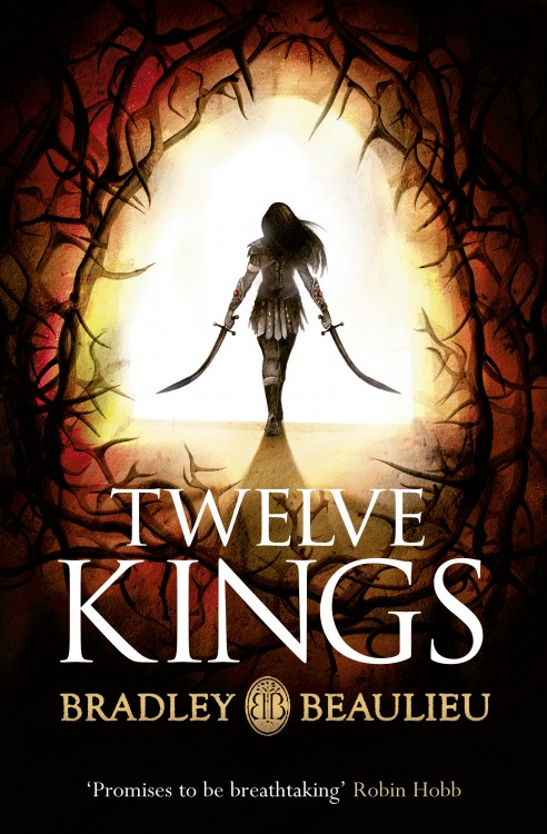
Today, Gollancz revealed the cover art for the UK edition of Bradley P. Beaulieu’s Twelve Kings, the first volume of the Songs of the Shattered Sands trilogy. I had a chance to read some early drafts of the novel, and readers are in for a treat. I also had the opportunity to see a few early sketches of this cover, and it’s fun to see Gollancz take a lot of the early feedback and create a cover with a lot of impact. I’m particularly impressed by the way they’ve focused on Ceda, the novel’s protagonist, making her identifiably badass and female (without over-sexualizing her, or falling back on the usual cover tropes applied to female characters.) It’s a nice compliment to the US cover.

Note, the title of the novel in the UK is Twelve Kings, versus the US title, Twelve Kings in Sharakhai. They both have their strengths, but I think I prefer the US version. There’s something about made-up fantasy names that resonates with the 16 year old in me.

Art by Marc Simonetti

Art by Marc Simonetti

Michael J. Sullivan revealed the cover art for The Death of Dulgath, the third volume in his Riyira Chronicles series, with artwork by French artist Marc Simonetti.

Marc Simonetti is one of my favourite fantasy artists, and his work here is just sublime. It should surprise no one that I’m much in favour of the shift away from the photo-realistic, figure-based covers that Orbit produced for the first two books in the Riyira Chronicles series. Sullivan agrees. “I never felt that the models used for the other pair were a good representation of how I saw Royce and Hadrian. But, by the time I saw them it was far too late to do anything about it,” he said on his blog. “For [The Death of Dulgath], we wanted to keep Royce and Hadrian’s back to the camera and focus instead on Castle Dulgath, a run-down abode on the edge of the sea and the site of the majority of the novel.” Read More »

Art by Richard Anderson.  Design by Christine Foltzer.

Art by Richard Anderson. Design by Christine Foltzer.

I am very proud to reveal the cover for Sunset Mantle by Alter S. Reiss, one of several novellas coming later this year as part of the debut lineup of SFF novellas from Tor.com’s new short fiction imprint. As always, I’m a big fan of Richard Anderson’s work, and Irene Gallo’s art team, including designer Christine Foltzer, has done a fine job of wrapping a cover around Anderson’s work. Read More »

Dragonbonestone-of-farewellGreenAngel

Uuuuurrrrggghh.

It’s no secret that I’m a huge fan of Tad Williams’ Memory, Sorrow and Thorn, a landmark epic fantasy trilogy published in the ’90s. So, when Hodder & Stoughton, one of my favourite SF/F imprints, announced they’d be publishing the series in the UK with brand new covers, I was appropriately excited. I’m usually a fan of Hodder & Stoughton’s covers, and Summers’ previous work for Hodder & Stoughton is stylish—particularly his cover for Lavie Tidhar’s A Man Lies Dreaming—but these are a big miss for me.

Even in a vacuum, where the series doesn’t already have some of the most iconic cover art, by one of the field’s legendary artists, these just aren’t right for the series. Memory, Sorrow and Thorn might have inspired George R.R. Martin to write A Song of Ice and Fire, but they’re not edgy or dark. They’re bright, expansive, and full of colour—these covers do little to convey the tone and spirit of Williams’ classic tale.

That all said, I do think the cover for Stone of Farewell is the best of the bunch, and is nice in a gritty, punch-you-in-the-face kind of way. Reminds me a bit of Stina Leicht’s (very good) contemporary Irish fantasy, Of Blood and Honey.

What do you think?

Cagliostro1Kiki1
Totoro1Spirited_Away1Mononoke1

Of all the wonderful opportunities that come along with being a parent, introducing your child to your favourite books, movies, comics, and music is one of the greatest. When deciding on how to decorate our nursery, my wife and I quickly settled on a theme inspired by two of Hayao Miyazaki’s wonderful films: My Neighbour Totoro and Kiki’s Delivery Service. These woodblock-inspired posters from Bill Mudron would fit beautifully in our nursery. The drawn back perspective, with an emphasis on Miyazaki’s wonderful worlds, is a nice contrast to the character-centric imagery that you often see associated with films. You get a strong sense of the characters living in this world, of it continuing on past the rolling credits. Terrific stuff.

Posters of Mudron’s Studio Ghibli woodblock prints are available through his online store.