Monthly Archives: November 2008

You’ve probably noticed that over the last few months a few Videogame related posts have crept their way on to A Dribble of Ink. This isn’t a mistake, but rather a reflection of a love for my other favourite hobby.

I thought it would be fun to put my Xbox Live Gamertag up here, so I could get some gaming time with some of the folk who read the blog.


Just drop me a Friend Request, let me know you read the blog and we’ll get some gaming going! In case you can’t see my gamer card, my Gamertag is Space Donkeys (original, eh?)

Comments closed

Remember Joe Abercrombie, public enemy No. 1 to crappy maps in Fantasy novels?

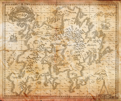
Yeah, well, even the most devilish eventually crack under the pressue. Best Served Cold, a stand alone novel set in the same world as Abercrombie’s The First Law trilogy, will include a map. An achingly beautiful map, sure to make other fantasists jealous.

Seriously, check it out:

The map for Best Served Cold by Joe Abercrombie.

And click HERE for a nice hi-res version.

Joe talks about why there’s finally a map of (a part of) the world he laid out in The First Law:

I’ve talked a bit in the past about the pros and cons of maps in fantasy, and the reasons why there was no map in the First Law. I think the main thing I didn’t really discuss was that, if a map’s going to be included, I want it to be right. I want it to punch its weight, and look the part. I think maps in fantasy series are too often lazy. Lazy in terms of the authorial thought going into them, and lazy in terms of the artistic execution. A map is artwork, and if you’re going to include it, it needs to look authentic, it needs to help set the tone and create the atmosphere for the world as well as simply describe it, or it’s a wasted opportunity. Or worse, it’s just stuck in there to say – “this book is epic fantasy, like that Lord of the Rings that made everyone so much money. Man, I hope this makes money too.”

So I was very keen that a map should a) be accurate within reason, b) have artistic merit, and c) communicate something about the setting just in the way that it’s drawn. To feel part of the setting. This was extra-specially true given that it was going on the cover, rather than just sitting forlorn, split in half over the first two pages. So the brief that went to the artist, Dave Senior, who draws a lot of maps for Gollancz books, was to aim at something like the work of Gerardus Mercator, the famous 16th century Flemish cartographer.

Couple of weeks later a rough version came back, which honestly was already pretty exciting. The general look, the lettering especially, was spot in. It felt classy. It felt authentic. One could believe that it was a map that the characters in the book might consult. There was a bit of tinkering to do, plus a few extra details – towns and towers and what have you – were added to fill in some of the white spaces.

Delighted with the results, I need hardly say. Excellent work, Dave Senior. In fact we like it so much we might attempt to incorporate it as a background on the title pages to the parts, as well.

Sounds like Joe couldn’t help but jump on the bandwagon, eh?

Seriously, though, the map is beautiful and certainly sets a standard by which lazy publishers should judge the maps they include in novels. Oh what I’d do for a print of that hanging nicely framed on my wall.

I dunno how many times I’ve mentioned this on A Dribble of Ink, but Patrick Rothfuss more or less rocks my world.

I’m a little late on this, but I wanted to make sure to spread the word. Rothfuss, making generous use of all that cash rolling in from the success of The Name of the Wind, is raising money for his favourite charity, Heifer International. Not only is he urging fans to donate, but he’s matching (!!!) any donations made by them, dollar for dollar. Talk about a generous soul.

Rothfuss explains why he chose Heifer:

My favorite charity is called Heifer International. They are a great force for good in the world, and I’d like to help them raise some money.

There are a lot of worthwhile charities out there. Important causes. Things I feel strongly about. But Heifer is my favorite. Here’s why.

Let’s say by some miracle I raised ten thousand dollars to help fight cancer, or Parkinson’s, or Alzheimer’s. While it would help the cause, it would just be a tiny drop in the bucket. Enough to help fund some lab’s research for a couple weeks.

But we don’t need to research a cure for hunger or poverty. We know how that works. Heifer doesn’t just hand out bags of rice, Heifer gives a family a goat and teaches them how to take care of it. Then that family has a continual source of milk for their children. They can sell the extra milk to make money. When the goat has babies, they give those babies to other members of their community, sharing the gift.

Heifer helps people become self-reliant. As someone who has just recently become self-reliant, I know what a nice feeling that is.

My Mom loved Heifer. Every Christmas I would donate enough money for a goat, then give it to her as a present. I remember the first year I did it. She opened the envelope where I had drawn a crude picture of a goat and a happy stick-figure child.

She knew what it meant right off the bat. “Oh! I love it!” she said. And she got a little weepy, because she loved nothing better than helping people who needed it. She had a heart as big as the sky.

This is why I love Heifer. If we raise a couple thousand dollars for them, it will make peoples’ lives better. A couple thousand dollars means little kids get milk to drink. It means families get sheep, which means wool for warm blankets and clothes. It means better wells, so moms with babies can have clean water to drink.

I think this is something we can all get behind, can’t we?

So here’s my plan, the bare bones version.

1. You will help by spreading the word, and making donations.

2. I will match all of the donations, dollar for dollar.

3. We both have a big warm fuzzy feeling in our chests that lets us know we’ve helped make the world a better place.

4. Finally, as a gesture of my appreciation, I will supply gifts for the people who participated: Signed books, maps, sneak peaks of book two, stuff like that.

This blog is to explain *why* I’m doing this. The details about *how* are over here on THIS BLOG. There are links to my Heifer Team page and details about the prizes. So hop on over there and check it out.

You can find out more about the fundraiser (along with some of the incredible pieces of swag being given away, including a signed manuscript of The Name of the Wind and signed ARCs of The Wise Man’s Fear) and how to take part HERE.

To date he’s already raised nearly $20,000, which is just another sign at how awesome Pat’s legion of fans really is.

It only lasts until December 11th, so head on over to the Team Heifer donation page or Pat’s blog for more information on all the various ways you can help Pat reach his goal.

Good on ye, Rothfuss.

Well, after two (and a bit) long months, my vagabond days are over. I have my Macbook back in my possesion, a consistently solid roof over my head (some hostels are dodgy) and certainly won’t have to be waiting for anymore trains!

So what does this mean for you and A Dribble of Ink? Well, simply that things should be back to our regular broadcasting schedule!

I took every chance I could to blog over there, but it just wasn’t enough to satisfy me. Now that I’m back home I’ve got a load of content I’m just itching to put together. This includes reviews of Altered Carbon by Richard Morgan, The Ten Thousand by Paul Kearney (a less formal review of my re-read) and Blood Ties by Pamela Freeman. It was certainly a damn good 9 weeks of reading for me, so keep an eye out for those reviews over the next couple of weeks.
Read More »

Peter V. Brett’s debut novel, The Painted Man (The Warded Man in North America), has been making some waves since its release in the UK earlier this year. The concept is novel, and the fact that Brett wrote most of the novel on his Blackberry (talk about hand cramps!) certainly have the novel on my radar.

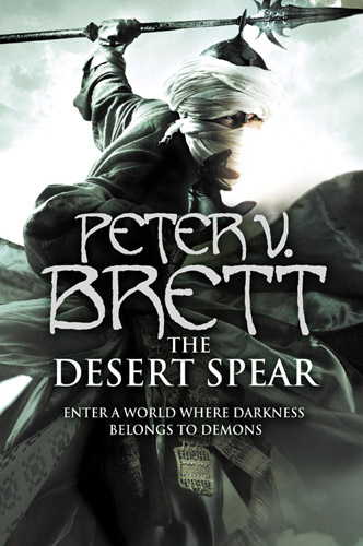
So I was interested to see that Harper Voyager has released the cover art for the second novel in the trilogy, The Desert Spear.

The cover art for Peter V. Brett’s The Desert Spear.

Continuing in the tradition of Joe Abercrombie, Brian Ruckley and David Abraham, it looks like Brett is yet another first-time author who really lucked out in the cover art department!

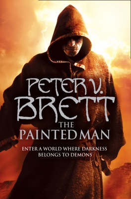
Here’s the equally cool cover for The Painted Man:

The cover art for Peter V. Brett’s The Painted Man.

You can visit Peter’s web site HERE.

Comments closed