The Natural History Museum’s prize exhibit – a giant squid – suddenly disappears. This audacious theft leads Clem, the research scientist who has recently finished preserving the exhibit, into a dark urban underworld of warring cults and surreal magic. It seems that for some, the squid represents a god and should be worshiped as such. Clem gradually comes to realise that someone may be attempting to use the squid to trigger an apocalypse. And so it is now up to him and a renegade squid-worshiper named Dean to find a way of stopping the destruction of the world as they know it whilst themselves surviving the all out-gang warfare that they have unwittingly been drawn into…
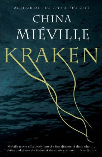
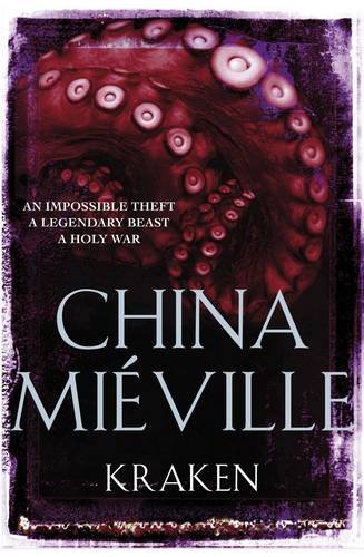
A couple of takes on the cover art for the upcoming Kraken by China Mieville. I really like ’em both, but if I had to choose I’d probably go towards the subtler look of the US Edition. Which one do you like better?
I find the US edition a bit too subtle for my taste. And I think that if I see the book in a book shop without knowing who the author is I would be inclined to pass over it without picking it. I would go however for the UK cover. It definitely works better for me.
Oh, the UK edition, definitely.
Definitely the U.S. cover. Reminds me fondly of the U.S. cover for The Scar. I have nothing against tentacles though.
I don’t like the US edition that much, it isn’t terrible, but my first thought was jellyfish rather than squid. I like the look of the UK edition; like I have to duck out of the way of incoming tentacles!
I have to go with the U.S. cover – the water creeps me out more than the tentacles.
definitely THE uk EDITION FOR ME. aS mIKE SAID, IT LOOKS MORE LIKE JELLYFISH THAN SQUID. tHE WHOLE “BEEN READ A BUNCH AND IS WORN OUT LOOK” AROUND THE EDGE OF THE uk EDITION IS SOMETHING i REALLY LOVE.
Both are very nice, and while I do understand the jellyfish objection to the US I still like the US better. It is subtle and intriguing, and Mieville is well known enough now that he shouldn’t have to rely on “cover genre recognition.”
I like the more over the top UK edition. It certainly grabs my attention, and i find the tentacles make me slightly uncomfortable. They are evocative of power and slimy crushing death at the tentacles of a cold hearted beast.
The US edition for me – that kind of cover is very evocative and I would pick up the book to check it out if I knew nothing about it
The UK one is slightly repulsive – I see the idea but I do not like the execution
I’ll take the UK edition.
Ultimately the US cover is a picture of water with a strange font. It’s evocative of… being underwater I guess, but the font changes feel like ten minutes in photo-shop, and the whole thing is a bit too “safe” for me. If they’d gone for a more abstracted graphic representation of the water I might have been more into it.
The UK cover has a awesome old-school vibe, and really fits in with Miéville’s status as one of the leading writers of the New-Wierd. It screams “subtle menace”, from the tentacles to the distressed edges.
Andrew, I never thought of that, but if they had gone with more stylized art for the water on the US cover, that really would have sealed the deal.
They’re both fantastic.
US cover for me. The tentacles coming down off the letters clearly convey ‘sea monster’ to me, and given that they’re coming down off the word ‘Kraken’, it’s pretty clear what kind of tentacles they are. I don’t dislike the UK cover, but the US is more intriguing and evocative.
The covers are so different. The U.K. Edition gives me the impression of an older book – 70’s type style. The U.S. cover is more modern, but changes what think the book is about. I actually like the u.k. edition. I just read about The City and The City and will be picking it up soon. Will be on the look out for Kraken when it comes out.
I like them both but if I had to choose I’d go for the US edition I think.
The UK version rather reminds me of Scar Night – the worn book feel etc. So perhaps that why I prefer the US cover – and a bit more subtlety.
[…] 2 lata temu – patrz ostatnie pytanie). Okładki do wersji US i UK można obejrzeć choćby tutaj, na Dribble of Ink. (Oczywiście, optuję za zamówieniem wersji brytyjskiej. ) Info na temat książki (jak […]
I think the US version is a bit too commonplace, but the tentacles on the UK version look too much like octopus tentacles. I don’t like either.