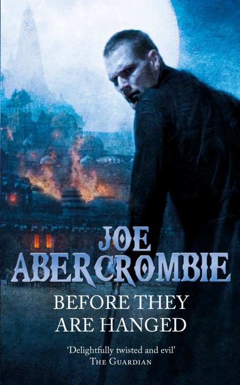
Thanks to Joe Abercrombie, we’ve got a look at the new cover for Before they are Hanged, the second volume of his First Law Trilogy. Similar to the paperback release of The Blade Itself, this new cover is a definite departure from the original cover. That said, I’m a fan of artist Chris McGrath, and don’t mind the figure-centric cover – it fits the tone of the novel and, though he doesn’t look at all as I pictured him in my head (he’s described as being much uglier, for one, which is the same criticism I had for Logen Ninefingers on the paperback release of The Blade Itself, but it’s nearly impossible for every reader’s image of a character to line up), the image of Glokta with Dagoska burning in the background is certainly compelling. Can’t ever go wrong with blue and a hint of orange, either. It’s hard to stand up to the iconic original, but it’s a decent cover all-around.

It’s not bad… but I’m really happy I already own the “2nd edition” paperbacks.
Oh, that’s Glotka!! There’s the cane and everything.
Okay…that makes a bit more sense. I thought that was Jezal, and that didn’t fit at all what I expected.
From a character perspective, I don’t think Glotka looks near broken enough. He’s got the cane and he’s hunched, by I always pictured his face as being somewhat wasted as well.
I could have read it wrong, though.
No, I had the same image. That’s not a face that people would be repulsed by, as happens in the text. I think the bottom line is that you can’t have an ugly person on a book cover.
Jezal will appear on the cover to Last Argument of Kings. He should be suitably attractive, given the previous two covers.
That’s meant to be Glotka? Good grief.
At first glance I thought this was a cover for some new urban fantasy book.
Well, McGrath, the artist, is perhaps best known for his work on Jim Butcher’s The Dresden Files, so that’s not surprising. It’s pretty clear that this is an attempt to attract new readers, so perhaps that ‘Urban Fantasy’ feeling is what they’re aiming for.
Note that these covers are specifically for the A-format mmpb editions. The existing B-formats, with the parchment covers, will remain on sale and will remain the ‘main’ paperback editions of the books.