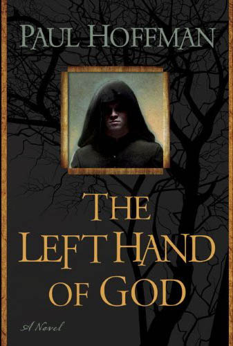
Okay, I gave the UK edition of Hoffman’s The Left Hand of God a hard time, but this is just ridiculous. Are they marketing it as a literary novel (with the inclusion the Name of the Wind–esque ‘A Novel’ tag) or a schlocky Fantasy novel (with the ham-fisted inclusion of a jackass in a hood)? I understand the idea that they want to hit a broad market with the release, but a complete mish-mash of styles is just as uncomfortable an unappealing as when Orbit tried it. I’m terrified that the hooded figure is looking out through a window cut from the front cover, his hood ending at his shoulders and revealing him in all his glory once you open the book.
I’m all for Fantasy novels trying to break new ground an broaden their appeal by straying away from the typical dude-in-a-hooded-cloak-fighting-an-orc-with-a-flaming-sword-and-a-castle-in-the-background covers, but if you’re going to do so, you’ve got to go one hundred percent, like Orbit’s recent re-issues of K.J. Parker’s The Engineer Trilogy.
James over at Dazed Ramblings has a similar rant about this charming cover.

That cover is just boring. I kind of like the typical fantasy novel covers. People that want boring mainstream covers probably aren’t the people that are reading fantasy anyway, so why do the publishers try to appeal to them instead of fantasy readers?
That’s a good question, Brenda. Especially for a novel like The Left Hand of God which is pretty standard Fantasy, from what I hear.
Bleh. Very boring cover in the end. And for those confused over the “a novel” tagline, I cleared it all up over here: http://pabba.livejournal.com/333710.html
Ah, but I am a fantasy fan and want “boring” mainstream covers. The way fantasy covers are going, what with the proliferation of hooded figures and photo manipulation, I would much prefer to have something “boring” sitting on my shelf–at the very least, I will not cringe upon looking at it.
Aidan, you are spot on about the need to go 100%. I have no idea what the publisher is going for here, but it is ugly and not something I have any desire to spend my money on (and neither is the UK cover for that matter).
Also, as an aside, when I was writing that post the other night I caught myself wondering: What is the point of adding ‘A Novel’ to novels? It should come as no surprise that trying to find information about it on Google is an exercise in futility. I mean, if I found it only on novels that try to look Literary, then I could understand, but it seems to turn up quite a bit. Amusingly enough, I have a book with ‘A Novel’ stamped on the cover, but head over to the author’s website and it is clearly labeled a novella.
Ha, thanks Paul, that pretty much sums up my feelings about the whole ‘A Novel’ thing.
I’ve played with the idea of just tossing away all the dust jackets for my novels, going for the old school looking library. Plain, literary and ‘boring’. Too bad I have so many paperbacks that would ruin the look.
That would not work for me either. I much prefer trade paperbacks (I’m cheap), so that is what my collection is largely made up of. Most of the hardcovers in my collection have cover art that I actually like.
I forgot to mention earlier, but thanks for the image of the naked jackass in a hood waiting patiently to spring out at you as you open the book…
I figured some of my readers might like that image. The publisher and Mr. Hoffman? Not so much.
Love the font though! ;)
[…] to my own recent rant about the US cover art Paul Hoffman’s The Left Hand of God, as well as Aidan’s, which follows a similar […]