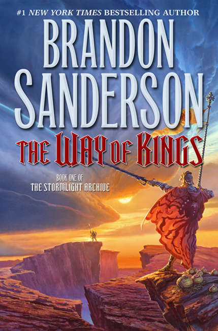
Whelan’s thoughts on the cover:
When I received the manuscript from Tor I was somewhat dismayed. 1400 pages! I felt that it would be tough sledding to work my way through such a massive fantasy epic.
As it turned out, though, I was soon hooked and lost in the world Mr. Sanderson so skillfully realized. It helped that the writing had a rich cinematic quality that brought images of scenes, characters and creatures to my mind as if I were immersed in a Myst-style virtual reality adventure, or watching a movie.
That was fun to read, but it made my work for the cover art very difficult indeed. How can one successfully distill enough of this novel to possibly do justice to the book with one picture? It was a steep challenge.
I’m an enourmous, slavering, hopeless Michael Whelan fan. I love the way he embraces scope. I love the way he uses colour. The cover for The Way of Kings is classic Whelan. I’m also charmed b is how involved he gets in the cover process, reading the novel before setting to work on the cover. Great detail, down to the forbidding storm cloud swallowing the sunlight, in reference to the overall title of the series, The Stormlight Archives.
Mr. Whelan’s been missed and it’s nice to back, if only for a one shot deal.

It is a nice cover – and one I’ve been looking forward to seeing since Brandon said that Whelan was doing it. Hopefully Whelan will do other covers in the series, though I don’t think that’s too likely.
Give me a thousand hooded figures over this backward-looking piece.
Hell no.
@Mark – I agree. This cover is a resounding meh.
I actually like the rough sketch a lot more. The crooked sword is ridiculous, the landscape just doesn’t sit right with me and the lighting effects give it a hokey feel. It could be worse but it could be so much better. Does anyone know what those onion monsters are? Reminds me of something I fought in Suikoden I.
Could BRANDON SANDERSON be any bigger?
PS – Aidan does your blog feed right into Twitter? You are much too quick on the draw… I posted my own thoughts (http://yetistomper.blogspot.com/2010/03/covering-covers-way-of-kings-brandon.html) but you beat me to the punch.
Looks great! Am really looking forward to this new series by Brandon!
@Patrick & Mark,
I just saw the sketches, and I agree that I like the layout and general look of some of them better, too. But I think colour is something that’s sorely missing from covers in the Fantasy genre these days, and that’s what grabs me about the final cover. Plus, with regards to my photography hobby, I’m always a sucker for heavy clouds and a sunset.
In all, I suppose it reminds me of being a teenager and first getting into Fantasy. The cover reminds me a lot of Whelan’s work on CS Friendman’s The Coldfire Trilogy, which always appealed to me when I was younger. If it wasn’t Sanderson, and it wasn’t Whelan, I might not be paying so much attention to it, so my opinions may be skewed a bit. I’m a man of contradictions and unusual taste, I suppose.
Regarding Mark’s comment about hooded figures, I think this cover, thanks to the bold colours, will standout on store shelves and be more likely to be picked up by a casual Fantasy reader than The Left Hand of God and its purple dude in a hood.
As for twitter, I post all my stuff there manually. I’m just that quick.
;)
Anyone ever see that MONTY PYTHON episode where they recreated WUTHERING HEIGHTS through the art of semaphore flags? This put me in mind of that. Or one of the 1970s covers of the DUNE books.
Whelan is a very good artist. This is not one of his better attempts.
a bit more to add:
I like Whelan’s work – his scope and color almost always fascinate me. I don’t think this is his best work, but it’s still pretty good. So I like it, but it’s still a very traditional fantasy book cover and I think Mark makes a decent comment (though hooded figures are no better). But the postives outweigh the negatives for me.
I only wish the author’s name was printed larger. I can barely make out who wrote the book!
That said, I do love the colors.
I happen to love it. I think it is a cover that is sorely missing in today’s marketplace full of cloaked codpieces. ;)
Did anyone else notice the title font is the same used on Warriors?
I’m surprised more attention hasn’t been paid to the length of the thing. 1,400 manuscript pages is almost as big as GRRM’s A STORM OF SWORDS, and in the ballpark of a lot of Erikson’s books.
Interesting to see what the hardcover and paperback paginations come in at.
[…] also has the cover for Brandon Sanderson’s The Way of Kings, which is the first to a projected 10 book series. Yikes! That is a commitment to know that from […]