Yearly Archives: 2010

Orbit's Chart of Fantasy Cover Art 2009

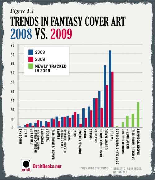
Last year, Orbit Books had a bit of fun by rounding up a huge swathe of 2008’s Fantasy novels and compiling a graph of the cliches used in the art. Now, they’re back at it, taking a look at the covers for 2009’s novels and comparing them against the novels in 2008.

It’s interesting to see that nearly all the categories dropped off (Maps, Hobbits/Dwarves/Trolls/Ogres, and Guns are the only categories to see an increase in 2009), suggesting, perhaps, that we actually saw a bit more variance in the cover art released in 2009. I think we’re all shocked by how low Hooded Figures ranked; though, if they took out the ‘hooded’ part and added in ‘hired college student wearing a cloak, labelled with a tramp stamp and/or looking menacing‘ to the list, I’m sure it’d rank near the top. I do like those ‘dark covers of meaningless’, though. We could use more of them, and maybe even add in a ‘light cover of meaningless’ or a ‘colourful cover of meaningless’ while we’re at it.

It’s an interesting, humourous look at the trends in the industry. It certainly shows that cliches are alive and well in the hearts of readers and the minds of graphic designers and marketers everywhere. Also of note is that Orbit Books will be compiling a similar graph based on the titles of novels released in 2009, which should be of equal interest.
From Roberts’ blog:

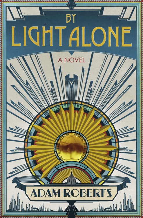
By Light Alone by Adam Roberts

In a world where we have been genetically engineered so that we can photosynthesise sunlight with our hair hunger is a thing of the past, food an indulgence. The poor grow their hair, the rich affect baldness and flaunt their wealth by still eating. But other hungers remain . . . The young daughter of an affluent New York family is kidnapped. The ransom dermands are refused. Years later a young women arrives at the family home claiming to be their long lost daughter. She has changed so much, she has lived on light, can anyone be sure that she has come home? Adam Roberts’ new novel is yet another amazing melding of startling ideas and beautiful prose. Set in a New York of the future it nevertheless has echoes of a Fitzgeraldesque affluence and art-deco style. It charts his further progress as one of the most important writers of his generation.

You know how I like to complain about cover art being boring, derivative and blandly figure-centric? Well, you won’t be hearing any of those complaints today. Lovingly kitschy and spot on for the tone and setting of the novel.

The Heroes by Joe Abercrombie (UK)

“Tunny.”

“Uh?” He opened one eye and the sun stabbed him directly in the brains. “Uh!” He snapped it shut again, wormed his tongue around his sore mouth. It tasted like slow death and old rot. “Uh.” He tried his other eye, just a crack, trained it on the dark shape hovering above him. It loomed closer, sun making glittering daggers down its edges.

“Tunny!”

“I hear you, damn it!” He tried to sit and the world tossed like a ship in a storm. “Gah!” He became aware he was in a hammock. He tried to rip his feet clear, got them tangled in the netting, almost tipped himself over in his efforts to get free, somehow ended up somewhere near sitting, swallowing the overwhelming urge to vomit. “First Sergeant Forest. What a delight. What time is it?”

“Past time you were working. Where did you get those boots?”

Tunny peered down, puzzled. He was wearing a pair of superbly polished black cavalry boots with gilded accoutrements. The reflection of the sun in the toes was so bright it was painful to look at. “Ah.” He grinned through the agony, some of the details of last night starting to leak from the shadowy crannies of his mind. “Won ’em . . . from an officer . . . called . . .” He squinted up into the branches of the tree his hammock was tied to. “No. It’s gone.”

Forest shook his head in amazement. “There’s still someone in the division stupid enough to play cards with you?”

“Well, this is one of the many fine things about wartime, Sergeant. Lots of folks leaving the division.” Their regiment had left two score in sick tents over the last couple of weeks alone. “That means lots of new card-players arriving, don’t it?”

“Yes it does, Tunny, yes it does.” Forest had that mocking little grin on his scarred face.

“Oh, no,” said Tunny.

“Oh, yes.”

“No, no, no!”

“Yes. Up you come, lads!”

It’s Joe Abercrombie, no mistake. With each new novel, Abercrombie seems to be further cementing his style, to the point that his writing is distinctive enough to be recognized even without his name attached. This excerpt should enough to either A. whet your appetite for The Heroes or B. make you into a slavery, bloodthirsty fool who can’t wait until the initial release of the novel. I won’t tell you which category I fall in.

Head on over the the Orion Books/Gollancz Blog for the full excerpt from The Heroes.

From Tor.com:

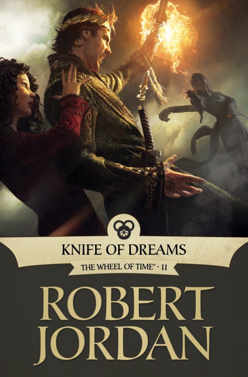
Knife of Dreams by Robert Jordan (eBook)

It was time to pump up the action on the covers. I knew early on I wanted to ask Michael Komarck to work on the series but I wasn’t sure which book. After talking to Jason Denzel and reading some of the fan comments, it seemed Komarck’s gritty photorealism would be a perfect fit for this sequence.

At this point in the series Rand’s physical and mental stability is breaking down. Komarck’s tight composition and unconventional angles make the viewer feel that imbalance. Komarck engages you by making you feel slightly uncomfortable, almost wishing you could take a step back to regain your composure.

In an age when a lot of noise is being made about illustration “needing” to become moving images, I would say the beauty of this image is that you are in perpetual conflict—you want Rand to regain balance, but no amount of looking will change his struggle at that moment.

Since his work on George R.R. Martin’s A Song of Ice and Fire, Michael Komarck has become one of my favourite Fantasy Illustrators working in the industry. If put in Irene Gallo’s shoes, of choosing the artists involved in the Wheel of Time eBook re-issue, he would have been one of my first choices. I mean, just look at this Lord of the Rings painting.

I’m a big fan of the Knife of Dreams cover. Great physicality, emotion, colours, contrast. Just awesome. Plus, Rand actually looks like a man in the painting, as opposed to a teenager or a boy, as befits his transformation through the series. Great stuff from Gallo, Komarck and the rest of the Tor Books art team.

From a Goodreads interview with Brooks:

I’m working on a book that’s the first of a trilogy that takes place after High Druid of Shannara, which is in the future of the Shannara world. I’m doing something entirely new. It’s centered around a search for all of the elfstones that are referred to repeatedly in the other books. They disappeared in the old world of fairy, and nobody knows what happened to them. In this series of books we are going to find out. People have asked about this for years, so I think there will be some pretty strong interest in the story line. Just the other day I was wishing I hadn’t [already] used the title The Elfstones of Shannara, because it would be so much better if I could use it now!

One of my biggest criticisms of Brooks’ latest novel, Bearers of the Black Staff, is that he too often dips his pen back into the same inkwell, building stories with the exact same blocks time and time again. Particularly, he’s used the Blue Elfstones as a plot device in the same manner for books on end. I hoped he would one day challenge himself, and put aside those familiar building blocks to more widely explore his mythos. Sounds like I’m getting (almost exactly) what I was asking for. It’s just too bad the book won’t be on store shelves for two-and-a-half years.