
Photography by Michael Frost; Photo Illustration by Gene Mollica
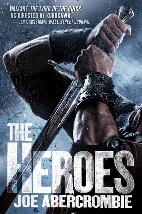
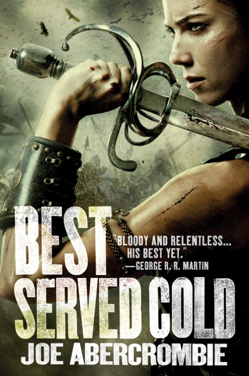
Orbit’s had a few swings at the plate now with Abercrombie’s series (this is the third cover they’ve done for Best Served Cold, each vastly different from the other eg. 1 // 2). How’d they do this time? Well, I appreciate that they took a standard image of a badass dude™/badass chick™ and tilting expectations a bit by cropping in tight on the characters; but it works much better on The Heroes with the abstract arm, and less well on Best Served Cold, with the pretty leather-clad girl. One of my major issues with featuring characters on a cover, especially photo-realistic characters and models, is that rarely do they match the image in my head or, really, the characteristics of the person they’re supposed to convey. Abercrombie’s novels are known for their nihilism and no-holds-bar approach to the scum of humanity and the terrible things we can do when we feel justified; the girl on the cover of Best Served Cold just can’t capture the ruthlessness of Monza (the protagonist of Best Served Cold) or the proper tone of Abercrombie’s novels. The tight, blood-spattered sword, however, hits it out of the park. Strange that they didn’t go similarly abstract for both covers.
Still not in the realm of the UK covers, but the best stuff Orbit’s done for the series by quite a mile. Lauren Panepinto, creative director at Orbit Books, and Abercrombie have both posted some interesting reactions/thoughts to the covers on their respective blogs.

super cheesy.
the best thing about this cover is … no, there is none. uk cover prevails.
They look like movie posters, if you ask me. And why do cover designers do this: pick a model to pose for a badass sword-wieldin’ take-no-prisoners female, and the model clearly doesn’t have the build or muscle tone to actually represent said character? I’m not saying she needs muscles like a comic-book superhero but it would work a whole lot better for me if she didn’t look like her arm would snap if she had to use that sword in anger.
They *do* look like movie posters, Elspeth. I’m sure that’s what Orbit was trying to achieve. Also, very good point about Monza’s spindly arms. She’s supposed to be lithe in the novel, but still has strength enough to wield a sword and fight hand-to-hand.
These, I love!
[…] and dumb churning water, like the Sam Sykes cover to the right). Aidan over at A Dribble of Ink seems to have similar thoughts (and a commenter noted that they look like movie posters, which they do). If you’re going […]
I love the Heroes cover – that’s great, so why they didn’t realise skinny girl looked rubbish by comparison is beyond me. Even with the example right in front of them of how much better captured movement looks on a cover, they still opt for a staid pose.
Elspeth your cover to Songs of earth is nowehere near as good as these covers.these have bite .Your comment “: pick a model to pose for a badass sword-wieldin – is pretty much what your cover shows and on your FB page you went wild over it .lol.Its dangerous to comment on others covers when your own is blander than bland.
Sarah: my comment was about the widespread selection of non-athletic female models to represent athletic female characters, so you appear to have misunderstood. The Heroes cover has an appropriately athletic man; why not the same treatment for Monza? My cover is neither relevant nor appropriate to this discussion.
we can, i think agree, that all photo covers are stupid :D
Aside from the athleticism of the model, I think it’s more to the point that Monza is badly scarred and injured for almost all of BEST SERVED COLD, and wouldn’t look as attractive as the cover model here (unless it’s meant to represent her as of Page 1, and even then I think she’d be more covered in scars from her long years as a mercenary).
And I think the cover would be far more interesting if the woman was as world-worn and (though I hestitate to use the term in a good way) battered by life, rather than generic attractive model. It would give her some personality, add some life to the image, which is often one of the problems with using the bland model headshots. It’s a book about revenge – she doesn’t have to be beautiful, but she does have to be interesting.
My first thoughts were: “Oh, they are doing the movies now? Oh dear, they won’t be PG13…”
UK covers are better, imho.
Im going to tell the BSC model you guys think she’s spindly…and I would be concerned, as she can completely kick my ass…
Being able to kick ass and being able to lift a heavy sword are two completely different things, Lauren! ;)
Now, as for that model… could you introduce her to my brother? He’s looking for a date for this Friday!
I’ll come clean. I think these are kind of awesome.
They do look like movie posters, though. I don’t know if that’s a bad thing or not.
[…] a sword), but inject some life into it. This will sit well along the trade paperback releases of Best Served Cold and The Heroes. So, good on Lauren Panepinto, art director at Orbit Books, for saving the series’ cover from […]
Nice post which One of my major issues with featuring characters on a cover, especially photo-realistic characters and models, is that rarely do they match the image in my head or, really, the characteristics of the person they’re supposed to convey. Abercrombie’s novels are known for their nihilism and no-holds-bar approach to the scum of humanity and the terrible things we can do when we feel justified; the girl on the cover of Best Served Cold just can’t capture the ruthlessness of Monza or the proper tone of Abercrombie’s novels. Thanks a lot for posting.