Remember Joe Abercrombie, public enemy No. 1 to crappy maps in Fantasy novels?
Yeah, well, even the most devilish eventually crack under the pressue. Best Served Cold, a stand alone novel set in the same world as Abercrombie’s The First Law trilogy, will include a map. An achingly beautiful map, sure to make other fantasists jealous.
Seriously, check it out:
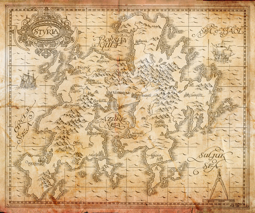
And click HERE for a nice hi-res version.
-793409.jpg)
Joe talks about why there’s finally a map of (a part of) the world he laid out in
I’ve talked a bit in the past about the pros and cons of maps in fantasy, and the reasons why there was no map in the First Law. I think the main thing I didn’t really discuss was that, if a map’s going to be included, I want it to be right. I want it to punch its weight, and look the part. I think maps in fantasy series are too often lazy. Lazy in terms of the authorial thought going into them, and lazy in terms of the artistic execution. A map is artwork, and if you’re going to include it, it needs to look authentic, it needs to help set the tone and create the atmosphere for the world as well as simply describe it, or it’s a wasted opportunity. Or worse, it’s just stuck in there to say – “this book is epic fantasy, like that Lord of the Rings that made everyone so much money. Man, I hope this makes money too.”
So I was very keen that a map should a) be accurate within reason, b) have artistic merit, and c) communicate something about the setting just in the way that it’s drawn. To feel part of the setting. This was extra-specially true given that it was going on the cover, rather than just sitting forlorn, split in half over the first two pages. So the brief that went to the artist, Dave Senior, who draws a lot of maps for Gollancz books, was to aim at something like the work of Gerardus Mercator, the famous 16th century Flemish cartographer.
…
Couple of weeks later a rough version came back, which honestly was already pretty exciting. The general look, the lettering especially, was spot in. It felt classy. It felt authentic. One could believe that it was a map that the characters in the book might consult. There was a bit of tinkering to do, plus a few extra details – towns and towers and what have you – were added to fill in some of the white spaces.
Delighted with the results, I need hardly say. Excellent work, Dave Senior. In fact we like it so much we might attempt to incorporate it as a background on the title pages to the parts, as well.
Sounds like Joe couldn’t help but jump on the bandwagon, eh?
Seriously, though, the map is beautiful and certainly sets a standard by which lazy publishers should judge the maps they include in novels. Oh what I’d do for a print of that hanging nicely framed on my wall.
I read Joe’s very interesting take on maps and I have to say that I’m one reader that likes and expects a map to be in every fantasy book. Why? Because fantasy novels are LONG, way too long in my opinion and frequently involve traveling to and fro. A map helps to establish a sense of “place” and distance.
In mainstream non-fantasy novel, if a character travels from Dallas to Los Angeles, we don’t need a map in the book because we already know where those places are, becuase we’ve seen it on a map elsewhere or even travelled that distance ourselves. In a fantasy setting, with a made-up geography, maps are a must.
I’ve begun to conduct a game.. A board game in the style of DnD. Now, I am not an artist, nor do I know any, able to draw me a map.. So I’ve been searching for quite a while and stumbled upon this and it’s more or less perfect. Would it be a sin if I used the same map with changed names for the game? I am not planning on selling the game whatsoever. I just need a map to base the world upon, so I can start making the actual game. Thank you.
[…] ones. I love maps that show almost transcendent artistic vision. Take, for example, this simple map from Joe Abercrombie's Best Served Cold. It's not so gorgeous because of the landmass (though that is very nice), but because of the magic […]
funny someone should mention D&D. Check out the World of Greyhawk maps and tell me they aren’t spitting images….
http://www.google.com/imgres?imgurl=http://www.highprogrammer.com/alan/gaming/dnd/greyhawk/map/nwog-big.png&imgrefurl=http://www.highprogrammer.com/alan/gaming/dnd/greyhawk/map/index.html&h=601&w=800&sz=61&tbnid=bueHRFtivqwNbM:&tbnh=91&tbnw=121&prev=/search%3Fq%3Dworld%2Bof%2Bgreyhawk%2Bmap%26tbm%3Disch%26tbo%3Du&zoom=1&q=world+of+greyhawk+map&docid=tjVSSQwlt_heoM&sa=X&ei=HqbtTtaiPOjk0QGsuNzMCQ&ved=0CCIQ9QEwAA&dur=71