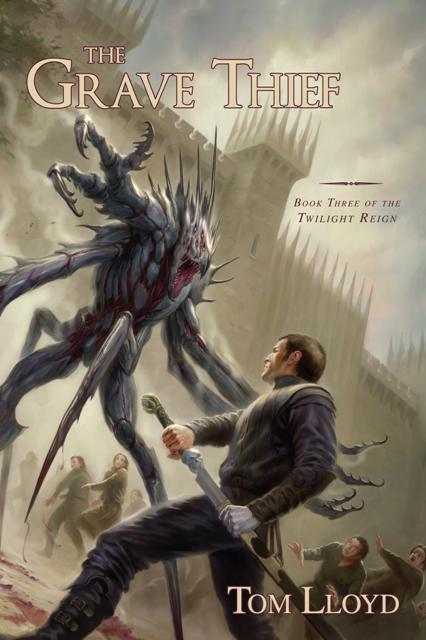
Back in April, I posted the US cover art to Tom Lloyd’s The Grave Thief, and the reaction wasn’t terribly in its favour. Well, it looks like Pyr Books, the publisher, caught wind of the reaction here (and elsewhere on the web) and did a bit of touch-up work on it.
The Old Cover

The New Cover

Thoughts?
I definitely appreciate the change in typeface – more aggresive, more eye catching, more interesting. Though it’s still not an incredible cover, it’s nice to see Pyr taking a step back and admitting when they have a dud of a cover.

Both are still the same! It’s still the same cover. I doubt they’ve admitted anything.
It’s the same cover with the title moved around a bit, the same kind of touch-up work that goes on with any cover as it is developed. If Pyr had really ‘admitted’ it was a dud they’d have changed the whole thing, surely?
Certainly they’re still very similar, but the biggest problem with the original cover was the bland typeface, that blended in with the background way too much. By moving some of the elements around, giving it a big bump in contrast by changing the colours and putting more emphasis on the text overall, the cover was improved drastically over the original.
Of course, the art by Todd Lockwood (who I have a very love/hate relationship with, these days) isn’t fantastic. But, short of commissioning another piece of art (which would be expensive), there was little they could do there.
Like I said, still not a fantastic cover, by any stretch, but a big improvement on the original, nonetheless.
I like it. It looks a decent enough cover to me…
It’s ok, I still prefer the UK version better. The zoomed in and too arty picture doesn’t sell wel for me. I prefer a more broad outlook, a landscape picture that draws attention. Like the UK version.
But it still looks better than the old one
Compared to the cover of the German edition UK and US cover are a lot better. German title of The Storm Thief = Stormeye.
Sturmauge – Cover of German edition.
You weren’t kidding, that German cover is terrible!