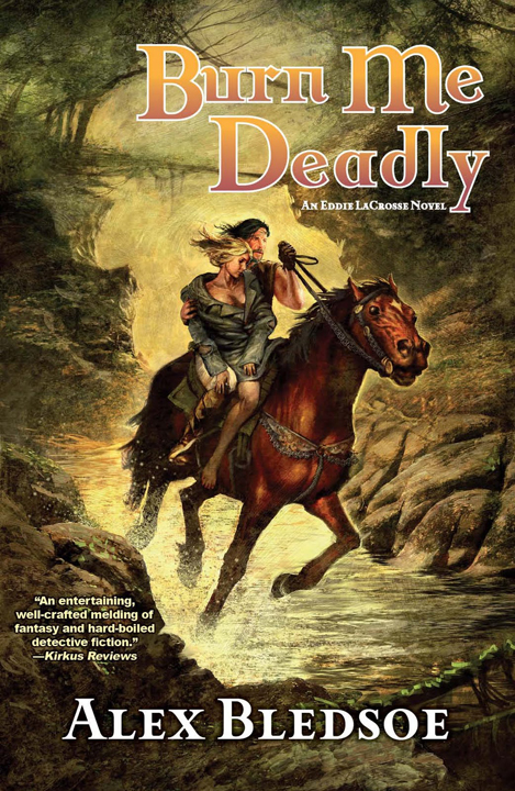
Alex Bledsoe released the cover art for his upcoming novel, Burn Me Deadly, painted by Jean-Sebastien Rossbach:

Bledsoe, and his first novel in the Eddie LaCrosse series, The Sword Edged-Blonde, popped onto my radar a few weeks ago after a couple of positive reviews from Graeme and Jeff, two bloggers whose tastes run similar to my own.
The artwork for both his novels appeals to me in that pulpy, mid-nineties kinda way. I dunno about the typography, though. The placement of the title sure makes everything a little lopsided. What do you think?

I can see why they put the title where they did, I’m not too keen on it’s colour though (clashes with the forest background). I guess it’s what’s inside that counts though, I’ve just started reading my ARC and it’s looking good so far :)
Well, it is certainly a step up from the original Night Shade cover The Sword-Edged Blonde had. I discovered a while back that I just can’t stand it when a title is placed over the artwork, even if it is something so minor as some trees, because it appears muddled. So I am not the biggest fan of the placement in this case.
I like the cover because it fits to the content…. By the way this is my Review: The Sword-Edged Blonde.
James, where would you place the title on this cover? I thought about it and I’m still not sure where to place instead of the current place.
That’s the thing. There really is no good place to put the title on the art. I went and pulled some books off my shelves while thinking it over and I noticed that most titles were located in an area that was mostly a consistent, if not solid, color (usually a fade above or below the artwork or something like a street, which is not applicable for this, but still…) or were placed in a band that was separate from the artwork. On this cover the closest thing to a consistent background is the tiny area in the lower left corner, which is obviously not big enough to do anything with.
I would suggest cutting off a bit of the top of the art and expanding on the rock at the bottom to provide a decent background, but if anything it would make the cover extraordinarily dull. An alternative would be to put a frame around it with the title and author. Something like this perhaps.
Heh, I have to stop there, if I do not then I will go on an on.
Now that you mention it, it does look offcenter or something (the title). I think I would prefer a different font.
James, I’m impressed. Didn’t expect such a detailed answer. I think the ‘Trial of Flowers’ cover step in the right direction. It is similar to this one. It also depends whether color of auhtor name and title fit to the colors of cover like in this example or not. And on this one I would move the author name down and a bit to the right. The title needs to be moved down.
Jeff: I think the font is fine, it nicely matches the pulp feel of the cover. I think the color and background combination is what makes it off.
Edifanob: Thanks, as I said, I do tend to go on about this sort of thing. I can definitely agree with you on the cover of The Drowning City. The majority of the title is placed in an area that varies between a light and dark background, which would not be so bad if the rest of the cover shared that background. However, most of the left corner of the cover is a solid expanse of black that remains unused and empty. This is an issue I had with Lord Tophet, where the title is place over top a busier part of the image and a great gaping void is not put to use.
Apologies to Aidan for this prolonged bit of off topic.
Apologies? This type of discussion is the biggest reason I love running a blog! I’m not taking part, but I’m greatly enjoying following along.
See, now I really like Justin Sweet’s work and actually enjoy the cover art for Sword Edged Blonde, the Nightshade version. I think the Tor paperback version looks absolutely dreadful. This cover, however, is very nice. I’m really pleased with it, especially considering that I hadn’t seen it until just now and only moments ago I finished reading an ARC of Burn Me Deadly. It is a fantastic sequel, even more enjoyable than the first one which I was extremely pleased with:
http://www.stainlesssteeldroppings.com/?p=871
The Nightshade cover was awful — Eddie didn’t look human.
I like this new cover except for the title font.
BTW, the audio version of TSEB was excellent.
We’ll have a review up for Burn Me Deadly in a few days.