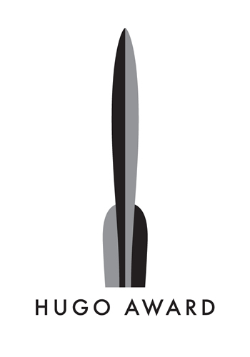
From the official blog:

The jurors were impressed with the standard of submissions, and of the many very different conceptions of the award, and were thrilled by how many of the submissions made their shortlist.
In making their decision our expert jury took a wide range of factors into account. Many very attractive pieces of art were rejected because they were too complex to be effective when added to a book or DVD cover. In other cases excellent images were let down by weak typography. The winner, designed by Jeremy Kratz of Arkansas, combined both the necessary simplicity to fulfill our requirements with a good choice of text and pleasing combination of the various elements of the design.
We would like to thank all of the people who entered the contest, and congratulate Jeremy on his win.
It’s a nice design – clean and classic – but I’m a little worried about scalability. With the Rocket being so tall, the lettering could get very hard to read once it’s scaled do small enough to fit on the cover of a book.
In case you’re interested, here’s my submission to the contest:

What do you think of the new Hugo logo?

Hi! I just found your website and blog, and I really enjoyed reading some of your posts. They are very eloquent and thoughtful. Thanks for sharing your ruminations with us in cyberspace, and best of luck with your book!
Awfully conservative. Looks like the designer spent some time on the Angry Robot website given the color scheme.
Aarti – Thanks! I’ll need all the luck I can get with Through Bended Grass…. I see you run a blog of your own, which I’ll definitely be adding to my RSS reader.
Doug – Hah! I knew something seemed familiar about it! I had a look at the guy’s web site, though, and he has a few variations on the logo, including colour scheme.
I liked your design better, especially the mixture of uppercase and lowercase. However, the coloring of the word “award” might have been a problem on certain covers.
Keep designing like this and it’s only a matter of time before you win something like this!
Thanks, Tia.
Looking at the winning submission, I don’t think mine had the gravitas they were looking for, but I’m still quite happy with the design, even a few months later. As for the colour, I designed it with an interchangeable colour in mind (as well as Black and White), and posted this one simply because I like that blue colour!
I’m not happy with what won. I think that it’s ‘too’ plain. Plain and simple have always been a winning combo for logo designs, but… this one I see, and nothing about it really stands out.
I submitted a design myself, and having gone on google image search have seen a few more entries as well as yours and still not sure what ‘wowed’ the judges on this one in particular.
I was obviously disappointed to hear my own entry hadn’t been successful, but then again I wouldn’t have expected to win. I was more disappointed though, to see such a primitive logo chosen for what is a great and magical institution.
I know the judges wanted something simple, but this is only really one step away from the EPS of the rocket every entrant was given. There were two requirements for entries: 1 – Use the rocket from the EPS, 2 – Use the words ‘Hugo Award’. As far as I can see this logo simply does both those things mechanically. A real missed opportunity.
It reminds me of the people who still think there are only 216 colours you can use on the web, come on guys, you can print some fairly sophisticated things on a DVD or book sticker these days!
Anyway, this was my entry if you’re curious…
http://www.holster.co.uk/play/hugo-award
Congratulations to the winner though, my opinion is hopelessly biased after all!
®