Apparently keeping an ear close to the ground, Orbit Books, the publishers, have written a great big post about how the cover for the US edition of Best Served Cold came to be. The cover has come under fire since being released to the public, so it’s interested to see why Orbit went in a different direction than the UK publisher.
Genres develop certain visual cues, and this happens in all kinds of media — book covers, music packaging, and even websites. Old manuscripts and maps evoke armies and fighting and war. The same way a slick photographic style says urban fantasy. As visual beings we make snap judgements from these cues, and a designer knows these cues and when to use them or purposfully confuse them.
Our approach was to focus on a more character-driven cover, while keeping the grit and dirt and gore of the epic fantasy look. The fabulous Hsu & Associates Design and Michael Turek Photography were put on the case. They did a series of great covers, but they just didn’t capture the raw violence of this book. We had one huge issue — the main character is a woman, and a good chunk of male fantasy readers think any cover with a woman on it is immediately girly urban fantasy fluff. So we kept pushing the texture, and the grit, and we came up with a gorgeous image and design…
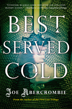
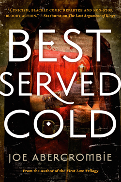
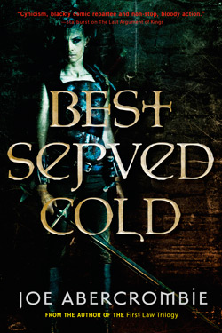
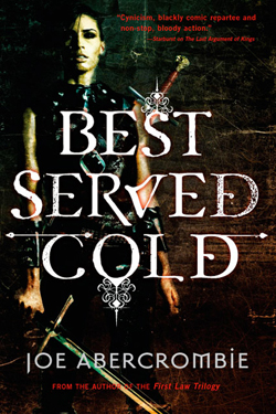
We loved this last cover. It’s gritty, it’s character-driven, it’s dark, and the texture is gorgeous. If the main character was a man in a loincloth or armor, let me tell you, this cover would be it. Unfortunately, it’s an ugly stereotyping of the genre (and we here at Orbit are all about challenging stereotypes), but a woman on the cover still reads urban fantasy to a lot of people. We showed the cover to Joe, who thought the cover was great, but he was also concerned about his fans. We didn’t want to alienate epic fantasy readers, and of course we didn’t want to misrepresent it as an urban fantasy book. But we truly felt that it was important to have Monza on the cover — so we decided to combine the two.

And after a lot of photoshop and a LOT of playing, we reached a happy medium. It speaks to Joe’s core audience of shields-and-swords fantasy readers, but opens the door for new readers to be interested by the mixed signals of the cover and pick it up. And that’s our goal — getting a person in a bookstore who has never heard of Joe Abercrombie to pick it up. Because if they give the book that chance, read the flaps, read the praise that Joe’s great writing has already achieved, then we have them. Do we expect that there will be some controversy? Of course, I can hear it already. I grew up a girl in a male geekboy’s realm and I am well used to being downplayed, dismissed, and told to “go watch Buffy” (and ogled, but that’s a post for another time). I am female, but I love epic fantasy. I love swords-and-shields AND love urban fantasy. And there are a lot of women like me out there. And there are male urban fantasy readers as well. (Don’t tell me no, who do you think is buying those Dresden Files books, hm?) And this book, which has such a great, strong, female heroine (or antiheroine, if you prefer), is something I would pick up and love. Joe’s writing will succeed on its own merit, and we of course expect he’ll gain new readers through reviews. However, I believe, as a book designer, that a cover is successful if it reaches the same audience that the interior of the book does. And I believe this cover does that. Is it controversial? of course. Is it a mashup of different styles? yes. But Joe is pushing the envelope and challenging readers, and so should we here in the Art Department.
Not surprisingly, it seems that Orbit is attempting to broaden Abercrombie’s market by including a female on the cover. Will it work? Who knows. The cover still strikes me as too Urban Fantasy and misses out on the timeless, adventerous feel of the UK cover. In many ways I think they should have stuck with just having Monza on the cover and completely eschewing the map. People who are going to be drawn in by the map are probably already aware of Abercrombie’s work and are probably also the same who are decrying the divisive nature of the US cover.
The way it is now, it seems like Monza’s on the cover only to sell more copies, rather than to properly represent the novel within. Rather than fully commiting to either design, they settled on something in the middle that fails to do either ‘look’ properly. As other’s have pointed out, it seems obtuse to place a quote from Junot Diaz (a Pulitzer prize winning author) on a gritty, dirty cover like this – again, trying to appeal to the literary crowd with the quote and the lowest common denominator with the leather clad chick. Middle of the road doesn’t always get things down, but that Diaz quote would look much less out of place on the UK cover.
I appreciate Orbit Books pulling back the curtain and defending the cover after all the flak it’s taken in the past day. To be fair, this issue probably would not have arisen, were it not for the fact that there was already outstanding art work out there for the UK edition and if Orbit has simply released this cover into the wild without any preconceptions from the current fans of Abercrombie’s work. If it ain’t broke, don’t fix it, right?
In the end, though, it’s what’s between the covers that really matters and I’m confident that Abercrombie will deliver in full force. Expect a review as soon as I can get my hands on a copy.

Thank you for the kind reposting. I would love to hear what you think of the cover again after you read the book. You may not like a cover with a kick-ass chick on it, but Joe Abercrombie wrote a great book with a kick-ass chick IN it.
I’m looking forward to it as well. I’m curious to see how Joe handles the female lead, especially after the testosterone fueled First Law trilogy. I’m a sucker for strong, female lead characters, so I expect Best Served Cold is going to be right up my alley.
Reading the book won’t make the cover any better.
I expect the book to be as good as Joe says it will be, scrub that, nothing is that good, but I still expect very high standard.
Woman with sword, lots of blood; this does not sound like an eostrogen overload!
I suspect calling a woman on the covers of books a Chick gives you an idea of the market they are pushing.
So partly in order to challenge the ugly stereotype that fantasy reading folks believe a cover with a woman on it is urban fantasy, Orbit came up with this lame mishmash thus confirming the ugly, but unfortunately true, stereotype that US fantasy books have worse covers than their UK editions! Bravo.
Boy am I glad Amazon.de has the UK version. That ‘woman’ on the US cover is so ugly I really don’t want to see more of her than the pics here.
Yeah its enough to make a person go to drink. Unfortunately the mainstream beers here mainly suck. :O(
Looks like a lot of good information here.. I learned about book packaging from keeping up with fantasy authors Christine and Ethan Rose.. you have GOT to check them out on their sites! http://www.RowanoftheWood.com and youtube/tuberrose. Their book rocks! because it has a female vampire in it.
Rather than fully commiting to either design, they settled on something in the middle that fails to do either ‘look’ properly.
That’s the key point. Th UK cover is very nicely designed. The iconography of sword, map and money is clearly laid out, the text is easy to read and eye-catching, and the blood-splatters are carefully kept to the corners in order to avoid reducing the clarity of the design.
The cover with the black-clad woman on it is basically less well designed. The title is harder to read, and the decoration above the “S” and below the “O” merge confusingly with the picture. That could be solved easily enough, but the more fundamental problem the designers have is that it’s yet another fantasy novel with a black-clad action woman on the cover.
What they should have done at that point was come up with a new design concept. You can’t polish a turd, and if the basic idea of the design is flawed then you need to go back to the drawing board. Unfortunately, they fell into the trap of trying to push and pull their failed idea into something that ticked enough boxes for them to convince themselves it was working.
They’ve ended up with something truly horrible. Two completely different design concepts are smashed together, and neither complements the other. The text is a bit clearer, at least, but the blood-splatters are now all over the place such that they confuse both the title and the iconography. That’s not to say some kind of cover design involving the protagonist, a sword, a coin and a blood-spattered map couldn’t work – but to do it well, you’d have to start over, not mess around with two existing, radically contradictory designs.
Of course, that would mean more expense in artwork and/or photography, and in the real world that may not have been possible. In which case, the best thing to do would be to say “We have one good cover, and one crap one. Let’s use the good one”, and just go with the UK version. That would involve an admission of failure, which is always hard, but at least Mr Abercrombie’s book would have an attractive cover in the US.
I completely understand their logic on why they went this route for the cover. Although I think the covers for his first trilogy are nice, they don’t immediately stand out from the crowd too much.
I prefer the US design, myself.
I always felt that The First Law covers DID stand out from the crowd. In a genre that is increasingly dominated by character-heavy covers, the artwork on Abercrombie’s novels eschews this attempt to capture an individual character (which suggests a single primary protagonist) or a party of characters (which often looks too busy and fails to capture the character interplay and group dynamics found inside). And yet, I would rank The First Law among the most character-driven fantasy I have encountered, to the point of developing a distinct character and narrator voice for each POV. Incredibly real and complex character interaction moves the story along even more than plot developments. I can only assume that Best Served Cold will include a similar depth of character, even if the plot is brisker.
I understand that Best Served Cold will focus primarily, if not entirely, on a single protagonist. In this light, I can understand the desire to dominate the cover with the protagonist’s image. However, The First Law covers were able to accurately sum up Abercrombie’s style and tone precisely because they avoided integrating characters. Not to insult the artist(s) or fans of the US cover, but it seems to me that any reader who is roped into reading the book solely due to a prominently placed (female) character is unlikely to get quite what they are expecting. There is just so much intricacy and depth to the author’s work that I don’t think a single character can grasp the whole essence of the world he is building. And while I find it hard to believe anyone could not like Abercrombie’s writing, I still feel the cover risks misleading both new and old fans. It seems only proper that all books stemming from The First Law sequence should share a cohesive cover design, just as we expect Abercrombie’s style to remain largely the same from book to book. The UK cover accomplishes this; the US cover doesn’t.
That’s my five cents’ worth, anyway.
such an understated art form the old cover art-
cool post,
newman
The Orbit post notes, and I agree, that a “slick photographic style” says urban fantasy, as far as fantasy book covers go. I agree. For me, it’s not the fact that a woman is on the cover that screams Urban Fantasy as it is the fact that it’s clearly a doctored-up photograph of a woman.
I always presumed that Urban Fantasy covers (and many romance covers, for that matter) used photographic images because they were cheaper than actually commissioning an original painting (or other piece of artwork). Presumably it’s less costly for someone to photoshop a stock image (or even a new photo of an actor in costume) than it is to have someone like Michael Whelan create a custom painting.
Give the current prominence of Urban Fantasy, however, I’m not sure that’s an accurate presumption. Anyone have any idea?