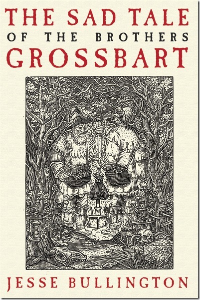
Saw this on Nextread, and couldn’t help but steal it. Absolutely beautiful artwork.

In the plague-wracked and devil-haunted darkness of Medieval Europe, an elite few enjoy opulent lives while the majority ekes out a miserable existence in abject poverty. Hungry creatures stalk the deep woods and desolate mountains, and both sea and sky teem with unspeakable horrors. For those ill-fated masses not born into wealth, life is but a vicious trial to be endured before the end of days. Hegel and Mengele Grossbart could give a toss. Being of low birth means little, after all, when the riches of the mighty wait just inside the next crypt. The graverobbing twins know enough about crusading to realize that if one is to make a living from the dead, what better destination than the fabled tomb-cities of Egypt? But the Brothers Grossbart are about to discover that all legends have their truths, and worse fates than death await those who would take the red road of villainy…
Orbit have really outdone themselves! And if this is any indication of the quality of the covers for the rests of their novels coming out later this year, expect many more to be featured here on A Dribble of Ink!

Steal away!
I commented that I didn’t like the colour of cream was a little too cream but was reassured the real thing is stunning!
It’s always tough to tell on a computer screen. I remember being rather ambivilent towards the cover for David Anthony Durham’s Acacia: The War with the Mein when I saw it on the web, but as soon as I saw a copy in real life I fell in love.
Thank GOD they stepped away from their WHITE BACKGROUND phase. Frickin’ HATED all of those covers!
Heh. It certainly is nice to see Orbit diversifying. It’s too bad they couldn’t have dumped those character driven covers before they slaughtered Joe Abercrombie’s latest.
Even Joe’s newest doesn’t bother me, although I understand why people don’t like it. I just hate white space. Even the website’s I’ve created, which have mostly white backgrounds, I now hate, because white space is empty space, and empty space is underutilized space. Ugh.
I love the neo-victorian feel of some of these new covers. This one is fantastic and since I often buy based on cover alone – they’ve got a winner with this one!
Now, now! Didn’t anyone tell you not to judge a book by its cover?
:)
I’m with Loopdilou – I’m a bugger for a cover – I’m sure that’s why I have soo many unread books. I think that looks pretty lets buy it and take it home….
Yah, I’ve heard that before.. And yet they say that people can actually judge a book by its cover ;)