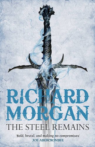
I’ve posted several different covers for Richard Morgan’s first foray into fantasy, The Steel Remains, but felt this one takes the cake as the best of the bunch. I assume this is for the upcoming Gollancz paperback edition, but don’t quote me on that.

Simple and evocative, this is exactly what a good fantasy cover should look like.

Well, I love the typeface. Great fonts and style. Cannot say I agree with you on the artwork though. Think the image looks piss poor. A plain gray cover with the text would have been better. Though I guess a fantasy novel is not going to come with such a barebones cover. lol.
Looks good, I have to confess I’m a total sucker for a good fantasy cover..
It’s pretty cool, though not as good as the original UK cover imo.
It’s the softcover Gollancz edition.
[…] warm reds, oranges and browns. Still, I like the style of the cover, which takes its cue from the paperback release of The Steel Remains (which, frankly, would better suit The Cold Commands, with its cool colours.) Should look pretty […]
[…] but also clearly from a new series. Reminiscent of the Gollancz editions of Richard Morgan’s The Steel Remains and The Cold […]