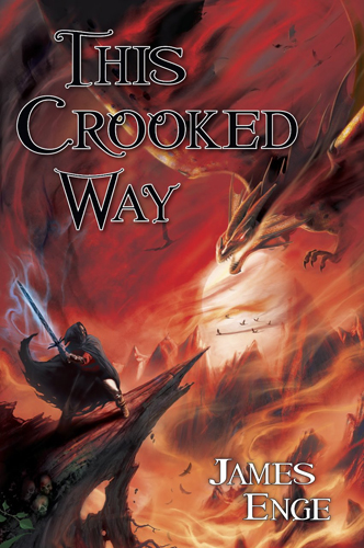
Stolen from the official Pyr blog:

Very similar in design to the recently released cover art for Tom Lloyd’s The Grave Thief, but somehow I feel it works much better here. The colour palette and the imagery is much more intense, for one thing.
What do you think?

That’s a fabulous cover! The composition, the colors, and especially the texture.
It has the same problem as [b]The Grave Thief[/b] cover. Poor layout and terrible font choices.
Beg to disagree with the previous Shawn. well, not entirely disagree. You can make an argument for poor layout. But the grave thief cover suffers from not allowing for imagination in the imagery. This cover is a complete 180 from that. The character model is small and manages to look “cool” while being nondescript, the same thing can be said for the dragon. the color pallet, imo, works well, the font does suck, but the main point is this:
The imagery allows for imagination.
Whereas with the grave thief, they are telling you exactly what these character/monster (s) look like, in this one they give u a foundation to create your own hero and villain. Much as Terry brooks (and most of his covers) gave you enough description as to create different appearances for his characters, while not giving so much that you must know they look a certain way.
this is what good author do so well.
i’ll agree that i also dislike the layout once you consider it in all its parts. but you can’t argue that it catches the eye and causes you to look at it multiple times in depth. thus i guess its a good job by the artist/marketing team.
If i was scanning covers at the local fiction section, i would stop and look closer at this book.