Found these over at Creative Review:
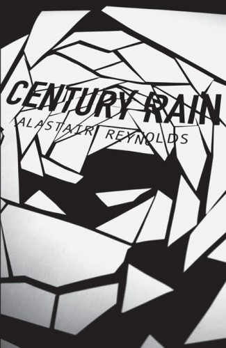


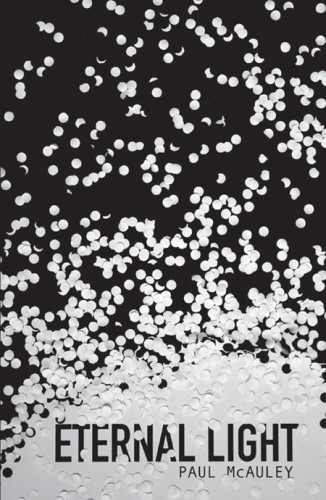
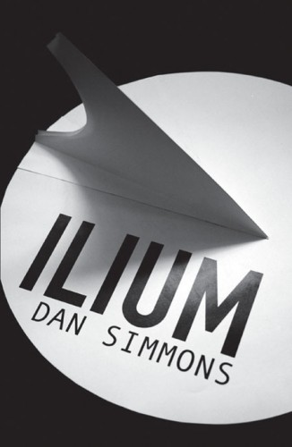
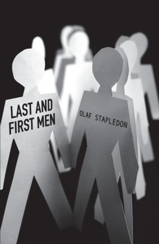
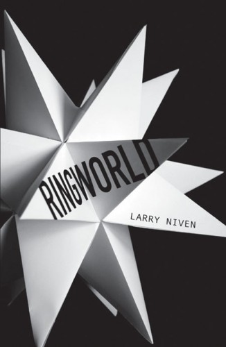
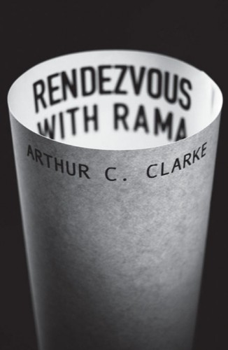


A little out there, eh? I’m personally a huge fan. It’s nice to see a company like Gollancz take a risk by coming up with a simple idea and running with it. You can tell me that those covers wouldn’t catch your eye on the shelf. My favourites are Eon by Greg Bear, Rendezvous with Rama by Arthur C. Clarke and Century Rain by Alastair Reynolds.
What are your thoughts? Do you like the out-of-the-box design?

They’re clearly designed to appeal to non-genre readers. Not necessarily a bad thing, but it’s so obvious. I guess you can give credit to them for trying something new, but personally I hate them. The Ilium one is utter crap.
“You can tell me that those covers wouldn’t catch your eye on the shelf.”
They wouldn’t stand out too much to me. They look almost like self-published books, though the Rama cover is clever.
In addition to aiming for non-genre fans (though unless shelved outside the SF section, I don’t see how that’d work), they’re an attempt to save money, methinks. Which is fine. They’re clever, but I don’t know most of the books, so I don’t know how well they work. The one for Ringworld fails. The Stapledon cover makes me wonder if the first and last men are a gay couple (or if it’s a non-fiction book about the gay rights movement, or whatever). ;-)
James – I definitely won’t argue that the Ilium one doesn’t work terribly well, neither does the Ringworld one, as Kendall mentions.
Rob B – I don’t get the self-published vibe at all. In fact, what I like about them is the obtuse, almost sixtiesish vibe.
Kendall – They’re definitely a way to save money, but I almost appreciate that about them. I’d rather see this than some more shitty art of some spaceships or out-of-context aliens.
I bought the Ringworld version of this, mainly because I haven’t read it and was impressed by the packaging when i picked it up (though not necessarily the cover). I’ll probably pick up some others too in the future, the larger size (between mass-market and trade paperback) works well. It’s just a shame they couldn’t put a little more thought into it and get the covers to actually relate at a glance to the stories within…
Paper machete images on a black background seem very simplistic, something you or I could do. The McAuley cover looks like somebody just dumped a bin of paper from a three-hole puncher on a black background.
Well… yeah, they are simplistic. That’s the point.
And, frankly, I can’t claim to have the creativity to pull off anything like this, nor the photography skills required to get properly exposed and focussed photos (which is difficult, in and of itself). I understand that you may not like them, but don’t act like they’re hack jobs thrown together by an intern in 30 minutes.
I wouldn’t say they are hack jobs, but IMHO they *do* look like simplistic images that could have been put together in 30 minutes.
That, of course, doesn’t take into account the brainstorming and thought that got the final image in the artist’s eye which drove the artist to arrive at the image.
I dislike them. Agreed, however, that they are better than some of the terrible cover art aidan has posted recently (think boy doing jig in front of blown out house) and agreed that they MAY be better than another high-graphics cookie cutter spaceship/alien montage.
But still. Don’t like, wouldn’t buy. Even if i thought i was going to love the books, i’d just check them out from a public library. Wouldn’t care to have them sitting on my shelf.
(a good contrast would be the blade itself trilogy–which i actually did love–even had i not liked it, the books are so handsome i’d want to buy them and put them in my collection.)
I think the problem with this cover art lies in the simple fact: they are as further from dreams these books are about as possible. No dream, no SF. And they look like a smart design. Which is pathetic.
Thanks for mentioning these and thanks for all the feedback. Not going to get into a debate about the perceived artistic merit (or otherwise) of these titles – clearly I’m going to be backing one particular view. :-)
One thing though – an exercise in saving money? How exactly? Designing covers, printing books, distributing them, publicising them, all costs money. Each and everyone of these titles remains in print on the Gollancz list in its previous (generally more conventional) cover livery. These are intended as alternative editions to existing runs, not replacement editions. A redesign and repackage never saves money, even when it replaces the earlier design and certainly doesn’t when it’s for an additional edition. A moment’s thought, a modicum of research would make this pretty obvious to most people.
This whole ‘Publishers, they’re out to rip us off’ conspiracy thing is way off the mark. To have it directed at a promotion intended to win extra readers for excellent books (and yes I know that means sales for us wicked publishers, but remember every sale for a wicked publisher is a royalty for a deserving author)is, well it’s irritating to be honest. But hey! It’s Friday! Maybe we all need the weekend. :-)
Simon Spanton
Deputy Publishing Director, Gollancz
Thanks for the peek behind the curtain, Simon. Good points about the cost associated with re-issuing covers, even with the relatively simplistic approach of these covers.
Wow, Simon, you seem to be reacting to comments not made here (“rip us off”–who said that here?). In case you totally misread my comment or overreacting to it, though:
I’ve read comments from an art director at a publishing firms that designed covers like this are less expensive than commissioning original painting for covers. So I thought, well, if they were going to do new covers anyway, then a designed cover–from what I’ve read–would, yes, save money. I never said anything was wrong with that and I thought I made it clear it was a guess.
(shrug) Hopefully you were reacting to something else (perhaps on another blog?!?!), ‘cuz if my “an attempt to save money” comment’s what set you off like that…wow, dude, relax, you took it very differently than I wrote it. And if you weren’t reacting to anything I said, then sorry if I’m jumping to conclusions here. :-)
P.S. “wicked publisher” etc….wow, I have nothing but scorn for people who really think of publishers like you’re describing. Still can’t believe your diatribe above. (shaking head) But sorry if my comment set you off….
hi kendall. it seems like most of your ‘own’ observations were ripped off from book cover archive:
“The one for Ringworld fails. The Stapledon cover makes me wonder if the first and last men are a gay couple (or if it’s a non-fiction book about the gay rights movement”
so for you to mention the editor ‘reacting to another blog’ in itself shows your own integrity. think about the simplicity involved behind these covers and then think about the complexity taken to achieve that
done
Not sure what “book cover archive is,” “bob bob”; my opinions are my own. If you think two people can’t have the same opinion without one copying the other, you’re smoking something interesting! ;-)
Your last paragraph doesn’t even make sense to me. Perhaps you missed where I said the covers were clever, though…or where I didn’t question anyone’s integrity, just wondered at comments that seemed to be reacting to things that no one actually said here.
Kendall,
Thanking everyone for their feedback, seeking to correct some apparant misconceptions and then breifly admitting to being irritated and then signing off with an amused admission to that irritation not being soundly based is a ‘diatribe’? You clearly haven’t seen me diatribing :-)
My mistake was to ascribe to one comment a motivation that I had seen clearly informing many other similar comments on other forums – that was a mistake and I’ll apologise for that.
I like the idea, and especially like the cover for Century Rain, that one makes me want to buy it right away. But then I have always been a fan of clean, simplistic covers,
[…] the cover design? Head here to see […]