Though it was graced with some pretty snazzy cover art in the US (HARDCOVER and PAPERBACK) and some pretty horrible cover art in the US (PAPERBACK), none of it is nearly as interesting as the recently revealed cover art for a UK edition of the book.

Love it? Hate it? Somewhere in between?
I’m mostly in the Love it camp. But then again, I’m a fan of cool minimalist art like this, and like the change from the generic painting-of-a-fantasy-character cover that’s so often bequeathed on Epic Fantasy. Since I haven’t read the novel, I can’t really comment on how closely it fits the tone and story, but it’s certainly something that would catch my eye on the shelf.
Thoughts?
The bottom part’s groovy looking, with the blue swirls and figure. I’m not a fan of the style of the buildings and towers in the background, though.
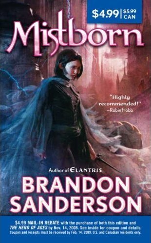
On the other paw, I think the second U.S. paperback cover’s better than the first paperback’s cover. Of the four, I like the original U.S. hardback’s cover art the best, though. ;-)
I liked it until I realised that the nagging sense of recognition at the back of my mind was that coloured smoke swirls were heavily used on The Night Angel Trilogy by Brent Weeks over here in the UK. The figure looks a little odd coming out of the blue as well – perhaps in the same tonal set would have worked better? Back on the fence I go!
What? You seriously thought the original paperback art for Mistborn was better than the new one? I think the new one is WAY better! (Incidentally, so does Brandon Sanderson.) Whatever. The Hero of Ages hardcover was the first of the hardcover Mistborn books that I actually liked, so I’m probably in the minority on this topic anyway.
Shane – Yep, I do like it better. The artwork might be better in the new one, but it lacks the action and excitement of the first one. And I’m not really too concerned with Sanderson’s opinion… the dude gave the cover art for The Gathering Storm a pass, so I’m not sure if he’s a fair example of objective good taste where his own works are involved.
;)
I will agree with you, though, that the artwork for The Hero of Ages is the best of the bunch.
I didn’t even read the title, just saw the cover in my reader right now and immediately thought I MUST HAVE IT. The cover is gorgeous, and I love the unfinished, almost deconstructed style.
The buildings in the background kinda remind me a little bit of Dave McKean’s illustrations in Neil Gaiman’s Coraline and The Graveyard Book. So…yeah, win :)
Put me firmly in the “Like it real well” camp. I would love it if the buildings in the background were more artfully done. They don’t necessarily have to be a more realistic pencil drawing (and i dig the fact that its a pencil drawing in the background, as well as the mixing of mediums) but it looks like a talented artist outlined the buildings, then let an untalented non-artist scribble/shade them in. The shading-in lacks continuity, congruency, and artful abstraction, in my opinion.
Amazing cover, like it as much as I like The Hero of Ages’s hardback. It does cover the mood and contrasts of the book really well; the mists vs. the buildings smudged by centuries of ash. I don’t like the current paperback covers at all, with the realistic picture of the main character posing. And the font of the pink-bordered text, ack!
I liked the original hardcovers the best, but this easily beats the crappy US paperback editions. The most shocking thing about your post is when you said you haven’t read it yet. Oh boy, are you missing out. If you cleared your current reading list and replaced them with the Mistborn trilogy, you will not be disappointed! I promise! Sanderson has quickly become my favorite author and has breathed life into a somewhat staling genre. Do yourself a favor and pick them up!
I’ve got agree with the majority and say that the original HC is better. I like the color at the bottom and I am normally a fan of minimalist/stylistic covers but I don’t care for the unfinished look going on with the buildings.
Aiden-Well you’ve got a great point regarding Sanderson’s acceptance of the cover art for ‘The Gathering Storm’, but then I’ve always thought the art for that series was terrible, so the new one being so atrocious didn’t surprise me all that much. That’s actually why it took me so long to read the books.
I can see your point about the newer paperback covers, they really don’t portray the action of the series. I hadn’t really thought about that. I just wasn’t a big fan of the hardcover art, and I thought the original paperback art was terrible.
I guess I’m in the “don’t really like it” camp. The buildings don’t seem to fit with the rest of the cover (plus they don’t look anything like a final empire), and I’m getting a really strong final fantasy vibe.
Your kidding? This is the worst cover I have seen in some time. It looks like a child have painted it!
[…] A Dribble of Ink » Blog Archive » Cover Art | The Final Empire by Brandon Sanderson (UK Edition) – I love and love and love this cover!! […]
[…] link: A Dribble of Ink » Blog Archive » Cover Art | The Final Empire by Brandon Sanderson (UK Edition) […]
Altho the background can be argude as not well drawn. I think the sole purpose of the badly shaded buildings is to draw your atention away from the background and put it to the character drifting in blue mist.
Theodor…. your opinion is safe to say yours and yours alone but would you please follow up with why you think it is “the worst cover I have seen in some time.”-Theodor? saying it looks like a child drew it doesnt really sum up anything we havent already discussed.
[…] few weeks ago, I posted the cover for the upcoming UK edition of Brandon Sanderson’s Mistborn: The Final Empire and it […]