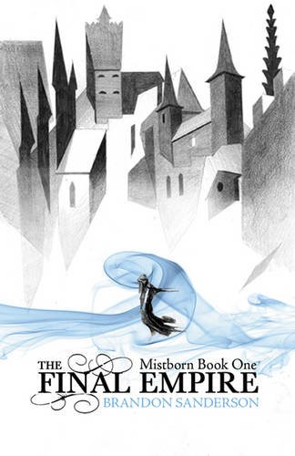
A few weeks ago, I posted the cover for the upcoming UK edition of Brandon Sanderson’s Mistborn: The Final Empire and it generated a good bit of discussion.

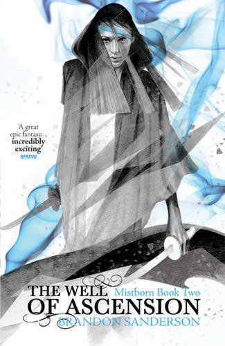
The covers to the final two volumes of the trilogy, The Well of Ascension and The Final Empire, have been released as well and are sure to be just as love-it-or-hate-it.


It’s interesting to see that they’ve moved into a more character-centric design, but I dig how each subsequent novel moves closer in on the figure’s face. I’ve got to say, I really dig what Gollancz is doing with these covers.

I like the blue portions but the shading/unfinished look really doesn’t do it for me. I’m also not a huge fan of character-centric covers as much as cityscapes/landscapes or something more abstract.
I do have to give them points for trying something different. The Wheel of Time covers and the various knock-offs are typically terrible.
I think those are gorgeous, really cool, much better than other covers for the series!
Meh…not a fan of these covers. I prefer the US hardbacks with Jon Foster’s terrific art.
I think the first one looks okay, but in my opinion books 2 and 3 look ridiculous.
I’ll take my US Hardcovers any day…though I really only like the third one.
I like the second and especially like the third, though it seems kinda cheesy that the third appears to just be a zoom-in on the second. Still, it reminds me of some of the better black and white comic art I’ve seen (and that’s high praise from me).
P.S. they’re both better than the first cover shown above! ;-)
I love that first cover. Great, spare design. As a fantasy cover, it evokes more of a sense of “wonder” in me than all the grandiose stylings of more traditional fantasy covers. Don’t really think of fantasy cover art as being “avant-garde,” but this one might come close to that. Brilliant stuff, grabs me immediately.
I would definitely buy it. German Expressionist-y. Very, very cool compared to many fantasy titles.
absolutely love the new covers. Wish those were the versions I have at home.
Personally, I don’t like the first novel cover. The figure in the blue mists is beautiful, but the buildings in the backround have no depth and the shading is off. The second cover has an unfinished-looking sketch of a woman who’s body is completely disproportionate–did you see how long her armas are? The last one is really the only on I like.
[…] that old Brent Weeks’ cover (which I didn’t like), had a bastard love child with the UK Mistborn covers (which I loved). I’m not so sure it works so well as Sanderson’s previous Gollancz […]
Personally thinks the art by Jon Foster better suit the series, but this is not too bad. It’s just that this style of art doesn’t fit in.
Here are the covers from two other countries, and I think the Japanese one is interesting:
Taiwan: http://ffoundation.pixnet.net/blog/post/31257090#trackback-79896
Japanese: http://www.hayakawa-online.co.jp/product/books/70495.html
[…] Kaanekujundus on ka kena. Mul on tunne, et lingis olevad pildid ei ole täpselt samad, mis minu ostetud raamatutel, ent üsna lähedased. […]