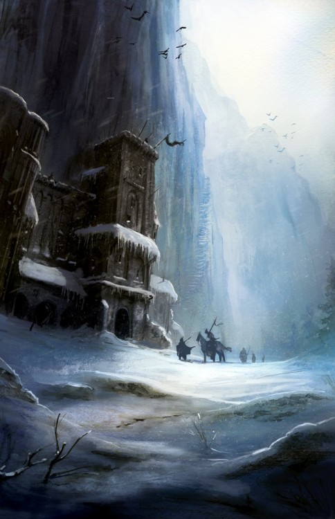
The Wall by Marc Simonetti for A Game of Thrones

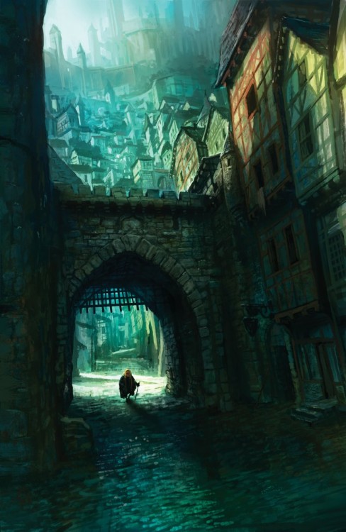
Tyrion in King’s Landing by Marc Simonetti for A Clash of Kings

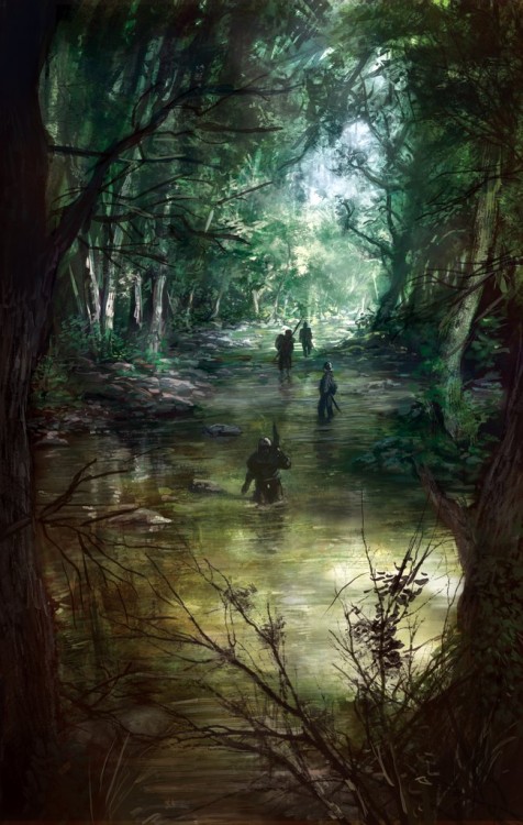
Looking for the Stark Children by Marc Simonetti for A Storm of Swords

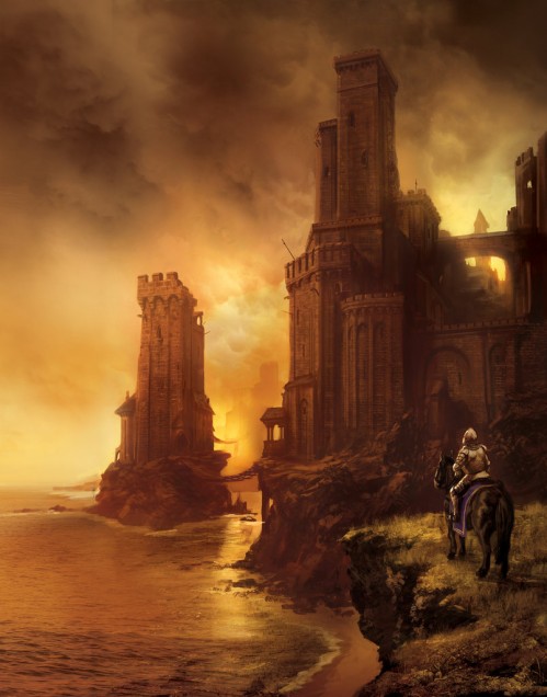
Greyjoy’s Castle by Marc Simonetti for A Feast for Crows
You know me. I’m an absolute sucker for awesome Fantasy artwork. So when Adam Whitehead, from The Wertzone, posted these amazing paintings for use on the upcoming French editions of George R.R. Martin‘s A Song of Ice and Fire series, I was absolutely floored. Absolutely incredible work from Marc Simonetti. Makes me sad for plain covers we get over here.

More excellent cover art coming out of France… no surprise there. I really wish that we would see more covers of this caliber from the US and UK publishers.
These are gorgeous
They really are beautiful. I love that stuff. The longer you look at them the more details pop out at you. They are redolent with atmosphere. Wow.
My favorite is The Wall. But they are all gorgeous.
I think that the work behind the cover artwork of the French editions is truly praiseworthy. I’ve seen quite a lot of amazing cover artworks on the French market. And these covers for the George R.R. Martin’s “A Song of Ice and Fire” novels are truly amazing. Marc Simonetti is a very talented artist and he proved that here once again. I also love the cover he made for the French edition of Patrick Rothfuss’ “The Name of the Wind”. I just hope to see such cover artworks more often. Especially on the Romanian market where is a great lack of such excellent book covers.
Aidan, thank you very much for the link :)
Those are absolutely amazing. Tempted to by the french books just for the covers. Art like that just sweeps me away and makes me wish I could read the book through amazing pictures like that. Sorry words just seam inadequate for that quality of artistry. Astounding.
I agree that French cover art is nice but its not a lot different in style than you do see in alot of digital painting styles.Its very mystical but doesnt grab me by the testicles and say WOWWWWW! these covers rock.They are more like production concept art – which shows elements.They are non threatening to the viewer.But dont make me wont to immerse myself into that world.There is something missing.Much like your average frenchman.:o)
I’ll agree that they have the same feeling as concept art for movies or videogames, but they totally grab me by the balls and experience the world between those pages!
Different strokes for different folks, I guess.
They are nice .More like production artwork – concepts of what the final artwork will be like. They are techically lovely but they sing a gentle song to me rather than vary the music and take me on a journey.They are mood pictures that would be perfect on a wall but a great cover has to grab your testicles to the book shelves and say hey have fun while you feast on that cover Mr.Matbe thats why we dont see them on USA or UK shelves is because they sing a gentle notes to you.They are interior pictures .Would look lovely scattered throughout the book but a cover art has to Entice you with what ever emotion your feeling that day.–not just the whimsical
I guess we just have different ideas of what a cover needs to be. I love the mystical, ‘unfinished’ look to the paintings. They urge me to want to experience the world and fill in the blanks myself. If an image is too defined, then I feel like the artist, and not the author, is defining too much of the world for me when I read a novel.
Yep, these are indeed fantastic. There are more and more artists who are doing this sort of ‘unfinished’ look, as you describe it, and I generally really enjoy it. There is something psychologically pleasing to me about the fuzzy around the edges nature of these works. I also enjoy that they give one a small window into the process of the creation of these works.
Thanks for sharing them, great stuff!
Aidan fine but then again these pictures could also be seen as too generic.They could be put on any cover.I like to associate the cover with whats inside otherwise what would interest me or take my eye on a book stand. I take your point butwhos to say when you get to the point in the story where the guy on horseback is looking whistfully at a castle its nothing like what you have imagined leading up to that point. But i dont think I ever go into and through a book and define a character from the first .If a cover defines a character that wouldnt sway me one way or other.A character would naturally change when you get to know more about him or her.so if your immersed into the story you would have an idea of charceter not definition.But I like abit of detail on cover to kick start things.I would say these pictures would be the periferal vision characters I get to know in the book.
Is your Novel being published may I ask?
Markus, I understand, and agree with everything you’re saying about covers. I think you’re mostly on the mark… it’s just that I feel these covers do everything you say a good cover should! That’s what’s so great about art, though, it hits people in different ways. I think one major difference between us is that you like detailed art on covers, and I often enjoy less detailed, under-defined art.
As for these covers in particular, what strikes me most about them is that they are exactly as I pictured those scenes in Martin’s novels, so I suppose that’s why they’re hitting so close to home for me. If I hadn’t read the novels, it could be that I’d feel differently about the art. It’s hard to say.
As for my novel, it’s not published as of yet. Still need to edit it and then find an agent to represent it or a publisher to put it on store shelves!
[…] Dribble of Ink has posted Marc Simonetti’s artwork for A Song of Ice and Fire. […]
These artworks with their focus mainly on atmosphere rather than on detail are certainly among the best ASIAF illustrations I’ve seen so far. It is really striking to notice that till now there seem to be so few artworks for this saga that are really good. We all know there are so many gifted illustrators around (just look at the diverse concept art sites on the web), but as to ASIAF-saga so many illustrations that I’ve seen are rather petty naive wannabe-art bordering on the kitsch than renderings which are really on eye-level with that remarkable work of fantasy fiction. Any examples for the contrary?
[…] addition, as noted by blogs such as A Dribble of Ink and Dark Wolf’s Fantasy Reviews, foreign publishing have hit their stride in redesigning […]
This artwork is breathtaking and so much more in line with George RR Martin’s vision of his world, and with what I would imagine myself that the world of “A Song Of Ice And Fire” would look like! I have the 2011 Ted Nasmith illustrated calendar and again, the illustrations are spectacular! It is for this reason that I simply cannot understand the decision to go with such plane and yes, even ugly coverart for the Canadian and US issues of the books. For f**k’s sake, Ted Nasmith is Canadian, you would think that at least Canadian publishers would decide to use his art for the book covers, but nooo, they have to go with the retarded versions…What about John Howe, another great Canadian artist, who worked extensively on illustrations for Tolkien’s works, as well as collaborating with Peter Jackson on his LOTR movie trilogy! He is more than qualified to work on “A Song Of Ice And Fire”, especially the books! Alan Lee also comes to mind! But it would be too much to hope for…
You know, I rather preferred the stylized covers that the “A Song Of Ice And Fire” novels had before. I do NOT like the new covers for the re-printed editions. I would rather buy the HBO tie-in editions, celebrating the upcoming series release. At least those are character driven! If the show has a full-run then it will be quite a treat to have all the books with those covers…
Although I actually do not know the coverart that loco73 seems to be so passionate about:
…I have learnt not to expect too much from publishers in general as to the artistic quality of fantasy cover artwork. I rather guess artistic quality is actually most often either not recognized, thought of as too expensive or only too easily sacrificed for supposed mass market compatibilty of some inferior design.
This given it is very understandable for the serious reader to go for the more stylized or symbolic covers so far used for the Bantam or HarperCollins paperbacks. At least they leave room for imagination and dont’ have it crushed by bad “realistic” artwork.
As for Ted Nasmiths illustrations I think they are in fact quite convincing and very close to what I imagined while reading the corresponding parts of the book(s). I’ve seen only the examples on Nasmith’s website but loco73’s praise seems appropriate here. But anyway: in order to not have my imagination channelled too much beforehand I’d actually prefer the more abstract, stylized covers on the books and have the more elaborate pictorial artwork on add on accompanying material like a calender or maybe just a (picture) book exclusively with an artist’s vision of the saga.
[…] Every once in a while, an artist nails the artwork from the book they are covering. Marc Simonetti does it on an alarmingly regular basis. […]
Beautiful artwork. Utterly breathtaking.