From Deas‘ website:
When Berren makes the mistake of stealing a purse from a thief-taker, it should have condemned him to a short and brutal life in the slave-mines. So when the thief-taker offers to train him as an apprentice instead, he can’t believe his luck. The thief-taker has secrets of his own, though, and Berren is soon sucked into a faraway war, filled with mercenary soldiers, necromancers who brew potions that can change your destiny, and a psychotic girl-princess with a penchant for cutting pieces out of her lovers’ souls.
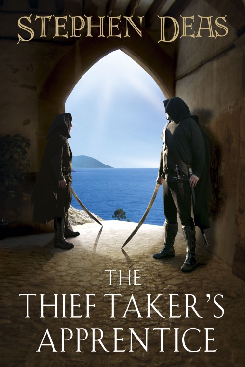
Jokes about hooded figures aside (there’s two this time, talk about innovation!), I like this artwork from Paul Young. Particularly, I enjoy how he uses the bright colours of the doorway to create contrast with the rest of the image and give the illusion of the thieves being hidden in the shadows without losing too much detail. The fellow on the left looks a little stiff, though. I do like the general layout of the text. The Thief Taker’s Apprentice is a sharp title.
As for the book itself, I’ve not read any of Deas’ other work, but it sounds interesting, if a bit similar to Brent Weeks’ Night Angel Trilogy. Still, you can hardly go wrong with Assassin’s and insane princesses.

Thanks! Nice, isn’t it.
Aidan Moher likes the hooded figures?
Stephen Deas has done the impossible.
Not a fan myself. Aside from the inevitable hooded figures (this has really gone beyond a joke), the whole image is just too computer-generated for me and looks like the box for a PC game.
I like the contrast between the sea and the shadows, not too keen on the figures though. Too staged and lifeless and my god but they’d sweat in that sun!
I like everything about it except for the two guys and the second font. The title is a bit… odd…
James, it does seem like the hooded figure has gone beyond cliche and into parody. I don’t get why the publishers are so set on it (besides the ‘Brent Weeks sold a lot of books’ argument). I know they have to appeal to ‘the unwashed masses’, but it’s becoming akin to seeing Fabio on the cover of every romance novel. Still, it’s generally good fodder for you and I.
The composition is what does it for me here, and the general layout.
Me likes.
I’m not surprised, Lou! Right off the bat, it reminded me of a Pyr cover.
The light and dark values are very nice.
My first thought was similar to James’s–it looks a bit too computer-generated. Kinda soft or something…not sure how to describe it.
I do like the darker portions (better than the outside part in the light), and the overall composition’s nice. It just looks too much like computer rendering for my tastes.
Disappointing…
Is that a penis or a sword?
Chad: I hear rumour that the title font will change; maybe someone listened…?
Jim: Rumbled. Curse you.