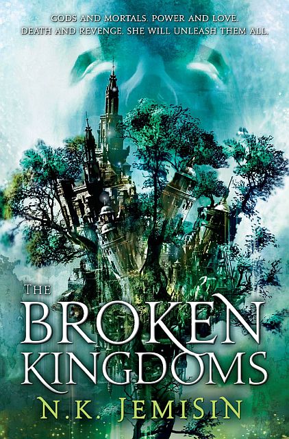
The cover for N.K. Jemisin‘s The Hundred Thousand Kingdoms is one of my favourite examples of proving an argument against the dreaded hooded-figure. I knew I’d love the the cover for The Broken Kingdoms, but I didn’t expect to like it even more than The Hundred Thousand Kingdoms! I’m a huge sucker for blues, greens and anything to do with the forest. Plus, it’s also a nice, portentous play on the previous cover.
Cheers to Lauren Panepinto, designer, and Cliff Nielsen, artist, for setting the bar once again.

I like.
Is there a blurb yet?
OH dear lord, Aidan, this cover is AMAZING. Itempas!
@Patrick – Not that I’ve seen.
@Ana – Isn’t it?
I’m not overly fond of either of the covers in this series, if I’m honest. The details on this just seem a bit… YA? Silly?
Gaah! It’s stunning. So pretty. Cannot wait to sink my teeth into it.
I had to tell Ana, the dude in the background reminded me right away of Dr. Manhattan. Just sayin’. Other than that, it’s a wonderful cover. If I don’t get to reading the first book soon I’m probably gonna stroke.
Aidan, altho i appreciate the kind words for the cover, this cover is not finished and as it has NOT been launched on the orbit blog i thought you would have known that. cliff & i are still working on finalizing the image. i dont know where you got it, but i would appreciate you at least saying its a work in progress.
I agree. Mysterious with wonderful colors.
This cover art is from the Orbit Fall 2010/Winter 2011 catalog. There is also a plot synopsis.
http://www.hachettebookgroup.com/_assets/busresources/LB_Complete.pdf
ah, touché. I didnt know little brown uploaded that. unfortunately catalog art is very often not final, and as i go out of my way to make sure everything goes on the orbit blog as soon as it is finalized, please dont consider an orbit cover final unless it appears on the blog. (Lest we have another Weeksgate.) there are more covers in that pdf that are also not final, just warning you.
I like this one too.
@Mark What makes a cover YA? Cause I’m not sure what element of this looks YA.
@Neth – We all know that Mark is bitter because it doesn’t have enough hooded figures, bloody swords or interns throwing fireballs.
Beautiful! I hope this (or some version of it) makes it to the final cover.
I think I see what Mark is getting at with the YA comment (though not with the “silly?” comment) – something to do with the way the city is drawn? Whatever it is, though, I think this cover is lovely.
[…] all started when I was told by blogging buds, “Dude thou must go-eth to A Dribble of Ink and partake-eth of the beauty that is the next N.K. Jemisin cover for The Broken […]
Neth – mainly because it reminds me of the palettes and tone of a lot of YA novels. It doesn’t strike me as very mature.
Aidan – in answer to the dig, I love that you want to push innovations, that’s great (and I’d love for more blogs to have such sentiments for literary innovation); but nothing positively endorsed recently – on yours or other sites – seems to be anything remotely radical. Genre art is mainly cityscapes or landscapes or figures, and they’ve been doing all of the above in different variations for the past thirty years, and probably will for the next thirty.
I’m just grinding your gears.
That said, what do you think of the UK Edition of Jeff Vandermeer’s FINCH? That’s a cover that hits all my buttons for artistic merit, identifying the genre and possessing tons of unique character.
I think they’re aiming Jeff into mainstream – the imprint is lit fic in the UK and aimed clearly at the David Mitchell readership. It’s a surprisingly commercial cover – because it won’t be stocked near the sf section…
I like the cover too though I would not disagree with Mark’s comment that the cover would not be out of place in the YA section, but that’s beside the point since many YA sff novels have much better covers than adult sff ones and I love browsing those covers in the store; as for blurb, The Hundred Thousand Kingdoms ends with an excerpt from this one and some discussion about it and that is more edifying than a blurb
It’s a gorgeous piece of art, and I can see where the YA vibe is coming from. It’s not good enough to get me to read the second volume after the disappointing first book (the story itself also had a YA vibe).
I <3 Jemesin.
But isn't that the 'dreaded hooded figure' there in the background?
Love it – I can’t wait to read it!
Oh, gorgeous. Why can’t I have this on a hardcover, damn it?
[…] around to addressing this now. Last week there was a little confusion in the blogosphere because some folks dug through Orbit’s “forthcoming publications” catalog and found the preliminary […]
Belated response here; been crazy busy. But I thought folks here might be interested in my own thoughts on the matter. Nothing wrong with the prelim cover being posted, but seriously — it’s just the prelim, folks. It’s lovely, but no sense in getting too excited about it yet.
[…] […]
[…] few months ago, I raised a bit of a stink by posting a leaked version of the cover for N.K. Jemisin’s The Broken Kingdoms. I thought it […]
[…] the first. This is a slightly updated version, in comparison to the one posted awhile back on A Dribble of Ink . I personally love the mystic cover art with its hues of aqua-green light strokes, radiating […]
[…] The Broken Kingdoms by N.K. Jemisin (Artist: Cliff Nielsen — as noted in the comments below, this cover is not final) […]