As the witch-pyres of the Spanish Inquisition blanket Renaissance Europe in a moral haze, a young African slave finds herself the unwilling apprentice of an ancient necromancer. Unfortunately, quitting his company proves even more hazardous than remaining his pupil when she is afflicted with a terrible curse. Yet salvation may lie in a mysterious tome her tutor has hidden somewhere on the war-torn continent.
She sets out on a seemingly impossible journey to find the book, never suspecting her fate is tied to three strangers: the artist Niklaus Manuel Deutsch, the alchemist Dr. Paracelsus, and a gun-slinging Dutch mercenary. As Manuel paints her macabre story on canvas, plank, and church wall, the apprentice becomes increasingly aware of the great dangers that surround her. She realizes she must revisit the fell necromancy of her childhood – or death will be the least of her concerns.
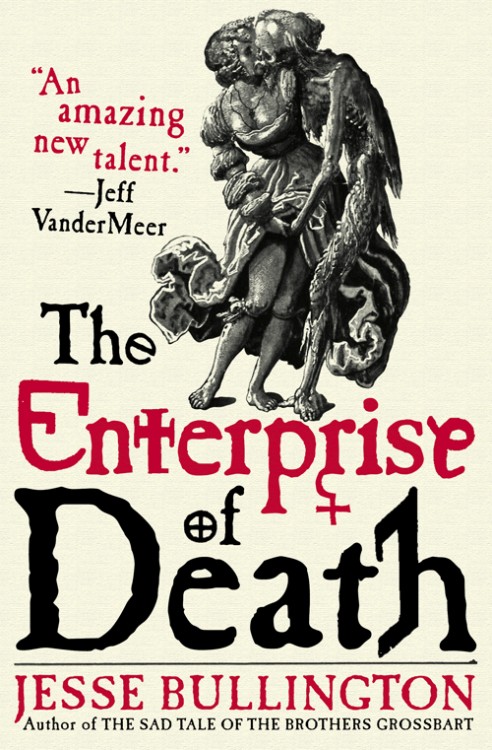
One of my favourite covers from last year was Jesse Bullington’s The Sad Tale of the Brothers Grossbart from Orbit Books. Bold and iconic, it set itself apart from other novels due to some terrific art by István Orosz.
The Enterprise of Death, Bullington’s follow-up novel, had it rough, having to follow such a strong cover and, frankly, falls a little short, thanks to the lack of such bold artwork. Still the saucy artwork (based on this art by Nicklas Manuel, who appears in the book!) is suitably macabre for Bullington’s work, and I’ve always felt that Panepinto’s work is strongest when she’s working with interesting typography. While it doesn’t have the impact I was hoping for, Bullington’s got another interesting cover on his hands.
If you’re interested, you can read my interview with Jesse Bullington, which includes more information on The Enterprise of Death and an original piece of flash fiction.
Cheer to Orbit Books and Lauren Panepinto for giving me the chance to debut this cover!

This cover is just okay. Seems to be a trend: recycling art that has fallen into the public domain. I like the font and design well enough, but come on publishers! Let’s give our great illustrators some juicy jobs (a la Tor Books.)
well Cris, although i am always happy to give an illustrator an opportunity to do some fabulous work, the author actually wrote the story around THIS particular piece of art, so we really did have to use it. go check out orbitbooks.net for the story.
I certainly shall! Thanks for the response, Lauren. I might be eating a little crow for dinner tonight…
And yes, indeed, it was crow pie for supper. I cruised Orbit’s website, and you guys rock just about every cover. I stand blissfully corrected!
Thanks for helping spread the word, Aidan! Way back before I even started writing the novel I hoped this piece would be incorporated, and I think Lauren did a great job doing so without relying solely on the art to carry the cover. Incidentally, my father thinks a certain hand could be a few inches lower, but when I explained the piece is six years shy of being half a millennium old he conceded that maybe altering it wouldn’t be right.