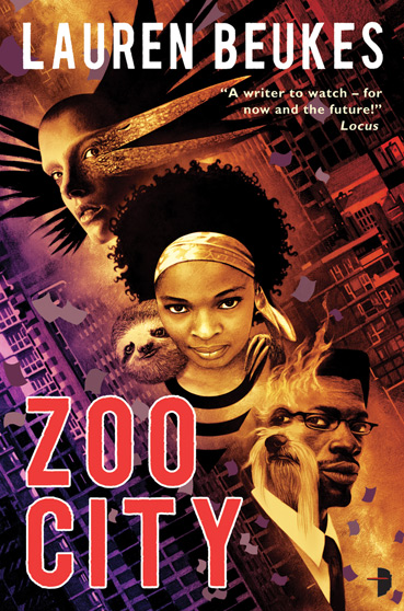
North America

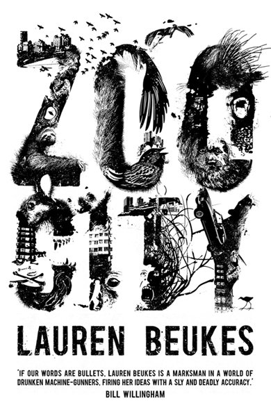
United Kingdom

Zinzi has a Sloth on her back, a dirty 419 scam habit and a talent for finding lost things. But when a little old lady turns up dead and the cops confiscate her last paycheck, she’s forced to take on her least favourite kind of job – missing persons.
Being hired by reclusive music producer Odi Huron to find a teenybop pop star should be her ticket out of Zoo City, the festering slum where the criminal underclass and their animal companions live in the shadow of hell’s undertow.
Instead, it catapults Zinzi deeper into the maw of a city twisted by crime and magic, where she’ll be forced to confront the dark secrets of former lives – including her own.
Two covers for Zoo City, the latest novel from South African writer Lauren Beukes. Oddly, both of of the covers are being published by Angry Robot Books, highlighting very clearly the difference in the approach to cover art in the different regions. Though I’m a big fan of John Picacio, something about the North American cover never really hit the mark with me, likely the floating heads, the strange angles or the yellow/purple colour palette. The UK cover, on the other hand, is a sight to behold – literary, bold and sophisticated, it attracts me for all the reasons the cartoony North American cover turns me off.
The book itself sounds great. It strikes me as a Dresdenesque yarn with good voice and enough to set it apart from the rest of the Urban Fantasy crowd.
It appears that Angry Robot Books is positioning and marketing the novel to a completely different crowd in each region, though the book behind the cover is exactly the same. If you saw the two novels on the shelf, which would you be compelled to pick up and read?

[…] This post was mentioned on Twitter by Aidan Moher. Aidan Moher said: New Blog Post – A couple of @angryrobotbooks covers for ZOO CITY by @laurenbeukes: http://bit.ly/aupZtJ […]
The UK cover is quite well done. The North American cover doesn’t do anything for me. At first glance, it comes off as a YA novel. Hate to say it, but I would walk by without a second glance.
I asked a few people at the office and they essentially said the same thing.
Hopefully we’ll get a shipment of the UK books in Ottawa!
Would that I lived in the UK so I could buy that version. Damn the publishers for making US books about comfort zones and familiarity. Why read if you don’t want to explore something new? At least they didn’t whitewash the cover, I suppose. Sigh.
Jonathan, how in the hell do you figure putting a black woman front and center on a US cover is about comfort zones? You even mention whitewashing yet fail to realize how atypical this is here.
I agree, Lou. I don’t love the US cover, but it’s anything but typical, comfortable or boring, which I applaud Angry Robot Books for embracing.
I was thinking more the montage style of fantastical/sci fi things which evokes a far different feeling for me than the disturbing images in the letters of the UK cover. Change the faces on the US cover to white and it looks like any other cover.
The first cover doesn’t look like something I’d want to read. The second cover is unhinged, makes the book look like it would be a terrific, edgy thriller. I’d go with the second one. Kudos for not whitewashing the first cover, but it doesn’t work for me. The art itself may not be boring, but to me, it makes the content of the novel seem unappealing. I don’t think I’d even bother reading the blurb on the back.
[…] http://aidanmoher.com/blog/2010/06/art/cover-art/cover-art-synopsis-zoo-city-by-lauren-beukes/ […]