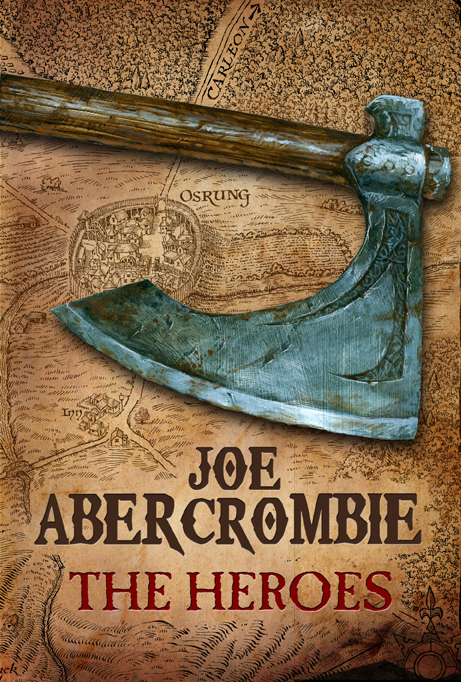
The UK releases of Joe Abercrombie’s novels are known for having some of the most iconic, beautiful covers in the genre, especially when put against the bland, lookalike covers pasted on the front of most novels being published today. So, kudos once again to the art team at Gollancz, for sticking to their guns and producing a fifth cover that’s just as lovely as the previous four. It fits Abercrombie’s style to a ‘T’, and looks like a book I’d be forced to pick up from store shelves (which I can’t say about the bloodtastic US cover, though it’s an improvement over Best Served Cold).
Plus, it’s got a map. I love maps.

[…] This post was mentioned on Twitter by LizUK. LizUK said: RT @adribbleofink: New Blog Post – Cover Art for THE HEROES by Joe Abercrombie. Unsurprisingly, it's awesome: http://bit.ly/chUz63 […]
The UK covers are wonderful. They look more mature, something I wouldn’t be ashamed to read in public. Looking at the US covers, it is no wonder fantasy–high, urban or otherwise–is often discounted out of hand.
[…] with the reveal of Joe Abercrombie’s The Heroes, this has been a bloody good day for cover art. Kraken‘s been blessed with some great cover […]
interesting use of the maps on the cover, considering Abercrombie’s aversion to them
I think I prefer they bloodied cover, but this one is great too. I just feels a bit too simple, compared with the other one. I also think that the US cover stands better on its own – when looking at it, you can see that it is linked with the The First Law-series, but not a part of it.
Lovely detail; great lines. wonderful art. I haven’t (gasp) read Abercrombie, so I don’t know how well it fits, but it’s great. It looks like a great cover for a graphic novel or comic, actually. ;-) (And that’s a compliment.)
[…] loved the cover when it was first revealed, but it was missing that final level of polish. It wouldn’t be an Abercrombie cover without a […]