From Charlton’s post on Tor.com:
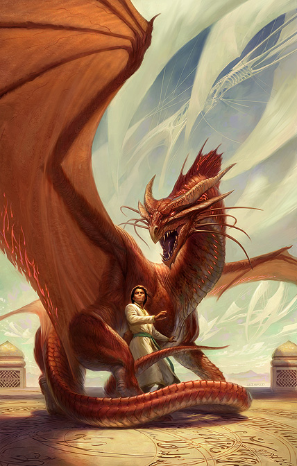
The scene inspiring this cover was suggested by the lovely Megan Messinger (who was one of my valuable beta readers). For this cover, Todd and Irene faced an additional challenge. At the heart of Spellbound lies a mystery as to what, fundamentally, a dragon is in this world. It’s more complicated than you might expect. Much of the action is devoted to trying to discover and understand two hidden dragons. For this reason, when I saw the first sketches I began doing cheerleader back-flips to make sure that the cover couldn’t “spoil” the story. Through various methods that can’t be discussed without spoiling, Todd and Irene created an image that will keep the reader guessing as to exactly what kind of a creature is on the cover. Things are not as they seem.
It’s no secret that I’m a fan of Todd Lockwood. I loved his art on the cover of Spellwright… and I like this even more! Where the cover for Spellwright felt a little adolescent (due, in part, to the typeface used), Spellbound is a bit more sophisticated and adult. Nicodemus Weal, the protagonist, looks like an adult, which is also nice. Really harkens back to some of Michael Whelan’s old covers. And I *love* the creamy blue background against the red dragon. Certainly it’s Lockwood at the top of his game.
Now, let’s just hope the typeface gets a bit more tender love ‘n care than Spellwright‘s bizarre glowly, swirly font.
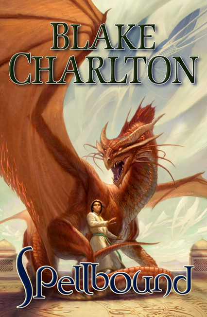
Update: Looks like LEC Book Reviews has a newer version of the cover with the title and author.

I’m still not fond of the font, but the dark blue and lack of glow is nice, but, well, author branding and all that jazz. Lovely use of colour all around.
It’s interesting to note the loss of detail in this version, suggesting that this is an earlier version of the cover. Expect the more detailed artwork above to actually appear on the cover.

Looks incredible!
That’s a gorgeous cover. I know I’ve been a curmudgeon about cover art and hype, but man, that’s one that I’d pick up the book based only on that. I want a print for my wall at home!
[…] This post was mentioned on Twitter by Aidan Moher, ediFanoB, Sam Sykes, Amanda Makepeace, Blake Charlton and others. Blake Charlton said: RT @adribbleofink: New Blog Post – Todd Lockwood artwork for SPELLBOUND by @blakecharlton. It rocks! http://bit.ly/c3VHo5 […]
That really is a fabulous cover. I’m afraid that you’ll be disappointed by the typeface. From the time-lapse making-of they have over at Tor.com it appears that the font is the exact as for Spellwright. Though that does mean a continuation – which is good – I have to agree with you that they could have gone with something less childish in the first place, as much as it may reflect the more juvenile aspects of the book…
Love the artwork. Hate the type face. My mind hasn’t been changed on that since the first book was released. Oh well. At least we can get that artwork from Todd eventually! That should be cool. Maybe I’ll even offer double-signed prints of it, if anyone would be interested in that of course.
Thanks for the review Aidan! You are correct the image with the type is an older draft, might not be the final etc. etc. Every time I look at it, I smile like a moron about what Todd has achieved. And @Shawn, I’ve already fielded two reader questions on fbook wanting to know if there’s going to be a double signed copy via The Signed Page… just saying ;)
[…] Reviews of the cover art are now up on A Dribble of Ink, LEC Book Review, and […]
Dang . . . that’s awesome. I love this cover. Lockwood is a genius with dragons!
[…] Spellbound by Blake Charlton (Artist: Todd Lockwood) […]