Via Cheryl Morgan:
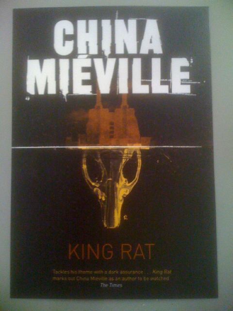
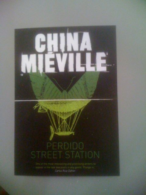
Several more covers (including Embassytown) after the jump:
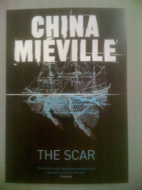
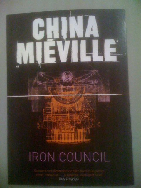
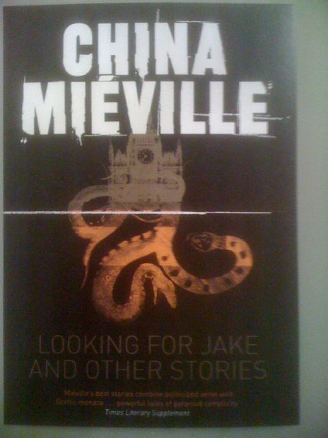
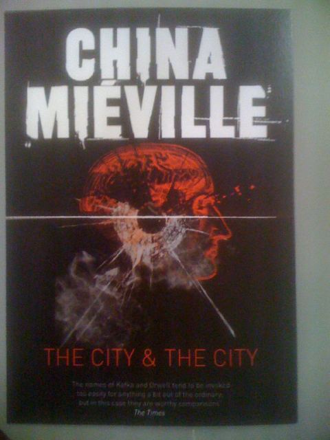
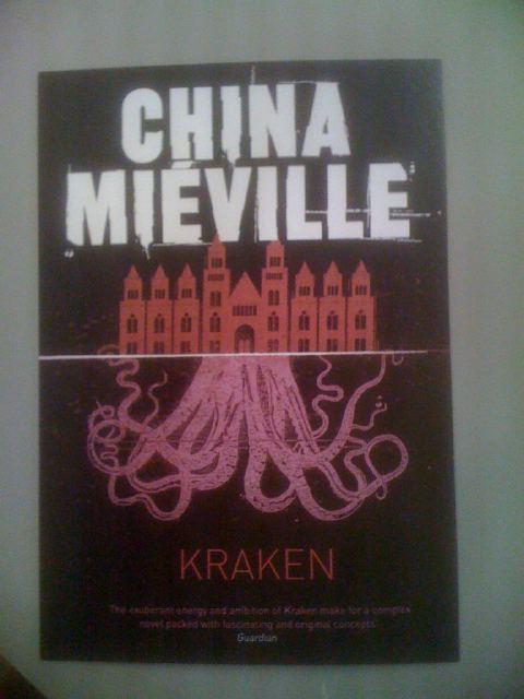
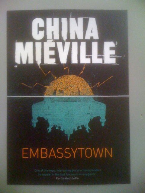
Today was China Mieville-fest in London. A bunch of industry folk got together to grovel at his feet, snatch up advance copies of his next novel, Embassytown and check out the newly minted covers for his novels. Obviously these are photographs of posters, not the actual book covers. Still, pretty nice, no? I’m particularly fond of The Scar and The City & The City. Greatly love how they all embrace Mieville’s penchant for blurring the line between our world and the weird world’s he creates.

An interesting new style but I think it suits some of them a lot better than others. Is it sensible to have such a similar visual approach for books that are pretty varied in their approach? For example, The Scar = GOOD, PSS = BAD. Works nicely for King Rat and The City & The City but I think it suits the tone of those books most. Looking For Jake and Kraken are a bit too similar (and I think the original US and UK Kraken covers were both better.
[…] This post was mentioned on Twitter by Aidan Moher, Tor.com Fantasy. Tor.com Fantasy said: RT @adribbleofink A whole whack of new covers for China Mieville (including EMBASSYTOWN). Very good job, @UKTor! http://bit.ly/hyZEEi […]
how do i buy those
@Tyler — Wait a few weeks (or until they’re released, I’m not sure the date) and then order them from http://www.bookdepository.co.uk.
I don’t care for the overall style at all. Yucko. And as Martin says, some of these books are so wildly different that trying to tie them together doesn’t make sense to me. Oh well. I have some of his books, with much nicer (IMHO) covers.
[…] are in my Twitter feed. My apologies for forgetting to tag them, but Aidan Moher has usefully blogged the full set. (The photos are actually of a set of postcards that the PanMac PR people were giving away at the […]
[…] exactly like all his other UK covers, so I suppose I’ll just re-direct you here for my opinion. The US cover art, which I prefer, is here. […]