Via Charlton (and The Speculative Scotsman):

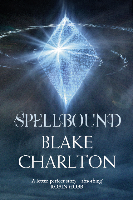
I really love the US cover for Spellbound. I mean, for a Fantasy nerd like me, what’s not to like about creamy colours, Todd Lockwood and a Dragon? Okay, maybe that font still sucks, but, hey, it’s a small complaint. In comparison, this UK cover for Spellbound is reserved and, well… kinda boring. The runes are at least an attempt to convey the language-based magic system in Charlton’s novels, but a cryptic diamond makes no promises to the reader about the excitement within.
Still, it’s a huge step up from the original cover for the UK release of Charlton’s Spellwright or the unbelievable French cover art.
*shudder*

I agree with you. This cover looks like something that should be on a geometry book. I really like the US cover, though.
Yep – the name is awful. I think Brandon himself has admitted though that his names are not his strongest suit.
Well talk about asking and receiving! Check out my comment for the 2009 UK release of Spellwright, not to toot my horn, but runish script and magic swirlies are a pretty accurate description of the above! I know I had nothing to do with it, but I’m going to walk around all day feeling pretty good about myself! What can I request next…dragons with lightsabers?