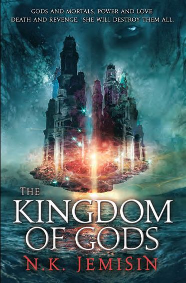
Just to ensure that Orbit Books doesn’t curbstomp me, I should make it clear that this is likely an early catalog cover and is subject to change (slightly or drastically) before the book ships later this year. For example, the first cover for Jemisin’s The Broken Kingdoms looked like this, the second (and final) version looked like this.
Phew. With that out of the way, can I squee? I don’t love it quite so much as the cover for the first and second volumes in Jemisin‘s The Inheritance Trilogy (no, not this one), but only due to my partiality towards the colour palettes used. It’s easy to say that Jemisin’s trilogy is one of the most consistent and sharpest looking sets to hit store shelves in years. Designer Lauren Panepinto and artist Cliff Nielsen deserve much attention and back-patting. It’s a crying shame that Orbit never released them in hardcover.

I must say that I have yet to be disappointed with the cover art for this series. While I do agree that it is not quite as striking as the other two, I do love how atmospheric it is.
I find it rather pretty. Definitely right that it’s not quite as striking as the other two, but I like the colour scheme. Draws the eye, I find.
Meh. Seems a bit cobbled together a’la Photoshop snips and cuts from a bunch of different source photographs. Color palette is nice, though.
I’ve never read the series. Any good?
can you link to the catalog, for some reason the link in the HBGU site is broken
@Clifton — If you check out the two examples I’ve linked to of The Broken Gods, you’ll see that a lot of what you complain about is smoothed over in the final pass. I have no doubt that this cover will look just as polished as the other two.
There is definitely something of the Photoshop mash to the covers but they manage to rise above this. The consistent style and use of colour makes them distinctive and look better form afar than close up.
Although where is the gray’s other eye?
I looked at the final version of the other book and it still had that cobbled-together look. I’d love to see it painted up as a cohesive piece because the concept is quite interesting. Perhaps this was created from scratch with the final look in mind, but it doesn’t really work for me. But I like my covers painterly.