Via Tor.com:

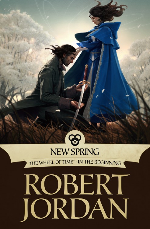
Irene Gallo, art director at Tor, on Chan and the cover:
I’ve been a fan of Jason Chan’s since he was still in school, although I didn’t know he was still in school at the time. I had been following his work online for a while and, yes, clearly he was a young artists but I was still shocked when he mentioned going to his graduation during our first project together. He is a quiet and thoughtful artist and over the past handful of years has worked to hone his craft, both as a freelance illustrator and video game concept artist. Jason combines a love of manga with a strong background in traditional narrative painting and I was excited to get the chance to work with him on New Spring.
When it came to scenes to depict, it seemed natural to revisit Moiriane and Lan. New Spring is their story before Rand’s begins. Jason chose to express a quiet and contemplative moment. The early spring blossoms suggest changes about to occur, yet it is still cold. It is a heavy moment. The weight of their mission is just starting to take over youthful abandon.
Recently, I’ve gushed about Jason Chan and his lovely artwork. I enjoyed his cover for Ari Marmell’s Thief’s Covenant, and this cover for the eBook edition of New Spring by Robert Jordan is another fine addition to Chan’s portfolio. On first blush, I like the soft, asian-inspired atmosphere of the piece, but it wasn’t until I got a closer look at the details (by clicking on the image), that I really started to appreciate Chan’s subtlety. Just look at the trim on Moiraine’s cloak! Maybe not my favourite cover from the series, but certainly another strong piece of art from the team at Tor Books.

That is a banging cover, especially considering all of the sub-par covers that the WoT has had to suffer through.
I like the scene depicted and composition, but the drawing itself looks too shopped for my taste.
The artwork is fantastic. However, if that’s supposed to be Rand then he’s at least 10 years too old.
Now that I’ve thought about it, that must be Lan.
Though I don’t really like how the whole picture sits together (half looking almost like a photo, half… not?), I rather like the blurriness surrounding the figures… (and obviously the cloak – that’s one spiffy cloak!)
Love that image! I swear, it’s the artwork that makes me want to rebuy all of the WoT series in e-book format, since it’s all so awesome!
There must be an odd wind; the hair of the two persons is flowing in opposite directions, and the cloak of the woman blows against her hair, too – a mistake you usually find on Fabio romance covers. ;)
Personally, I don’t like the photoshopped style of ebook covers anyway, but I suppose that goes with the medium. At it IS an improvement over the anatomically questioanble Sweeney crap.