From Sullivan’s blog:


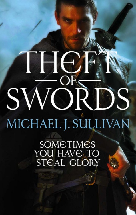
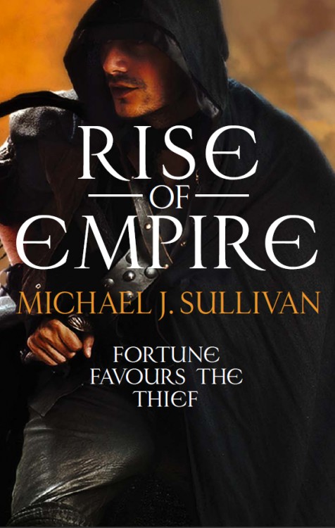
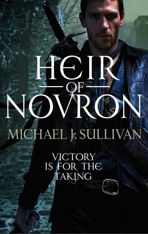
I like the layout/typography of the US editions much more. They both use the same art, but the UK edition’s emphasis on the characters (rather than the bold colour and overall design aesthetic of the US covers) takes away some of the adventure and mystery. They look, frankly, like every other menacing Fantasy book on the market. Somewhat reminiscent of the paperback covers for Abercrombie’s The First Law, which is a market I’m sure Orbit would love Sullivan to tackle. Not the most egregious covers I’ve seen, and admirably bold, but I prefer Panepinto’s take.

Why do all British covers get shady men lately? It’s sad.
Those book covers went from great to bad with the new printing. I am officially sick of the “Cloaked and/or Stubbly-Faced Dark and Brooding Guy” cover trend.
The US covers are much better and don’t draw as much attention to that strange shape on the models left thigh on Rise of Empire.
He’s just really excited to be featured on the front of a book cover, Misty!
Either that, aidan, or he’s really happy to see us.
[…] Cover: Theft of Swords by Michael J. Sullivan, posted by A Dribble of Ink […]
Very cool covers!
Sigh, yet more bloke in a cloak covers. At least the US covers have decent backgrounds that are a bit atmospheric.