Monthly Archives: October 2011

Halo Reach Cover Art

As has been bemoaned on this blog many times, the state of cover art in the Fantasy and Science Fiction fields is often underwhelming. Sure, there are gems, and there are some publishers who’re taking risks and doing wonderful work, but the duds far outweigh the studs. The same can be said for videogame covers. I won’t go into the the Japan/North America debate (needless to say, it’s very similar to the UK/USA debate for book covers), but instead point you to a group of artists who are trying to right the problem, thanks to the removable sleeves found in videogame cases.

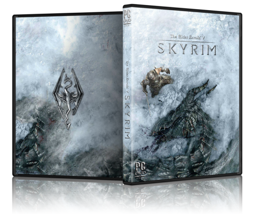
It’s no secret that videogame concept artists have some wonderful names among their ranks (Kekai Kotaki, for instance, and Jason Chan), but more often than not the covers for the videogames feature staid and boring computer generated figures doing boring things and looking generic. These artists on NeoGAF recognized the problem and have taken the gorgeous concept art from various games and used it to re-work the covers into things of beauty.

And aren’t they pretty?

Shadow of the Colossus Cover Art Dark Souls Cover Art Skyrim Cover Art

And a few others that caught my eye:

Alternate Videogame Covers

I’ve included a few of my favourites, but many, many more titles can be found on the official NeoGAF thread. Kudos to all the wonderful artists involved.

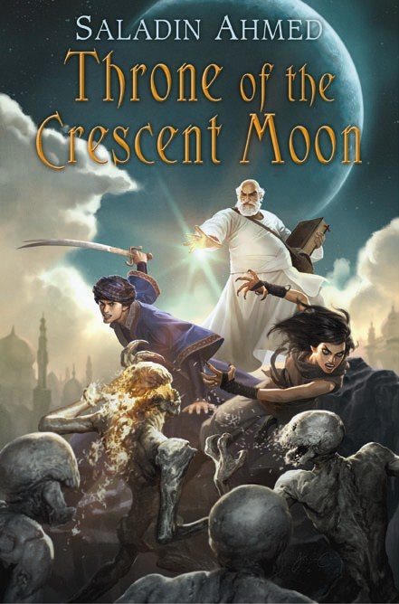
THRONE OF THE CRESCENT MOON by Saladin Ahmed

Doctor Adoulla Makhslood, the last real ghul hunter in the great city of Dhamsawaat, sighed as he read the lines. His own case, it seemed, was the opposite. He often felt tired of life, but he was not quite done with Dhamsawaat. After threescore and more years on God’s great earth, Adoulla found that his beloved birth city was one of the few things he was not tired of. The poetry of Ismi Shihab was another.

To be reading the familiar lines early in the morning in this newly crafted book made Adoulla feel younger—a welcome feeling. The smallish tome was bound with brown sheepleather, and Ismi Shihab’s Leaves of Palm was etched into the cover with good golden acid. It was a very expensive book, but Hafi the bookbinder had given it to Adoulla free of charge. It had been two years since Adoulla saved the man’s wife from a cruel magus’s water ghuls, but Hafi was still effusively thankful.

Adoulla closed the book gently and set it aside. He sat outside of Yehyeh’s, his favorite teahouse in the world, alone at a long stone table.

His dreams last night had been grisly and vivid—blood-rivers, burning corpses, horrible voices—but the edge of their details had dulled upon waking. Sitting in this favorite place, face over a bowl of cardamom tea, reading Ismi Shihab, Adoulla almost managed to forget his nightmares entirely.

The table was hard against Dhamsawaat’s great Mainway, the broadest and busiest thoroughfare in all the Crescent Moon Kingdoms. Even at this early hour, people half-crowded the Mainway. A few of them glanced at Adoulla’s impossibly white kaftan as they passed, but most took no notice of him. Nor did he pay them much mind. He was focused on something more important.

Tea.


Upon announcement, Saladin Ahmed’s debut novel, Throne of the Crescent Moon shot to the top of my most anticipated books. It’s been perched up there leering at me ever since. If you’re a fan of old school Sword & Sorcery, or you’re looking for Fantasy that steps away from the traditional faux-European setting, give Ahmed’s work a look.

For further introduction to Doctor Adoulla Makhslood and the setting from Throne of the Crescent Moon, be sure to read some of Ahmed’s award-nominated short fiction. I enjoyed ‘Where Virtue Lives’ (Beneath Ceaseless Skies #15) most particularly.

From Tor.com:

REDSHIRTS by John Scalzi

I really like it. It’s simple and calls enough on Star Trek (where the term originated thanks to those ill-fated, low-ranking security officers and engineers included on away missions) to be familiar and nostalgic, but also clear that it’s not a spin-off. It also seems geared more towards a more commercial/general audience (outside of tried-and-true Science Fiction fans) than Scalzi’s previous books with a cover that doesn’t scream its genre. Classy work from Irene Gallo and the team at Tor.

Scalzi likes it, too:

I love love love love love it.

Why do I love it? Let me count the ways.

1. The title of the book is Redshirts. What should the cover be? I mean, duh, this is not rocket science. It’s simple, iconic and obvious in the best way.

2. Also, the cover looks almost exactly like I imagined it should look like in my head.

3. But it actually looks better than I imagined it in my head, because I am not an art designer or an art director, whereas Irene Gallo and Peter Lutjen are, and this is what they do. I love it when reality is better than what you imagined.

4. And aside from any of this, I think this is a magnificent piece of commercial art. Book covers are advertisements, both to readers and to booksellers. This cover works because it’s clear from the cover what you’re getting in the book, and you can see the thing from across a crowded real world bookstore — or in a tiny thumbnail on your favorite online bookstore. It’s an eye-catcher, and if you know what a “red shirt” is, and almost everyone does at this point, it’ll make you smile.

In short: Love love love love love it. I really could not be happier with this cover.

Tor.com also shows off various alternate covers, all of which are just as nice:

REDSHIRTS by John Scalzi -- Alternate Covers

In particular, I like the third cover, which is kitschy and fun. Scalzi suggests that these covers might be even more suited to a commercial audience and it’s easy to see these sitting alongside Chabon, Grossman, Cronin or Fforde in the ‘Literature’ section of any given bookstore. I love how the ‘Redshirt’ on the first cover is made anonymous by the title of the novel, very clever.

Synopsis:

Ensign Andrew Dahl has just been assigned to the Universal Union Capital Ship Intrepid, flagship of the Universal Union since the year 2456. It’s a prestige posting, and Andrew is thrilled all the more to be assigned to the ship’s Xenobiology laboratory. Life couldn’t be better…until Andrew begins to pick up on the fact that (1) every Away Mission involves some kind of lethal confrontation with alien forces, (2) the ship’s captain, its chief science officer, and the handsome Lieutenant Kerensky always survive these confrontations, and (3) at least one low-ranked crew member is, sadly, always killed. Not surprisingly, a great deal of energy belowdecks is expended on avoiding, at all costs, being assigned to an Away Mission. Then Andrew stumbles on information that completely transforms his and his colleagues’ understanding of what the starship Intrepid really is…and offers them a crazy, high-risk chance to save their own lives.

Being a Scalzi novel, you know it’s going to be fun, engaging and a blazing fast read. I can also almost guarantee that the protagonist will be exceptionally witty, handsome and able to get out of sticky situations with nothing but a bit of elbow grease, a lot of good luck and some fairly acidic dialogue. I’m excited.

Modern covers for classic Science Fiction

The design of this series is meant to relate to the readers of Sci Fi but at the same time move away from its “geeky” reputation. All the covers have a specific illustration on the front page relating to the topic of the novel.

By restricting to 45 and 90 degree angles, the illustrations underline the fact that these novels are parts of a series and also give them that retro Sci-Fi feel.

Simple and clean, these covers manage to feel appropriately SFish while embracing solid design and not relying on tropes of the genre (spaceships, alien figures, laser guns) to sell the idea. From a marketing perspective they might be a bit of a hard sell (the title and author are often hard to make out, unlike these similar re-coverings from Gollancz), but they’d sure look purty on a bookshelf.

More of artist Martin Dellin’s re-imagined covers can be viewed here.

THE ALLOY OF LAW by Brandon Sanderson

The Hero of Ages

AuthorBrandon Sanderson

Paperback
Pages: 336 pages
Publisher: Tor
Release Date: November 8th, 2011
ISBN-10: 0765330423
ISBN-13: 978-0765330420

EXCERPT


By my estimation, Brandon Sanderson’s Mistborn: The Final Empire is a modern classic of Fantasy literature. That’s not to say it’s perfect, just that it has clearly carved out a well deserved niche in the Fantasy conversation. It did so by taking chances with the tired tropes of the genre, subverting those tropes and character archetypes without feeling forced (as is the current soup du jour in Fantasy) and telling a memorable, vast story in one volume. It’s been over two years since I finished The Final Empire, and it’s stuck with me since, constantly asserting itself as a recent Fantasy novel against which I judge the rest of the genre’s new faces. Unfortunately, it’s sequels, The Well of Ascension and The Hero of Ages were never able to capture that magic.

Those sequels faltered by exchanging The Final Empire’s dense, tightly plotted narrative and dashing lead, with an over-long, wordy tale full of tangential storylines and character arcs, a meandering pace and a male lead that takes too long to to evolve from a nervous, self-righteous boy to a confident, believable saviour. Ultimately, each novel ends with some of the genre’s strongest storytelling, but the first three-to-four hundred pages are generally difficult. Had Sanderson stripped the two novels down and combined them into one, we’d have one of the finest Fantasy duologies of modern times; as it is, however, we are left with a trilogy full of wonderful highs, turgid lows and much wasted promise.

But now, finally, there’s a Mistborn sequel that equals the promise and quality of the first novel. Almost.
Read More »