Yearly Archives: 2011

Via The Wertzone:

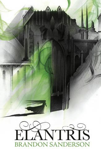
ELANTRIS by Brandon Sanderson (UK)

On the heels of yesterday’s lovely cover for the eBook edition of Sanderson’s The Mistborn Trilogy comes the UK cover for Elantris. It’s his older debut novel, first hitting North American shelves in 2005, but is only now being released in the United Kingdom.

Gollancz has really nailed a brand for Sanderson, playing off the previous covers for The Mistborn Trilogy and The Way of Kings. Like the cover for The Final Empire, there’s a wonderful sense of balance between the charcoal grey and the green mist. It’s perhaps not quite as suitable an image for Elantris as it was for The Mistborn Trilogy, but it’s still haunting and eye-catching. Brandon Sanderson’s lucked out big time and manage great covers on his novels in both of the major English-speaking regions.
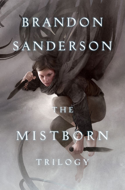
THE MISTBORN TRILOGY by Brandon Sanderson (eBook)

Over on Tor.com, Weber talks about the cover:

At one point she is named “beautiful destroyer,” and I think in many ways that is exactly what I was trying to convey when I painted her. I rolled that phrase around in my head a lot while working on this. Although I’ll never be able to make one picture capable of encompassing everything I love about this series, I’m pleased that I was given the opportunity to express a mood and atmosphere that does my vision of the story justice.

Lovely. Captures all the mood of the trilogy and, in a rare instance, Weber actually seems to have depicted a version of a main character that’s close to the one in my head. It’s simple, but manages to evoke all the best aspects of the series (read: not the ballroom scenes). Very reminiscent of Weber’s equally accomplished cover for the eBook edition of The Shadow Rising by Robert Jordan.

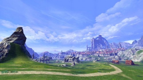
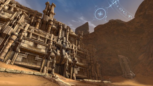
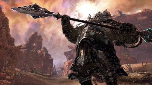
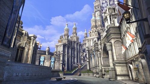
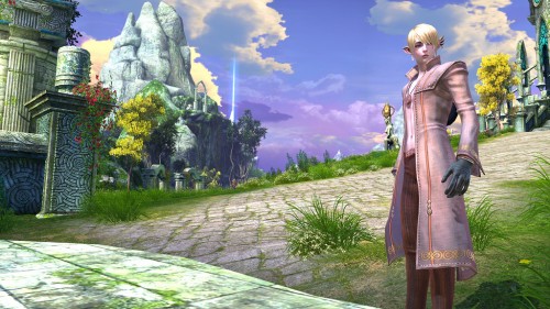
Recently, TheOctagon, a user on the NeoGAF forums, posted a few dozen screenshots he’s taken from a PC MMORPG he’s playing called Tera. Needless to say, I was absolutely blown away. It’s not often that a videogame will be able to deliver the same level of detail, artistry and lushness of the concept art from which it’s derived, but Tera seems to deliver on all fronts. Simply put, it’s beautiful.

Some of TheOctagon’s screens (and remember, these are real-time gameplay shots, not pre-rendered press release images):

Screenshot of TERA, taken by NeoGAF user TheOctagon Screenshot of TERA, taken by NeoGAF user TheOctagon Screenshot of TERA, taken by NeoGAF user TheOctagon Screenshot of TERA, taken by NeoGAF user TheOctagon Screenshot of TERA, taken by NeoGAF user TheOctagon

I can only imagine the rig necessary to play the game with the graphics settings at such high a level. To learn more about Tera, and apply for the Beta, you can visit the official website.


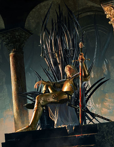
Yummy. This one’s a little more crafted and stylized than some of the previous trailers, but it, rather than being oblique, like some of the earliest trailers that lacked real footage, it manages to still give a proper sense of the characters and the struggles for power that fuel the series. I can’t get over how perfect the Iron Throne looks. As I’ve seen mentioned elsewhere, Nikolaj Coster-Waldau draped across the throne is almost the spitting image of Michael Komarck‘s famous painting:

Jamie Lannister sitting on the Iron Throne. Art my Michael Komarck

Littlefinger sounds as slick and conniving as he should. Even Catelyn, who I’ve been skeptical about since the re-cast, is looking good. Having just finished watching The Tudors, I’m itchin’ for some more politically charged, period television. Also, I’m hoping it will be a convincing way to introduce my better half to George R.R. Martin’s series. As I say in nearly every post about the show, it’s hard not to be excited.

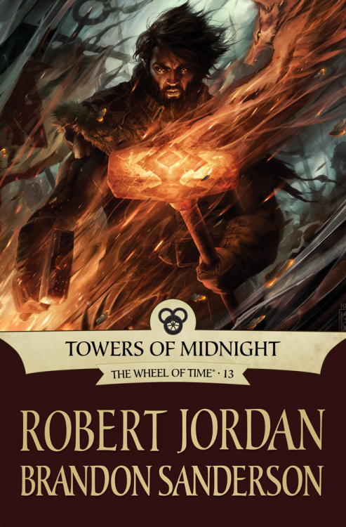
TOWERS OF MIDNIGHT by Robert Jordan and Brandon Sanderson (eBook)

Holy guacamole. Raymond Swanland‘s work on Cook’s The Black Company series has always astounded me, even if it often looks samey and retreads familiar ground too often. This cover for Towers of Midnight might be my favourite piece of art by him, and, perhaps, my favourite of all the Wheel of Time eBook covers. Just the look in Perrin’s eyes is enough to make me feel a little giddy… and I’ve not even read the book!

Irene Gallo, art director for Tor.com, has similar thoughts:

Raymond Swanland was on the top of my wish-list from the begining of this project. With so few books left, I couldn’t help but to look around carefully. Still, I never realy wavered from my first impression. I knew that Raymond could handle the dramatic lighting in play and be able to invoke tremendous power in the figure work. Even assuming the best, I was still blown away by the depth of emotion he captured in Perrin. Those eyes, lost in a trance, unminding of the natural world but absolutely focused on the chaos and activity around him…. You don’t have to know the story beforehand to get shivers looking at it.

Sure beats the tepid cover for the Hardcover release.