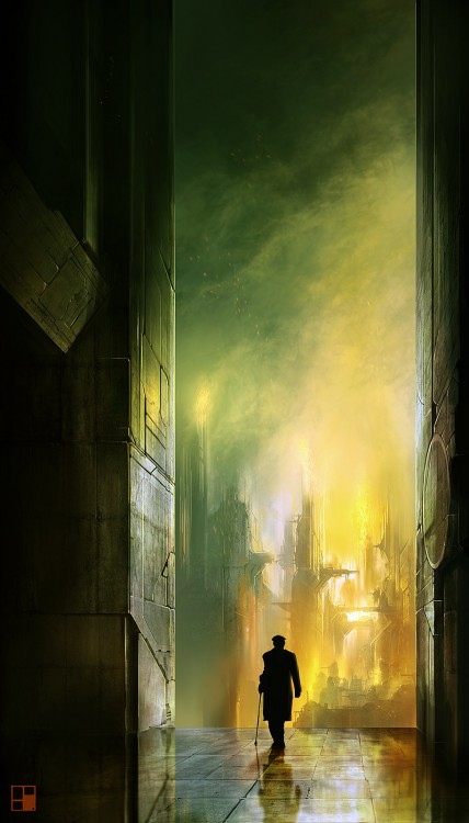
 2010 served up several solid debut novels. From Blake Charlton’s fun, throwback-to-the-90s Spellwright (REVIEW), to N.K. Jemisin’s out-of-left-field The Hundred Thousand Kingdoms (REVIEW), it was a good time to be discovering some of the genre’s new, young authors. Topping that heap, though, was Anthony Huso’s The Last Page. I’ll let my review do the talking:
The Last Page‘s influences are clear, but many. Huso weaves aspects of Epic Fantasy (in the form of magic books, invading armies and motley assassins), Steampunk (zeppelins, guns and tanks), Lovecraftian Horror (some truly frightening beasts and angry, universe crumpling gods), Urban Fantasy, heavy doses of Mievilleesque New Weird and even a light dalliance with Military Fantasy. With a quilt-like structure (each square built from one sub-genre), Huso’s story and world could easily have become a convoluted, cannibalistic mess, but, instead, he handles it with the aplomb and skill of a veteran writer. The weird world of Stonehold could stand beside the work of contemporaries like Mieville or Newton and never miss a beat.
It’s was a no-brainer that I’d get in touch with Anthony and pick his mind about his debut novel, poetic prose, language and his work in the videogame industry. He didn’t let me down.
The Interview
Anthony, welcome to A Dribble of Ink! I’ve written a little bio of you above, but why don’t you start things off by telling us something about Anthony Huso that we won’t find in any authorized biography?
When I sit in a restaurant, I line up my wallet, cell phone and keys in a nice row. The OCD is getting worse, generally, with age but it’s balanced out by the fact that my kids leave popsicle wrappers on the coffee table — which forces me to cope with reality.
The Last Page, at its heart, is a love story between Caliph Howl and Sena Iilool and the struggles of their relationship around the roadblocks put in place by their own personal agendas. At the same time, Sena plays a very adversarial and antagonistic role in Caliph’s life as High King. Was it hard to juggle these two sides o the relationship? Which was more important to the story?
It wasn’t easy. I think if it had been easy, it wouldn’t have been interesting to write. I like to watch people in public and notice how they interact. Relationships are fascinating. So you’re right, this is a story that revolves around a relationship, though I wouldn’t classify it as a proper romance. As for which side is more important, I think you can’t have the story without both sides, clearly. Now, that said, I found in writing it that whenever there was less of Sena in the text, the book didn’t go as well. I think this is really Sena’s story, even more than Caliph’s.
Read More »
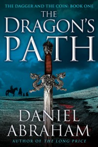 I don’t post many excerpts. It’s not that I don’t have the opportunity, it’s just that they don’t often excite me. When I had the chance to post the prologue to The Dragon’s Path, the first volume in Daniel Abraham’s The Dagger and the Coin series, all that apathy went running out the door, screaming into the fields behind my house. I was giddy as a school girl.