The northern wastes. . . .
A land of death and shadow where only the strongest survive. Yet that is where Caim must go to follow the mystery at the heart of his life. Armed only with his knives and his companions, he plunges into a world of eternal night where the sun is never seen and every hand is turned against him.
Caim has buried his father’s sword and found some measure of peace, but deep in the north an unfathomable power lays waiting. To succeed on this mission, Caim will have to more than just survive. He must face the Shadow’s Master.
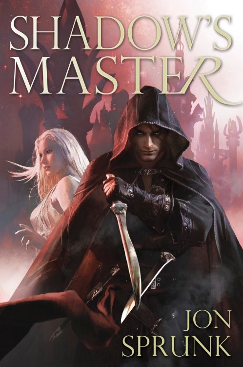
Not my favourite from Pyr, or Komarck, frankly, and I’m not a fan of the colour palette at all, but I appreciate them keeping consistency across the series. I really need to read Shadow’s Son at some point.

The consistency between the novels is definitely there.
As far as the palette, the series goes from green to blue. I guess red was an obvious choice if you wanted a distinctly different color.
I think the colour palette is BEAUTIFUL!
I’m with you in that this is my least favorite of the three, but I am happy for the consistency and it isn’t a bad cover, just not up to par with the other two novels. I own the first one but haven’t read it yet. Probably well past time that I do so.
I actually like the color palette, but I’m not as big of a fan of the faces of either of the characters like I have been in the past.
I’d have to agree with the others. I kinda like the palette. I just like this cover i guess.
I really like the way they portrayed the characters too. Not to be disagreeable . . .
I am not a fan of this cover either. The female figure looks too much like something out of a computer game for my liking. And like Carl, I lost my interest in characters featured on the cover long time ago. With some small exceptions though ;)
I need to pick up Jon Sprunk’s series as well, but with so many books I want to read it is difficult to squeeze it in at the moment.
Just to clarify, I didn’t say anything about not liking characters on covers. I am actually kind of old school that way and still very much like character focused fantasy covers, at least when the art is well done and the artist made an effort to match the description of the character in the book. I just don’t think these characters look as good as they did on the first two books in the series, which I love, especially book one.
Sorry Carl for my misunderstanding. It is unintentional :)
I liked the first two covers of the series. Not much, but still. Although this one is in the same line I don’t find it very much on my liking. Besides this, I really need to catch up with the series. And with other books that are still waiting for me to pick them up, unfortunately.
Oh no worries, I figured as much.