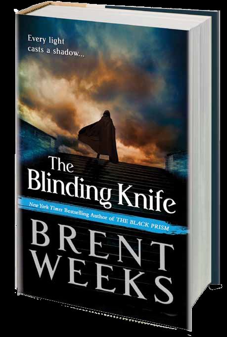
You know, hooded figure aside, that’s pretty darn sexy and much preferable to the photorealistic cover for The Black Prism, while still retaining the same feeling for the series. This isn’t the final cover, but gives us a good idea of the direction that Orbit Books is taking with the series. I like it. Great colours. I’ll be sure to post the final cover when I get my hands on it.
Thoughts?

Oh yeah, like that. And agreed – it’s better than the Black Prism cover. Looking forward to this.
I liked the other one, but I like this even better; awesome sky!
Looks a lot like Steven Erikson’s covers.
maybe they should make a cover without using the color blue ;-)
Thank goodness it’s not the final cover. I like the layout and how the colors work together but for me it’s just meh. I like the first cover better because it’s bold and the photorealism makes it stand out from other covers in the same genre. The style of this one seems too conventional. I really hope the final design comes out much different.
Don’t get your hopes up, Natasa.
Love it! Want it now!
[…] Cover: The Blinding Knife by Brent Weeks, posted by A Dribble of Ink […]
Yeah, it’s much better than the BLACK PRISM cover…though one has to wonder why they decided to abandon the photo realistic face cover style now…It’s like someone in marketing FINALLY caught onto that stuff not working…I mean good for them, but I wish they’d done it with the first book so I didn’t have to stare at Ares from Xena on that cover.
This cover is just so-so, and certainly would not entice me to buy the book.
The first cover was awesome! And it certainly did entice me to buy the book!
I also kinda like the first cover a little better, though the colors in this one are rather nice.
However, it looks generic: if I remove the author and title, this image would work for countless other books.
Better than Black Prism, but quite generic.
[…] Like, really gorgeous. And a step up even from the impressive early version that leaked a few weeks ago. It’ll look even more sharp if they end up using the foil-stamp […]