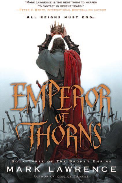
Yay for consistency and impact. I love the progression over the course of the trilogy from the tired-and-overdone hooded figure to this figure, cockiness replaced by ambition and power. Great stuff, and perfect for Lawrence’s trilogy. I still don’t like the title font, but, hey, you can’t win ’em all, can you?

Yeah, this is a great capper cover to the series. Fits perfectly with the tone of the trilogy. Love it.
Very cool. The covers are better than the writing.
Is he holding the crown back to front?