
Buy The Very Best of Kate Elliott by Kate Elliott: Book
In a post last year here on A Dribble of Ink, Aidan kindly debuted the stunning illustration Julie Dillon painted of a scene from my novel, Cold Steel. In that post I mentioned how the commission came about:
When I decided to commission an artist to illustrate a short story in the Spiritwalker universe, I was thrilled that Julie Dillon agreed to work with me…
Besides the black and white drawings for The Secret Journal of Beatrice Hassi Barahal, I also asked Julie for two color illustrations. I picked the subjects based on passages from Cold Steel that I thought would be visually evocative.
I particularly wanted an illustration for a scene in which the heroines, Cat and Bee, emerge from a cave onto a beach whose strand, instead of sand, is “red coals and smoking ash.” Here in the spirit world the sea isn’t water; it’s smoke. In the scene a dragon rises out of the sea of smoke to confront them.
A bright shape emerged, smoke spilling off it in currents. The dragon loomed over us. Its head was crested as with a filigree that reminded me of a troll’s crest, if a troll’s crest spanned half the sky. Silver eyes spun like wheels. It was not bird or lizard, not was it a fish. Most of its body remained beneath the smoke. Ripples revealed a dreadful expanse of wings as wide as fields, shimmering pale gold like ripe wheat under a harsh sun.
Julie sent me an initial sketch for my approval, and I was astonished by the dramatic sweep and expansive line.
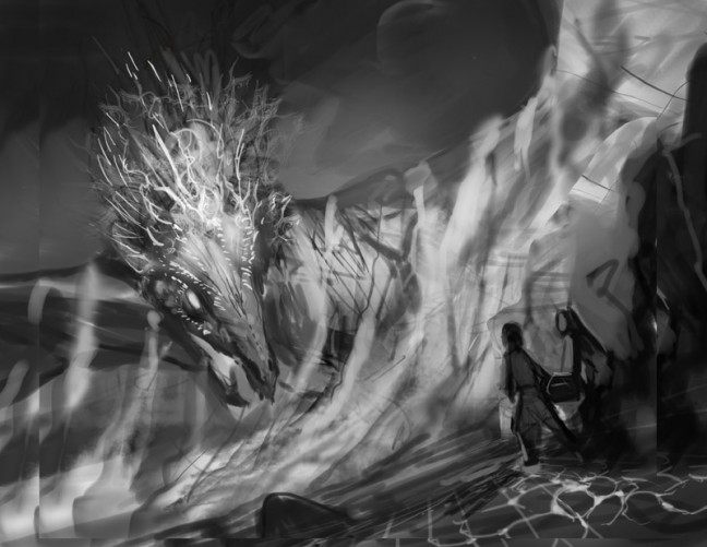
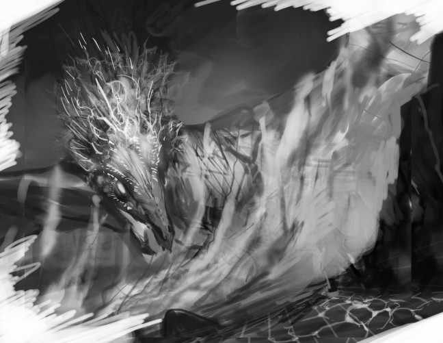
Later she polished up that black and white sketch for me to use as one of the 29 sketches in The Secret Journal.
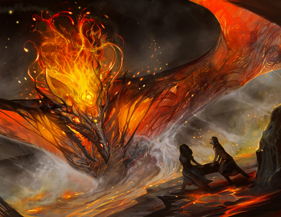
I was pretty impressed with the sketch but the finished color illustration blew me away. Her use of light is phenomenal. The dragon looks both ephemeral–made of smoke and flame–and yet also terrifyingly powerful.
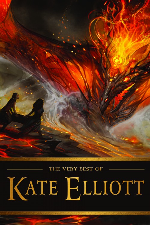
Therefore, when Tachyon Publications approached me about the possibility of publishing a collection of my short fiction (now available as The Very Best of Kate Elliott), I asked if they would be interested in using this illustration for the cover. They politely agreed to look at it, making no promises that it would be suitable, right up until the moment they saw it. At that point they were, understandably, quite enthusiastic.
Not every illustration or photo can be used on a book cover because the dimensions and balance have to work together. Furthermore, using the wrong typeface, color, and design can ruin an otherwise interesting image. Designer Elizabeth Story did an incredible job turning the illustration into a gorgeous cover. She flipped the image (my daughter, also a designer, explained why the image works better flipped on a book that opens on the left; it has to do with the way the eye gets drawn to the right and thereby to the side of the book you open). The clean, classic typeface doesn’t clutter, nor does it draw attention to itself and away from the image. The gold color of the letters echoes the fire in the dragon.
Watching art take shape fascinates me, whether seeing a story go through multiple refining drafts or observing as a sketch turns into a finished book cover. That the illustration so magnificently captures a scene from one of my own novels is just the icing on the cake.
You can buy prints of the color illustration at Julie’s INPRNT store.
Written by Kate Elliott

- Hugo Award
Winner
- About Aidan Moher
- Bibliography
I still think that’s quite a dragon, and a dragon is a fine icon to have on a cover of your work, Kate :)
[…] a cool post over at A Dribble of Ink that shows the evolution of Julie Dillon’s art from black and white sketch to color illustration to the cover of THE VERY BEST OF KATE ELLIOTT. I […]
[…] Elliott‘s cover for her short story collection THE VERY BEST OF KATE ELLIOTT – so this sketch to final cover post @ A Dribble of Ink was a fun read. Julie Dillon is an amazing artist, and her covers always make me take a second […]
There has been no Julie Dillon Art that I haven’t liked. I’m happy to have been one of the Kickstarter backers of her book, and am now the proud owner of a Sun Sheperdess giclee print. ^^
I discovered her via Andrea Höst ebook covers, heh.
Also, I loved what she did with your Secret Journal, that was such a labour of love and fun ^^