Apparently keeping an ear close to the ground, Orbit Books, the publishers, have written a great big post about how the cover for the US edition of Best Served Cold came to be. The cover has come under fire since being released to the public, so it’s interested to see why Orbit went in a different direction than the UK publisher.
Genres develop certain visual cues, and this happens in all kinds of media — book covers, music packaging, and even websites. Old manuscripts and maps evoke armies and fighting and war. The same way a slick photographic style says urban fantasy. As visual beings we make snap judgements from these cues, and a designer knows these cues and when to use them or purposfully confuse them.
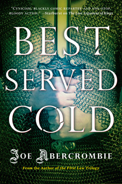
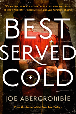
Our approach was to focus on a more character-driven cover, while keeping the grit and dirt and gore of the epic fantasy look. The fabulous Hsu & Associates Design and Michael Turek Photography were put on the case. They did a series of great covers, but they just didn’t capture the raw violence of this book. We had one huge issue — the main character is a woman, and a good chunk of male fantasy readers think any cover with a woman on it is immediately girly urban fantasy fluff. So we kept pushing the texture, and the grit, and we came up with a gorgeous image and design…


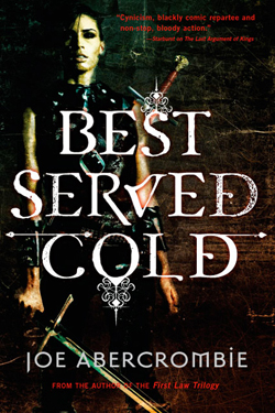
We loved this last cover. It’s gritty, it’s character-driven, it’s dark, and the texture is gorgeous. If the main character was a man in a loincloth or armor, let me tell you, this cover would be it. Unfortunately, it’s an ugly stereotyping of the genre (and we here at Orbit are all about challenging stereotypes), but a woman on the cover still reads urban fantasy to a lot of people. We showed the cover to Joe, who thought the cover was great, but he was also concerned about his fans. We didn’t want to alienate epic fantasy readers, and of course we didn’t want to misrepresent it as an urban fantasy book. But we truly felt that it was important to have Monza on the cover — so we decided to combine the two.

And after a lot of photoshop and a LOT of playing, we reached a happy medium. It speaks to Joe’s core audience of shields-and-swords fantasy readers, but opens the door for new readers to be interested by the mixed signals of the cover and pick it up. And that’s our goal — getting a person in a bookstore who has never heard of Joe Abercrombie to pick it up. Because if they give the book that chance, read the flaps, read the praise that Joe’s great writing has already achieved, then we have them. Do we expect that there will be some controversy? Of course, I can hear it already. I grew up a girl in a male geekboy’s realm and I am well used to being downplayed, dismissed, and told to “go watch Buffy” (and ogled, but that’s a post for another time). I am female, but I love epic fantasy. I love swords-and-shields AND love urban fantasy. And there are a lot of women like me out there. And there are male urban fantasy readers as well. (Don’t tell me no, who do you think is buying those Dresden Files books, hm?) And this book, which has such a great, strong, female heroine (or antiheroine, if you prefer), is something I would pick up and love. Joe’s writing will succeed on its own merit, and we of course expect he’ll gain new readers through reviews. However, I believe, as a book designer, that a cover is successful if it reaches the same audience that the interior of the book does. And I believe this cover does that. Is it controversial? of course. Is it a mashup of different styles? yes. But Joe is pushing the envelope and challenging readers, and so should we here in the Art Department.
Not surprisingly, it seems that Orbit is attempting to broaden Abercrombie’s market by including a female on the cover. Will it work? Who knows. The cover still strikes me as too Urban Fantasy and misses out on the timeless, adventerous feel of the UK cover. In many ways I think they should have stuck with just having Monza on the cover and completely eschewing the map. People who are going to be drawn in by the map are probably already aware of Abercrombie’s work and are probably also the same who are decrying the divisive nature of the US cover.
The way it is now, it seems like Monza’s on the cover only to sell more copies, rather than to properly represent the novel within. Rather than fully commiting to either design, they settled on something in the middle that fails to do either ‘look’ properly. As other’s have pointed out, it seems obtuse to place a quote from Junot Diaz (a Pulitzer prize winning author) on a gritty, dirty cover like this – again, trying to appeal to the literary crowd with the quote and the lowest common denominator with the leather clad chick. Middle of the road doesn’t always get things down, but that Diaz quote would look much less out of place on the UK cover.
I appreciate Orbit Books pulling back the curtain and defending the cover after all the flak it’s taken in the past day. To be fair, this issue probably would not have arisen, were it not for the fact that there was already outstanding art work out there for the UK edition and if Orbit has simply released this cover into the wild without any preconceptions from the current fans of Abercrombie’s work. If it ain’t broke, don’t fix it, right?
In the end, though, it’s what’s between the covers that really matters and I’m confident that Abercrombie will deliver in full force. Expect a review as soon as I can get my hands on a copy.
