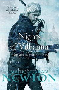
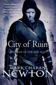
I’m fairly certain that Newton and the art team at Tor UK are just trolling me at this point. An old geezer and a melancholy Dashboard Confessional fan who doesn’t even know how to properly wear a bag with a shoulder strap? Le sigh. I’m far more interested in the fact that Newton spent some time combing through the first volume, Nights of Villjamur, and smoothing out some of the wrinkles:
There’s more, though: I’ve actually made quite a few (over a hundred) changes to Nights of Villjamur. Call it the ambitions of a first-time author, call it crap writing, but there were a few points of the text in this book that I believed caused a clunky experience. I’ve managed to iron many, many of these out, thankfully. It’s only a word or two here, a line there – not a complete re-edit, mind you, but enough to give me peace of mind that the most ridiculous of the excesses have now been removed.
This sort of thing happens all the time when authors are given a chance to tinker with their own work (David Anthony Durham recently mentioned that he’s done the same thing to the first volume of his Acacia trilogy). Nevertheless, it would be interesting to compare the revision.


I’m not having design crit from a man who uses an orange font. ;)
Very relieved to have been able to tinker. I managed to remove most of the phrases that were off-putting to the casual reader mainly. In theory, you’ll not notice much; just a smoother ride.
*cough*
;)
Are these semi-photographic covers the new trend in the publishing business? I feel like they’re cropping up here and there, and I’m not really convinced it’s a good thing. But might just be an old-fashioned kind of cover-fan talking. I’m slowly getting through the pile at Nights though..
Yes.
Don’t worry, you’re not alone.