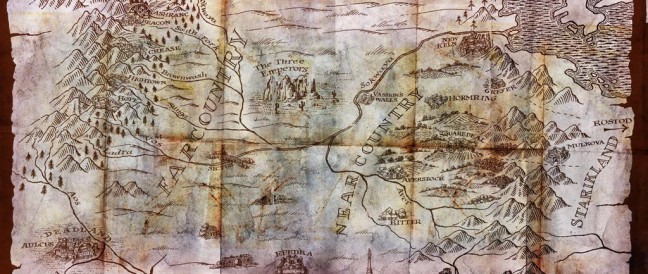
Abercrombie on the map:
The Heroes was very focused in time and place, detailed, forensic almost, the ground all important – faux military history, in a sense, so the map needed to look detailed, professional and precise as well, with the positions of units added in for an extra veneer of military exactitude. This time around the story is taking place in an expanse of largely unmapped, scarcely settled wilderness so it made sense that the map be much rougher, less accurate-seeming, more woolly and suggestive without too much worry over blank spaces, a drawn on the back of a beermat by a fella with a big beard sense.
We all like a good map, don’t we? I do appreciate, too, that there is a slight red cast to the colour palette used for the map, making this, literally, a red country.


We all like a good map, don’t we?
Um, yes, but you knew *that*, Aidan :)
Always nice to have a visual reference in mind when reading a story. It’s an added plus when the map doubles as art!
Reminds me of Shelly Shapiro maps.
Finally got a bit more of the geography of the Old Empire and Starkland. It’s a bit of challenge to figure out where and the what in Before They’re Hanged.